
COMPANY CASE STUDYRajasthan, India

ABIL

A strategic rebranding and repackaging initiative that elevated Agribiotech Industries’ brand identity

IdentityImproved Identity
RecallEnhanced Brand Recall
PremiumEnhanced Demand
ClientABIL
SectorF&B
ServicesDesign & Brand Identity, Brand Activation
Sawai luxury real estate architecture in Jaipur
ABIL case study image 2

A strategic rebranding and repackaging initiative that elevated Agribiotech Industries’ brand identity

The Mandate

ABIL didn’t just need a facelift, they needed a full identity shift. We dug deep into their market, crafting a strategy that preserved affordability while elevating perception. By positioning them as a premium-yet-accessible liquor brand, we bridged the gap between aspiration and realism, making the rebrand both culturally relevant and commercially viable.

What We Delivered

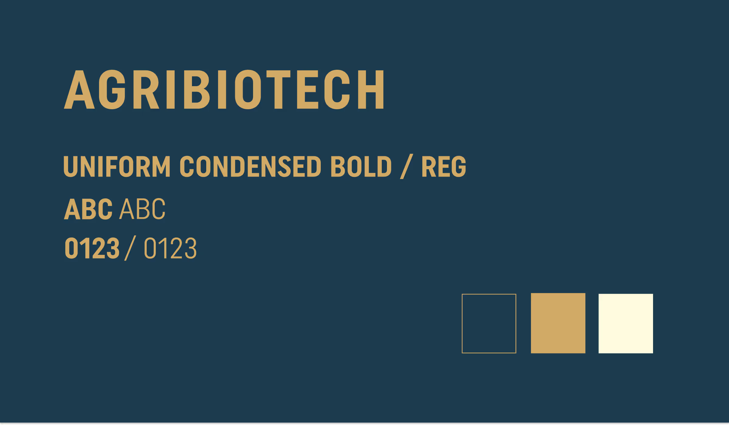
The graphics are - Bold, punchy, and cleverly minimalist. We created label designs that not only respected budget limits (every paisa mattered) but packed a visual punch on cluttered shelves.

01

Brand Identity

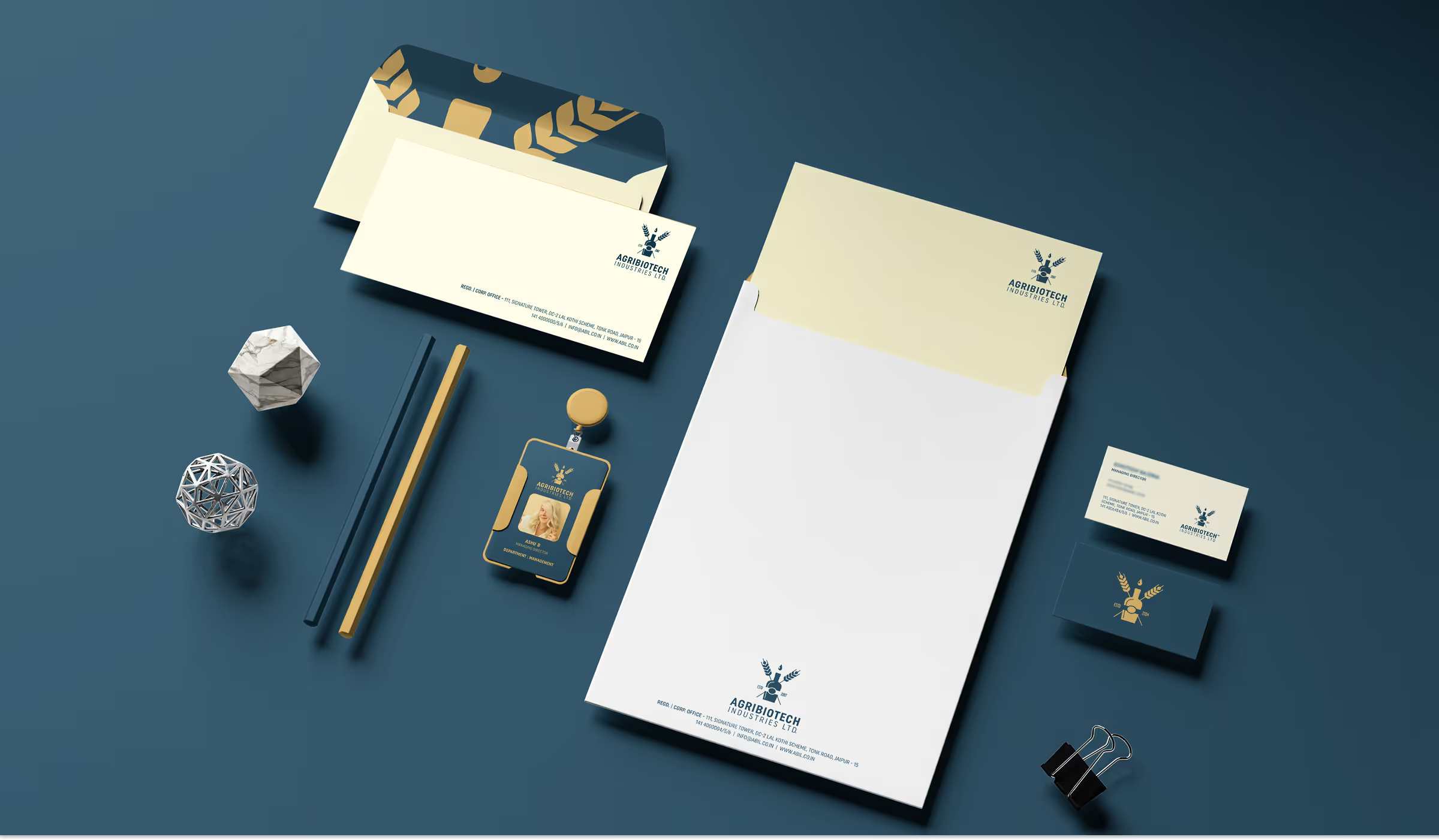
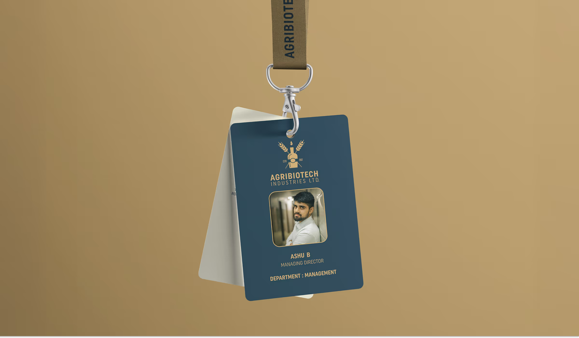
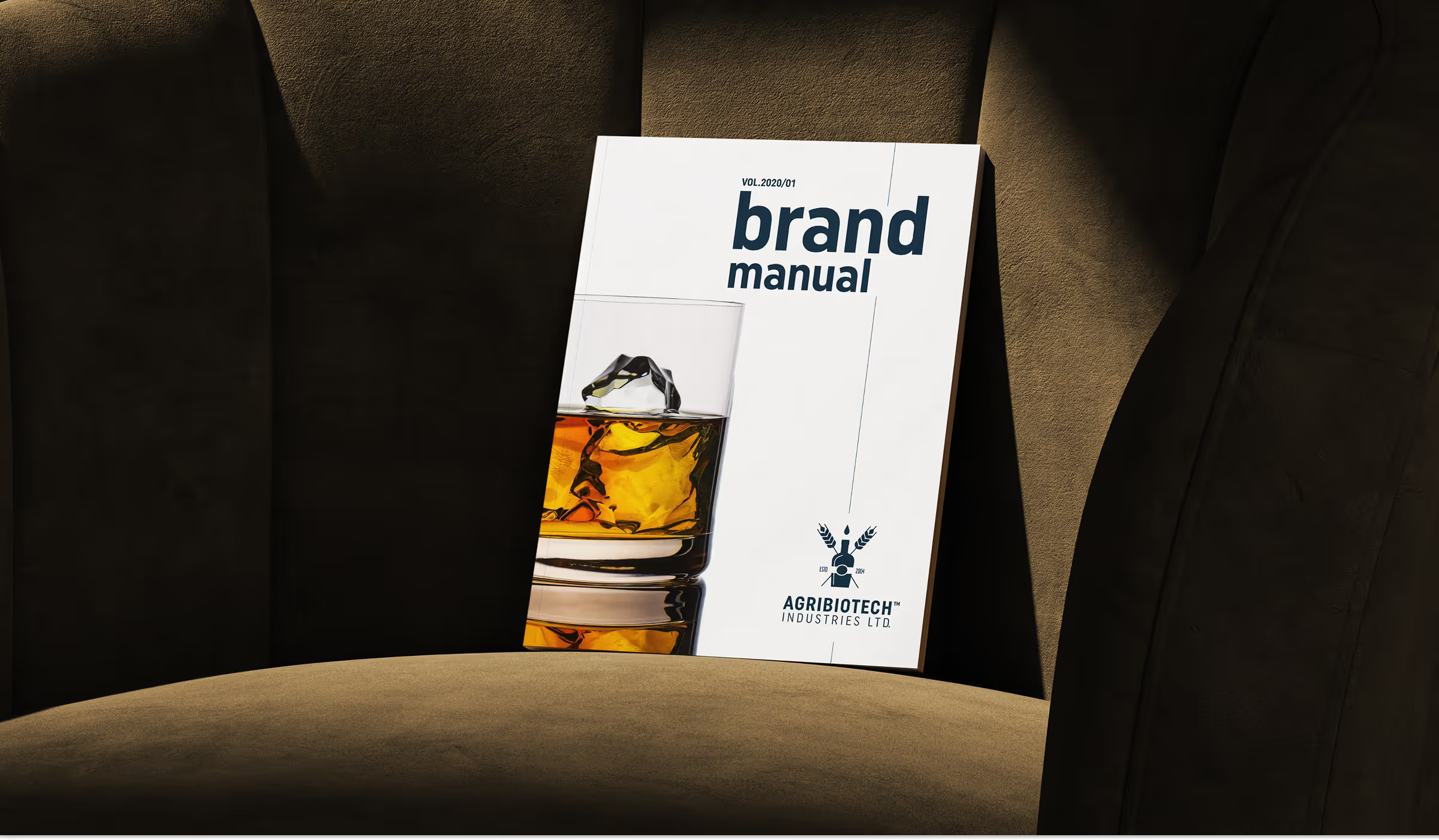
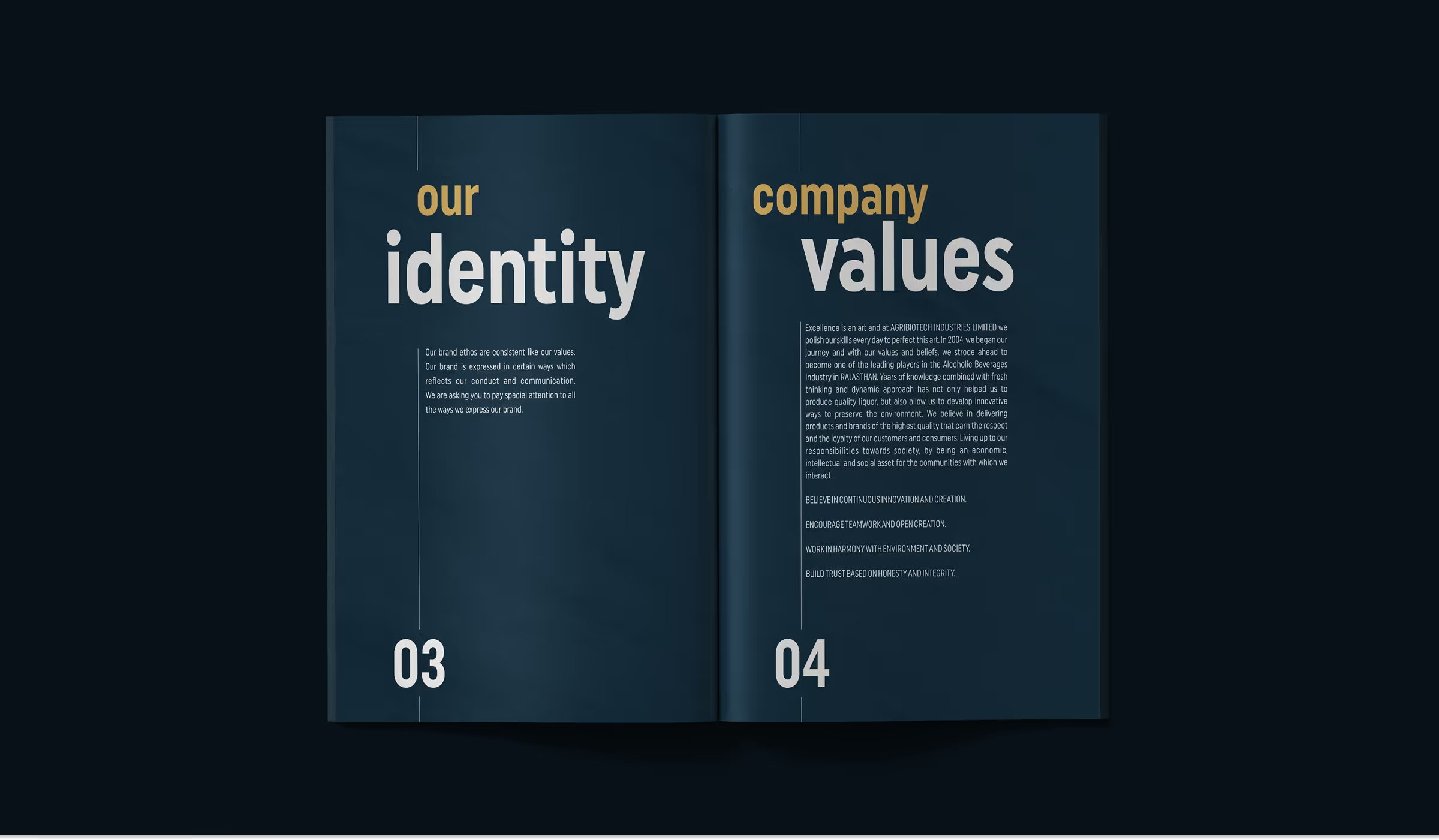
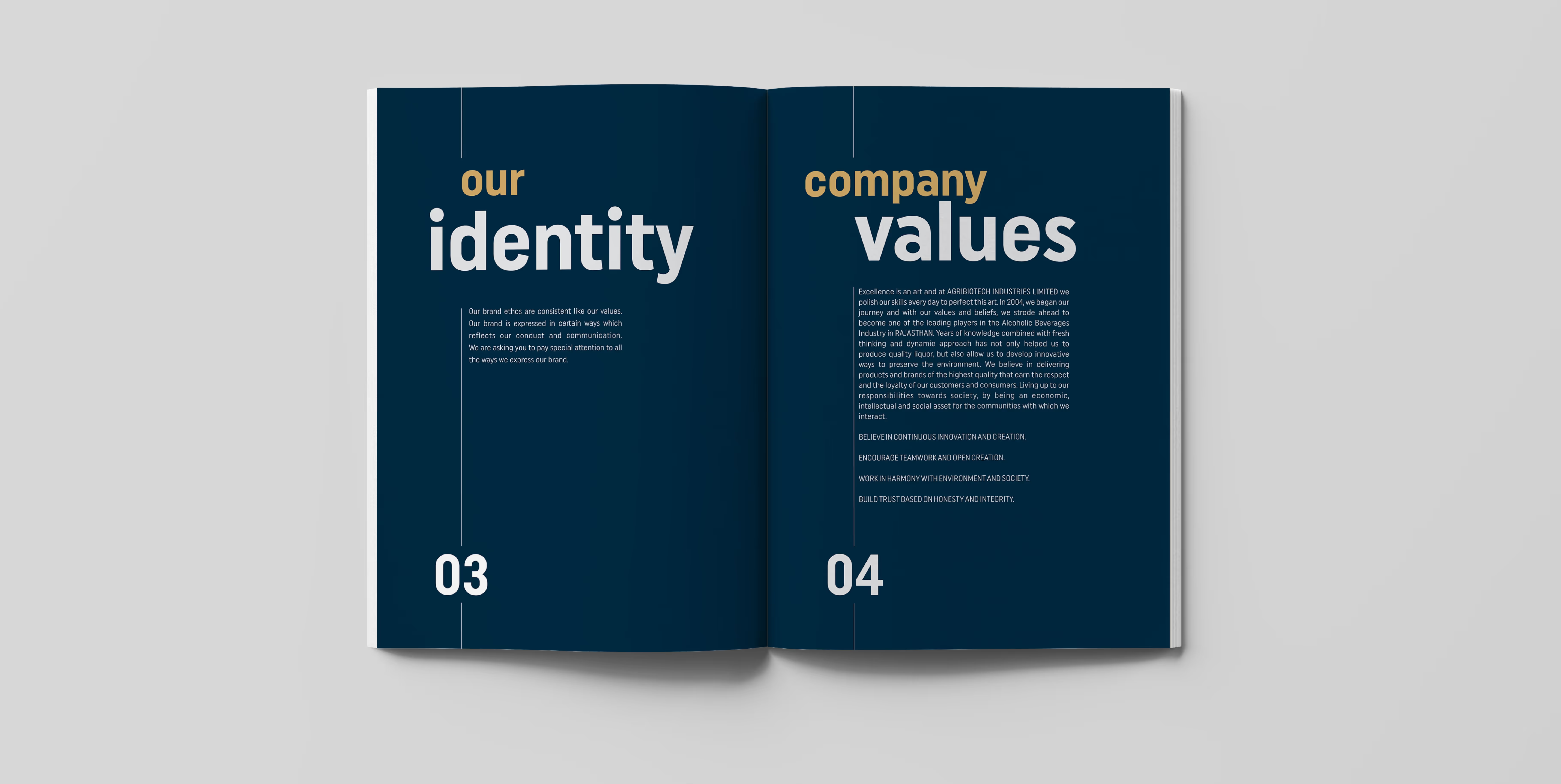
ABIL needed its regional liquor portfolio to move beyond familiar category conventions. We developed a more confident identity and packaging direction that improves recognition while remaining credible for its established market.

02

Brand Experience

The narrative reframes regionally made liquor as a considered, well-made product rather than a low-value alternative. Names, descriptors and product stories were simplified so retailers and customers could understand the range quickly.

03

Market Strategy

Retail visits and competitor studies revealed how buyers navigate crowded shelves. Those findings informed colour, hierarchy, label contrast and promotional ideas designed to improve visibility at the moment of purchase.

Vimeo embed 1
Vimeo embed 2
Vimeo embed 3
04

Visual System

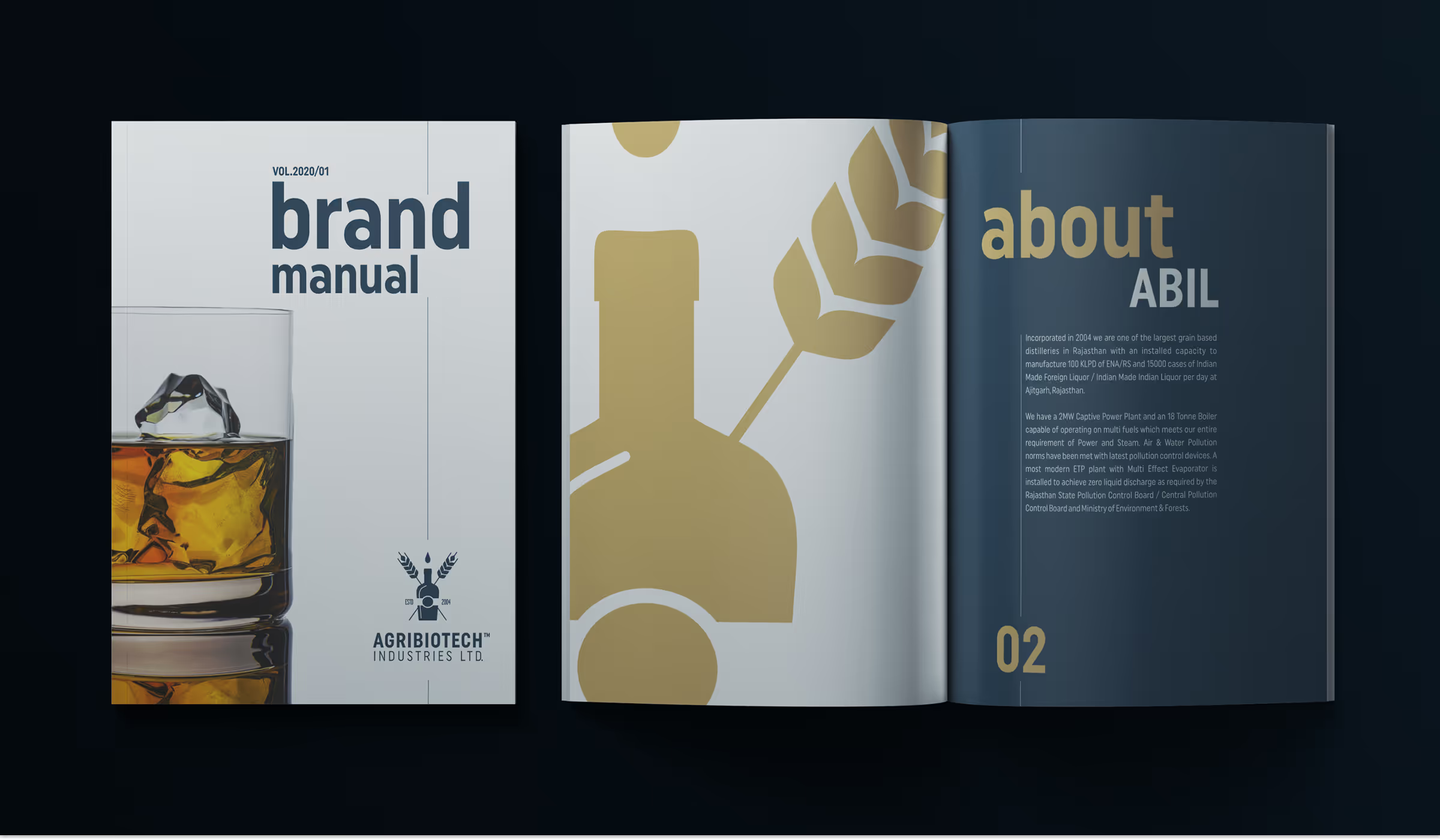
Bold typography, controlled colour families and simpler compositions create distinction across the portfolio. Each product has its own identity while still belonging to a recognisable ABIL system.

05

Digital Presence

Digital sales material was structured to present the renewed portfolio clearly to distributors and partners. Product information, packaging views and brand rationale can now be shared consistently during commercial conversations.

06

Campaign Collateral

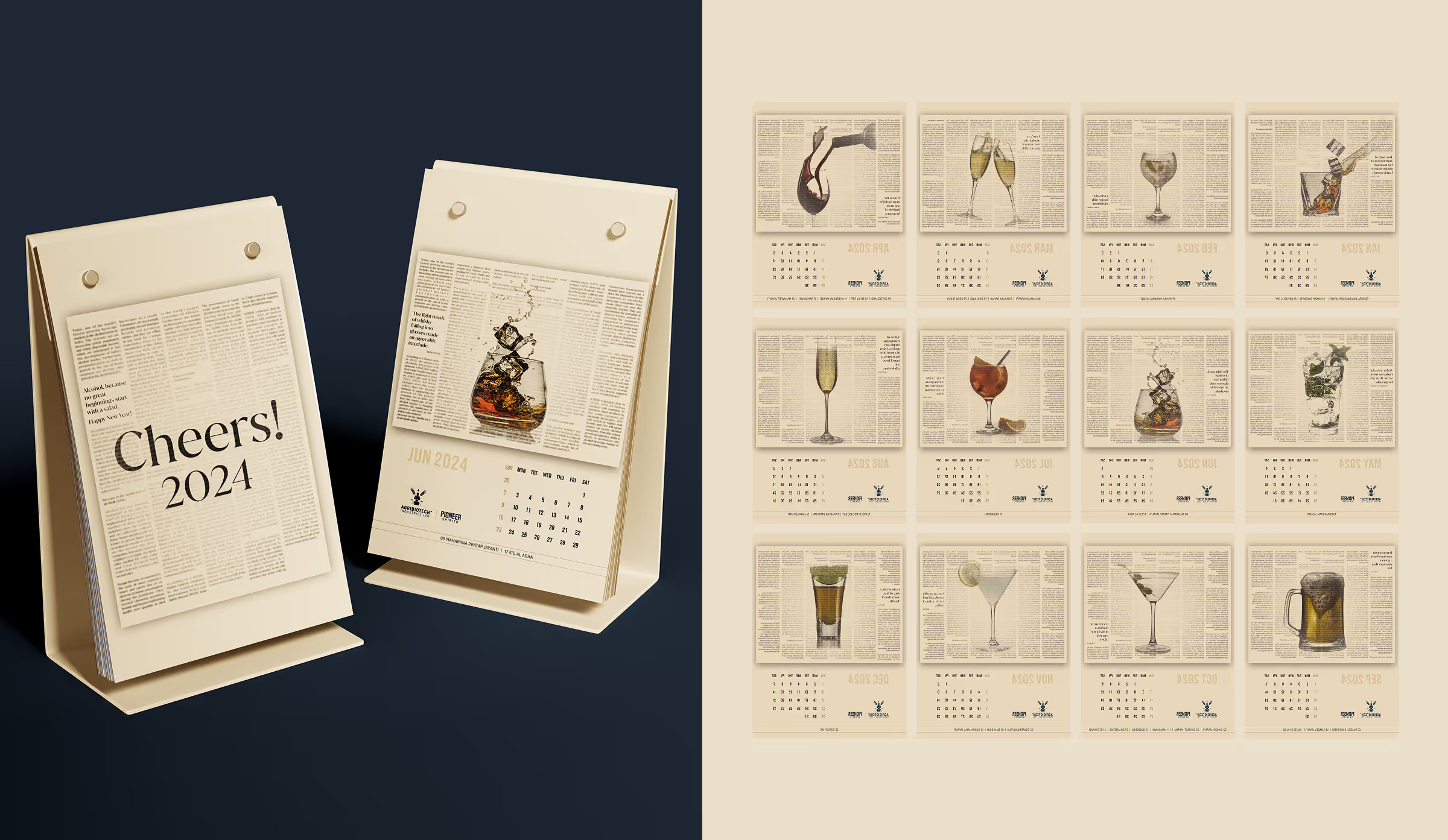
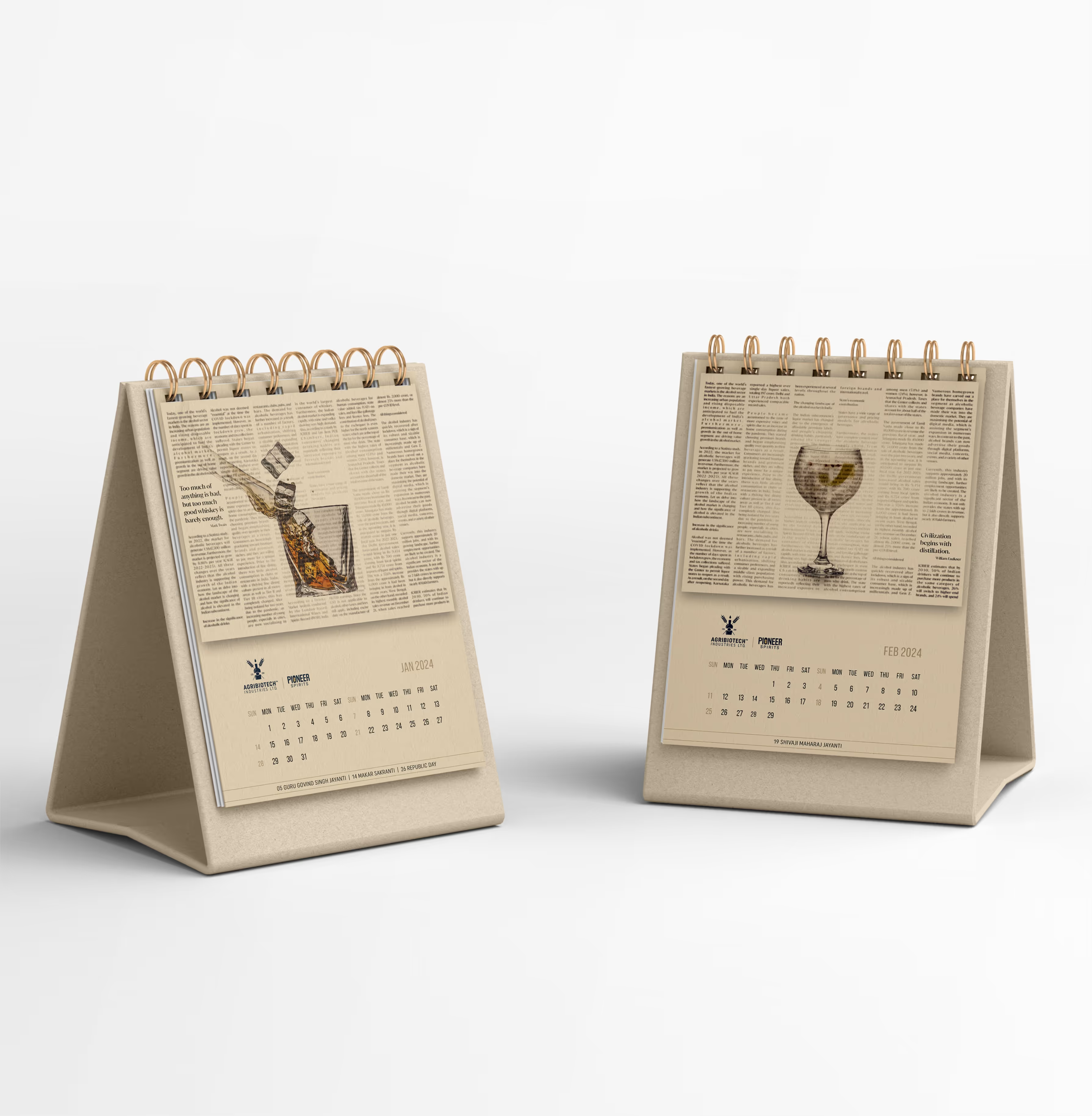
Labels, cartons and supporting promotional pieces were designed around real production and retail constraints. The work balances shelf impact with cost, material availability and the realities of manual bottling.

07

Environmental Applications

Shelf presence guided every decision. Strong front-facing identifiers, clearer variants and practical promotional assets help the products remain visible in dense retail environments without relying on unnecessary decoration.

08

Foundational Brand System

A production-ready framework defines label zones, typography, colour coding and application rules. It gives ABIL a consistent base for extending the range while reducing errors during printing and bottling.