COMPANY CASE STUDYJaipur and Mumbai, India

Deeta Thakural

From Name Change to Brand Elevation: The Signature Reinvention of a Jewelry Icon

NewIdentity
IconicBrand
DesignExpo
ClientDeeta Thakural
SectorRetail & Lifestyle
ServicesFull-Funnel Marketing, Brand Activation, Growth Solutions
Sawai luxury real estate architecture in Jaipur
Deeta Thakural case study image 2

From Name Change to Brand Elevation: The Signature Reinvention of a Jewelry Icon

The Mandate

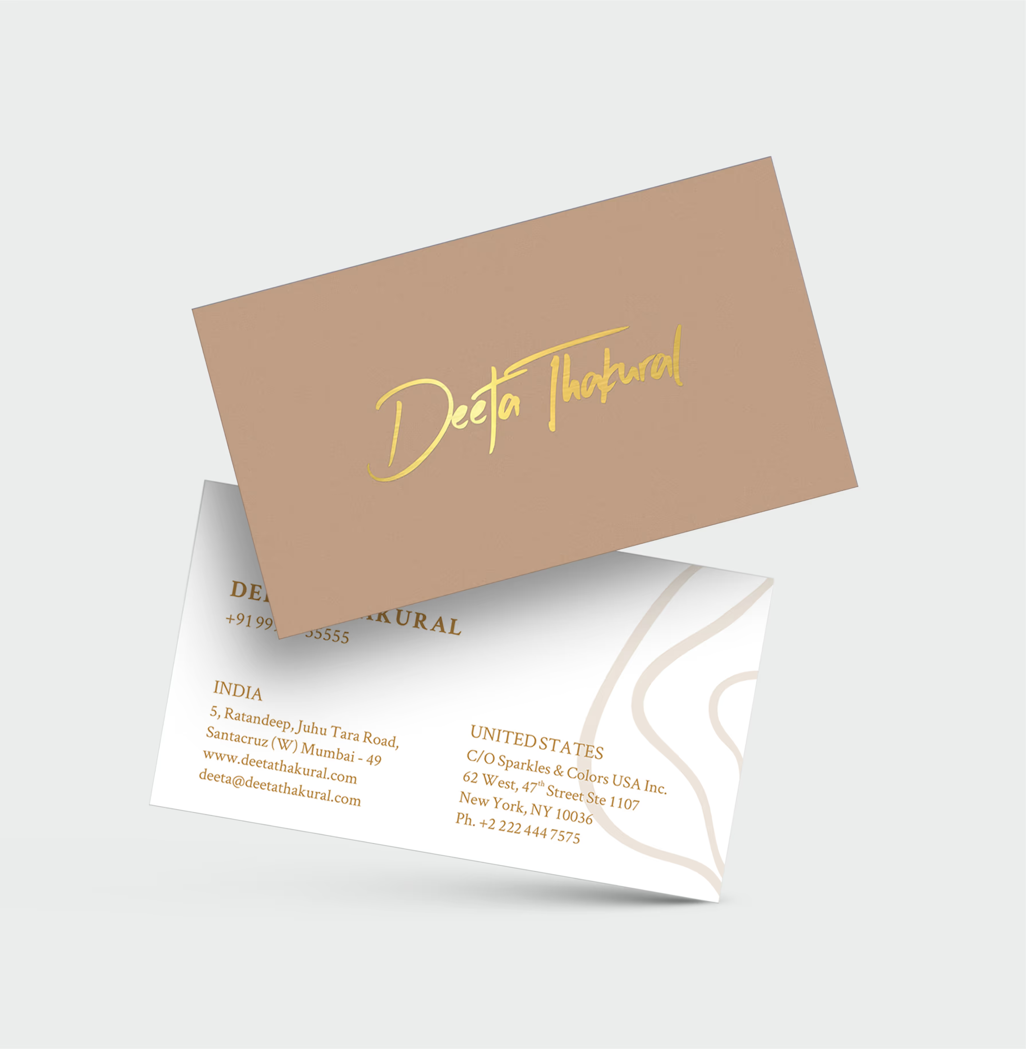
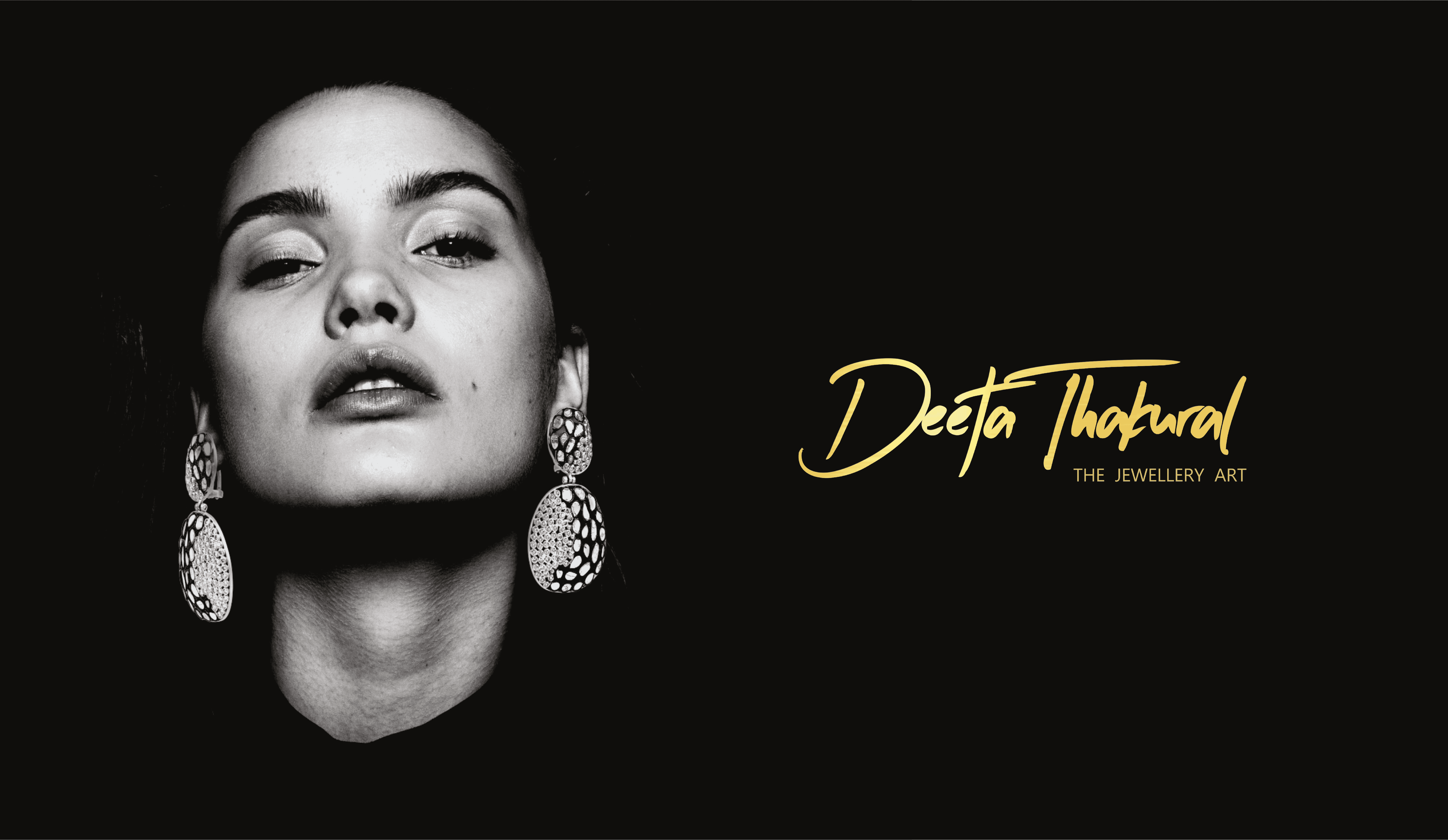
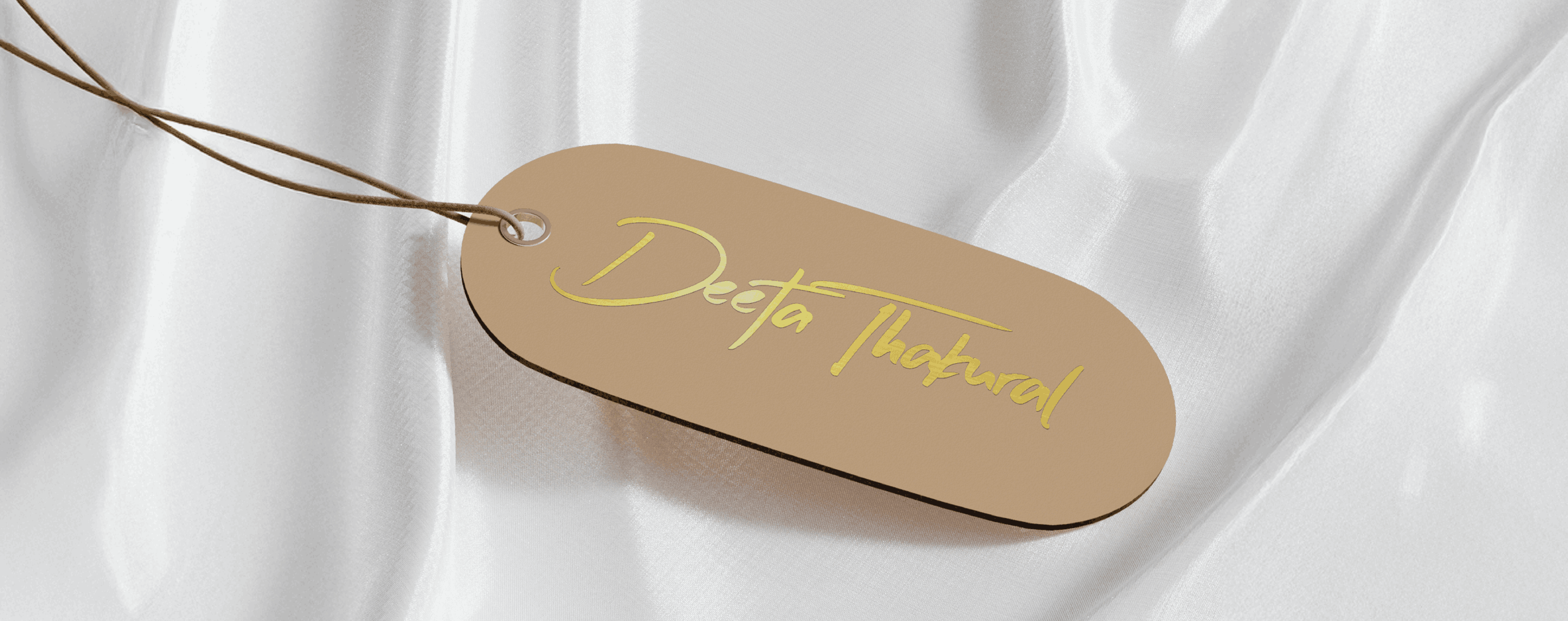
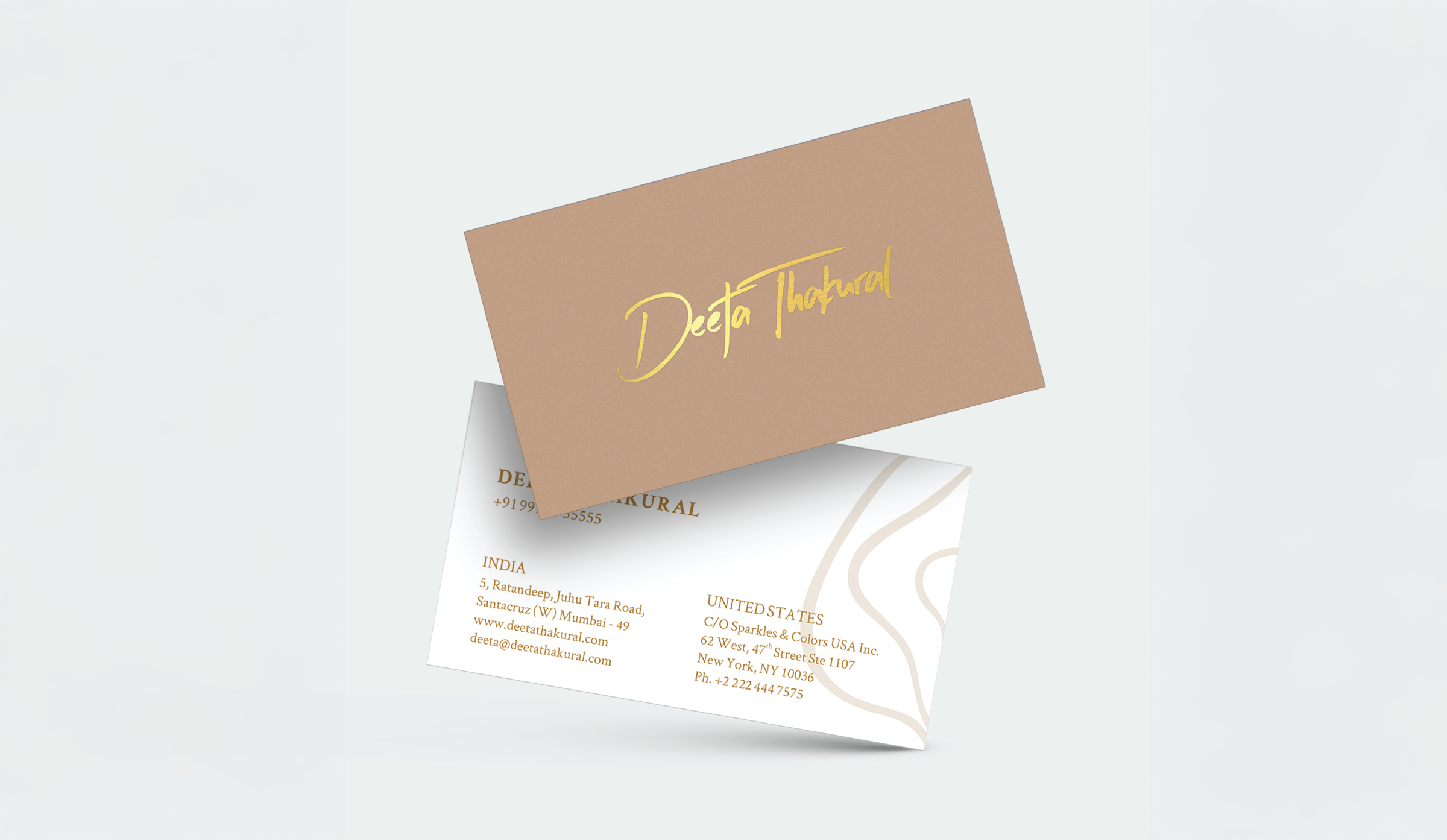
When Deeta approached us post-name change, we knew we weren’t just designing a logo. We were stitching together identity and legacy. We created a signature-style brand mark that felt deeply personal and instantly recognizable. It honored her design ethos while gently guiding her audience through the shift from Khushboo to Deeta.
What We Delivered

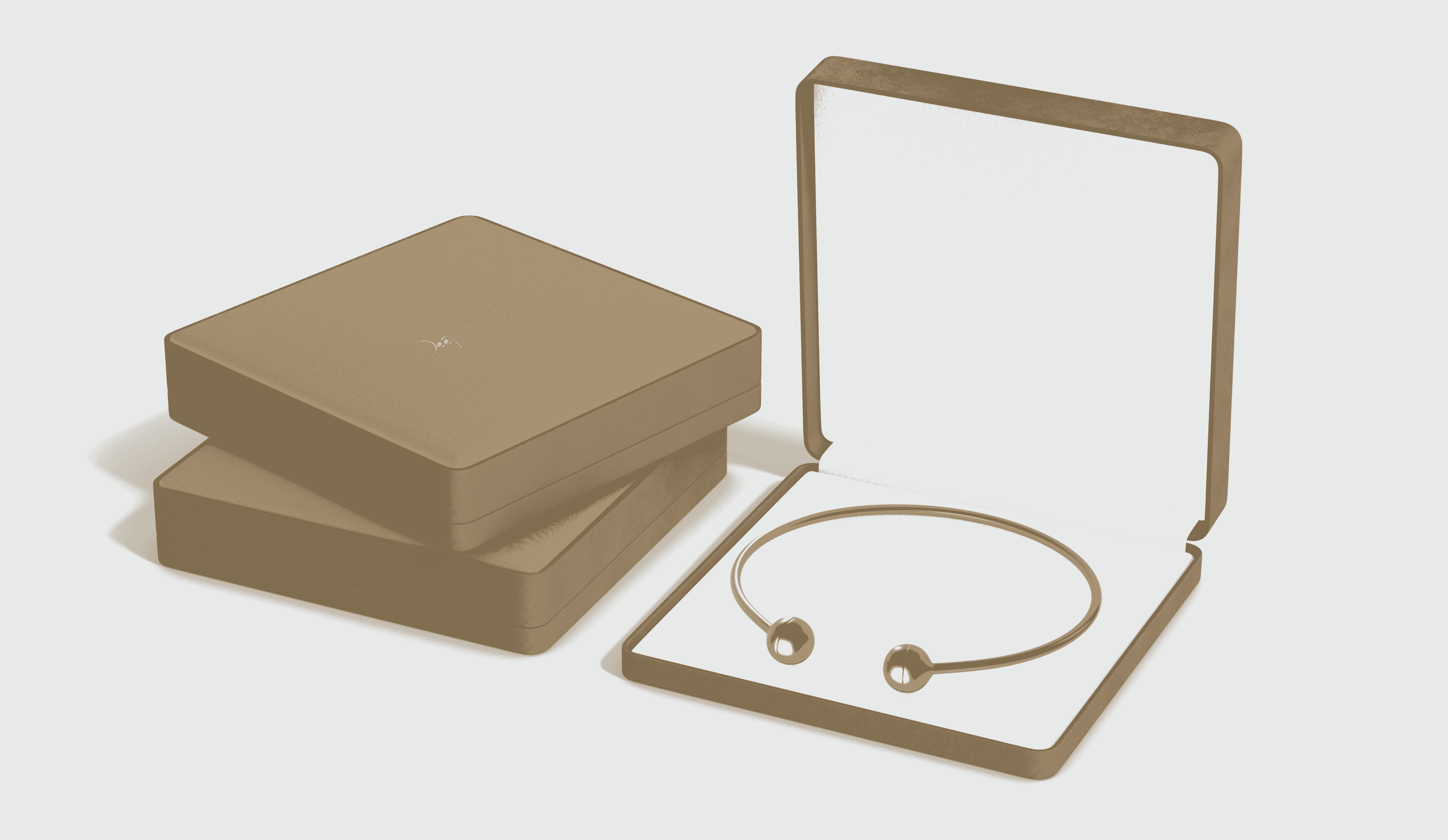
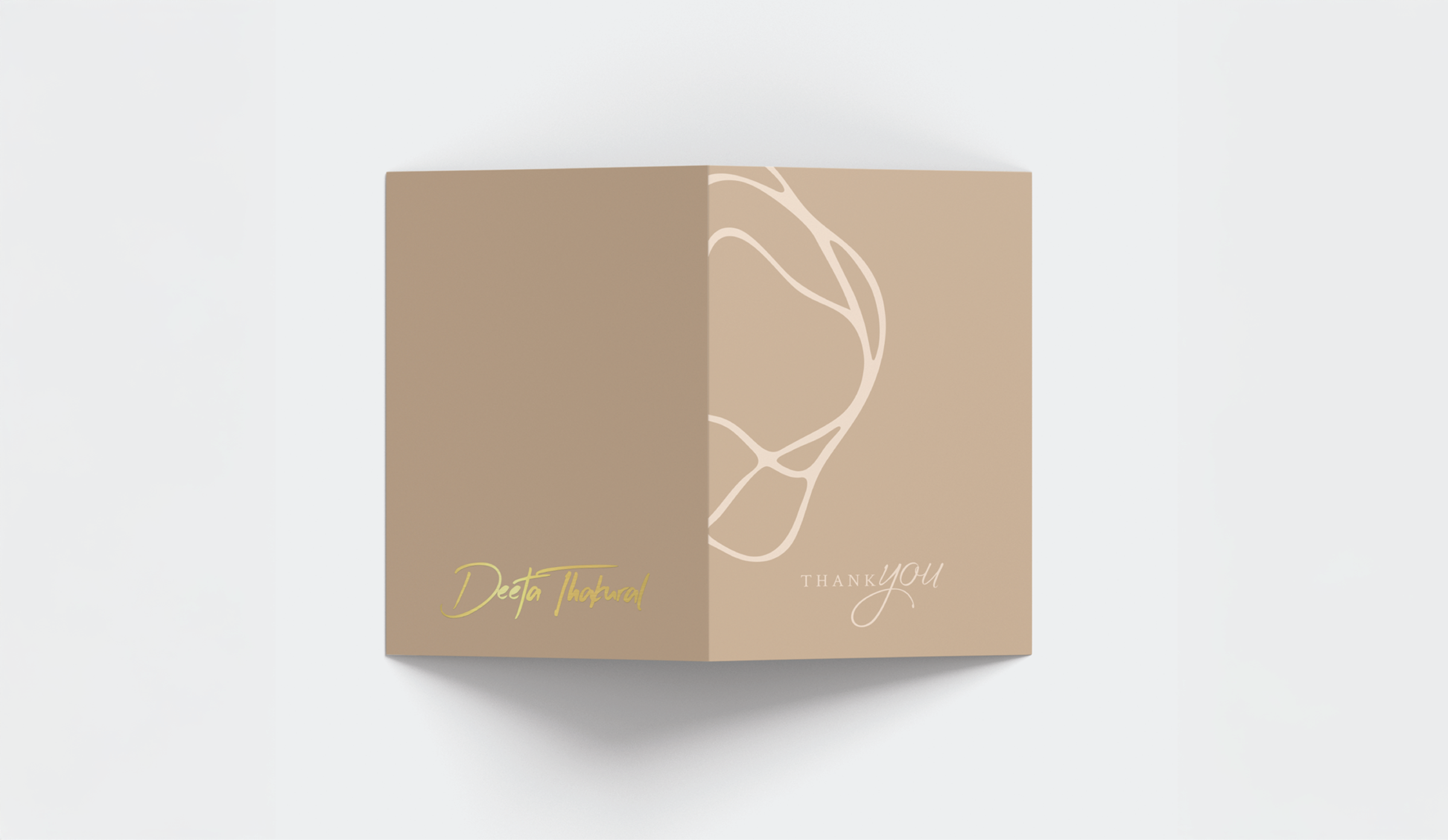
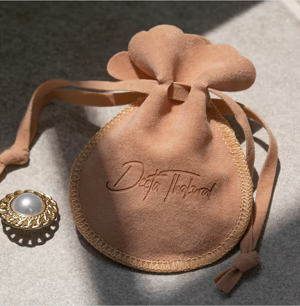
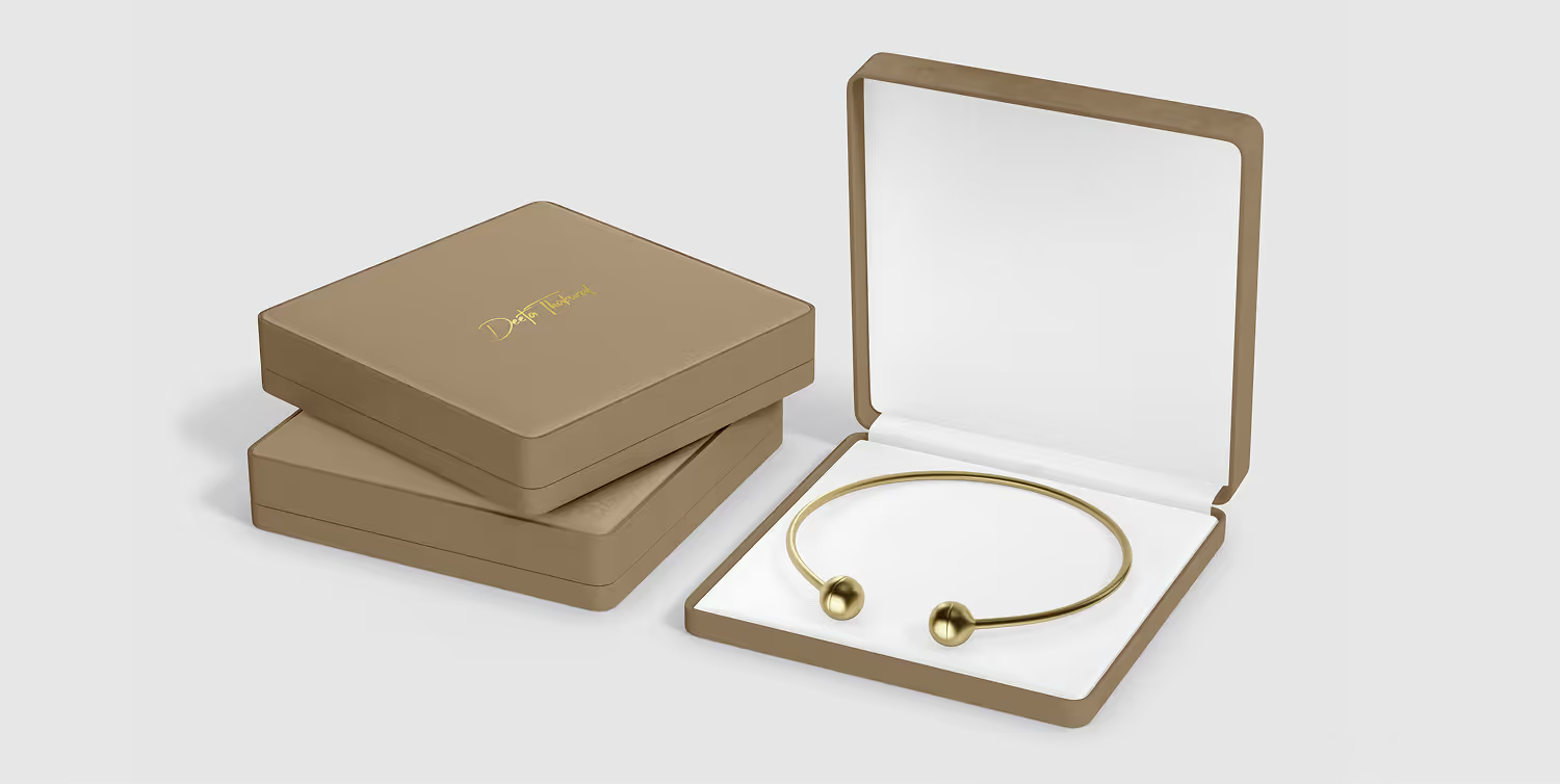
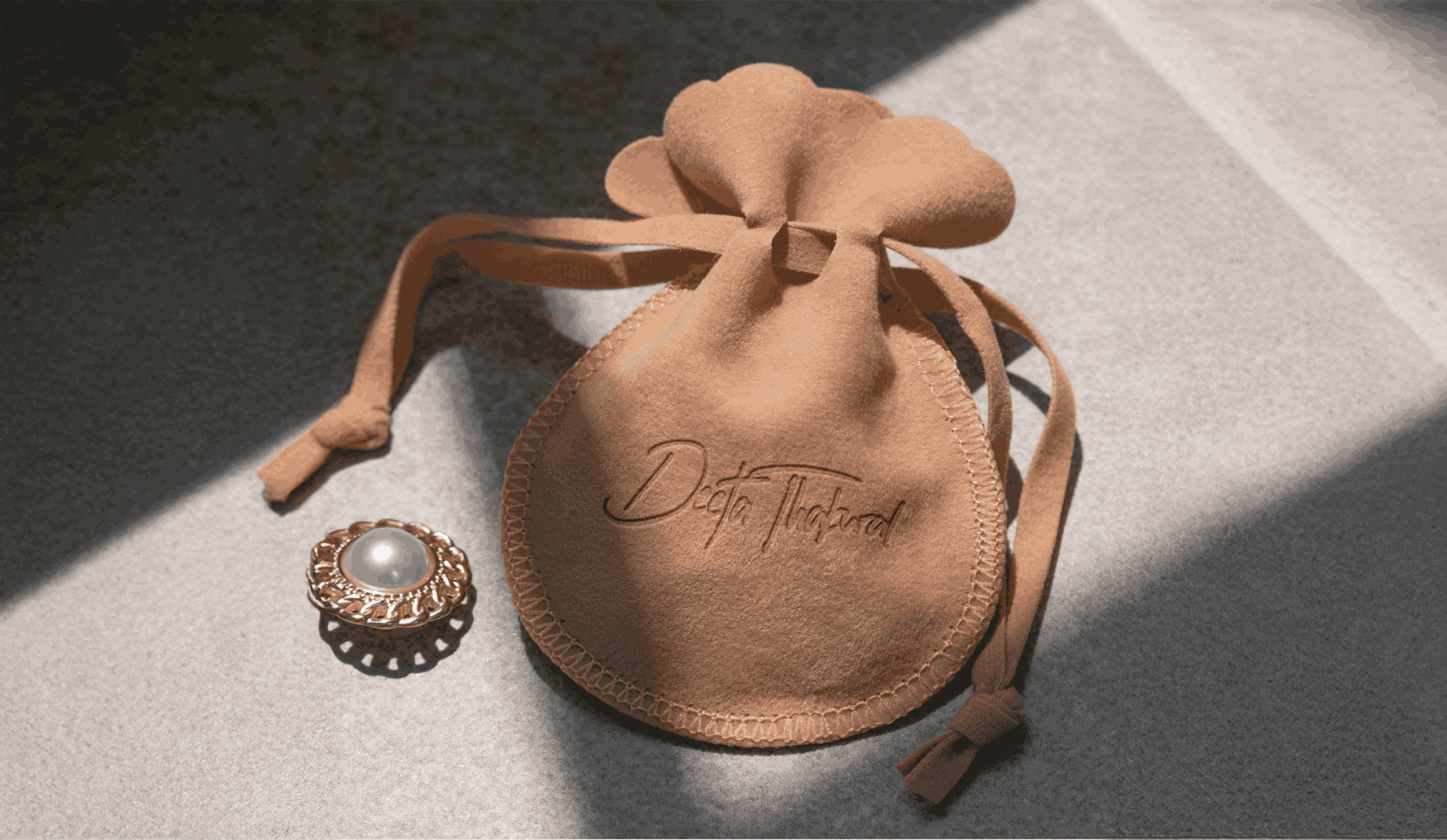
Our design choices leaned into quiet luxury. We used rose-gold foiling, muted pinks, and sleek textures - mirroring her handcrafted pieces. From jewelry boxes to show booths, every touchpoint became a tactile extension of her artistry. It wasn’t about flash; it was about elegance speaking in hushed, confident tones.

01

Brand Identity

The move from Khushboo Lakhi to Deeta required continuity, not reinvention for its own sake. We created a signature-led identity that feels personal, refined and immediately connected to the designer behind the work.

02

Brand Experience

The brand story introduces Deeta as the next chapter of an established design legacy. Messaging was written to reassure existing clients while expressing a clearer, more contemporary point of view for new audiences.

03

Market Strategy

Communication focused on preserving recognition during the name transition. Repeated visual and verbal cues connected the former identity to Deeta, reducing confusion and helping loyal clients adopt the new name naturally.

Vimeo embed 1
Vimeo embed 2
Vimeo embed 3
04

Visual System

Muted blush tones, rose-gold accents and generous white space reflect the quiet luxury of the jewellery. The system lets the pieces remain central while giving every application a consistent, unmistakably personal character.

05

Digital Presence

Digital touchpoints were reorganised around the new name and signature identity. Product storytelling, brand introductions and launch communication work together to make the transition clear without losing the equity built over a decade.

06

Campaign Collateral

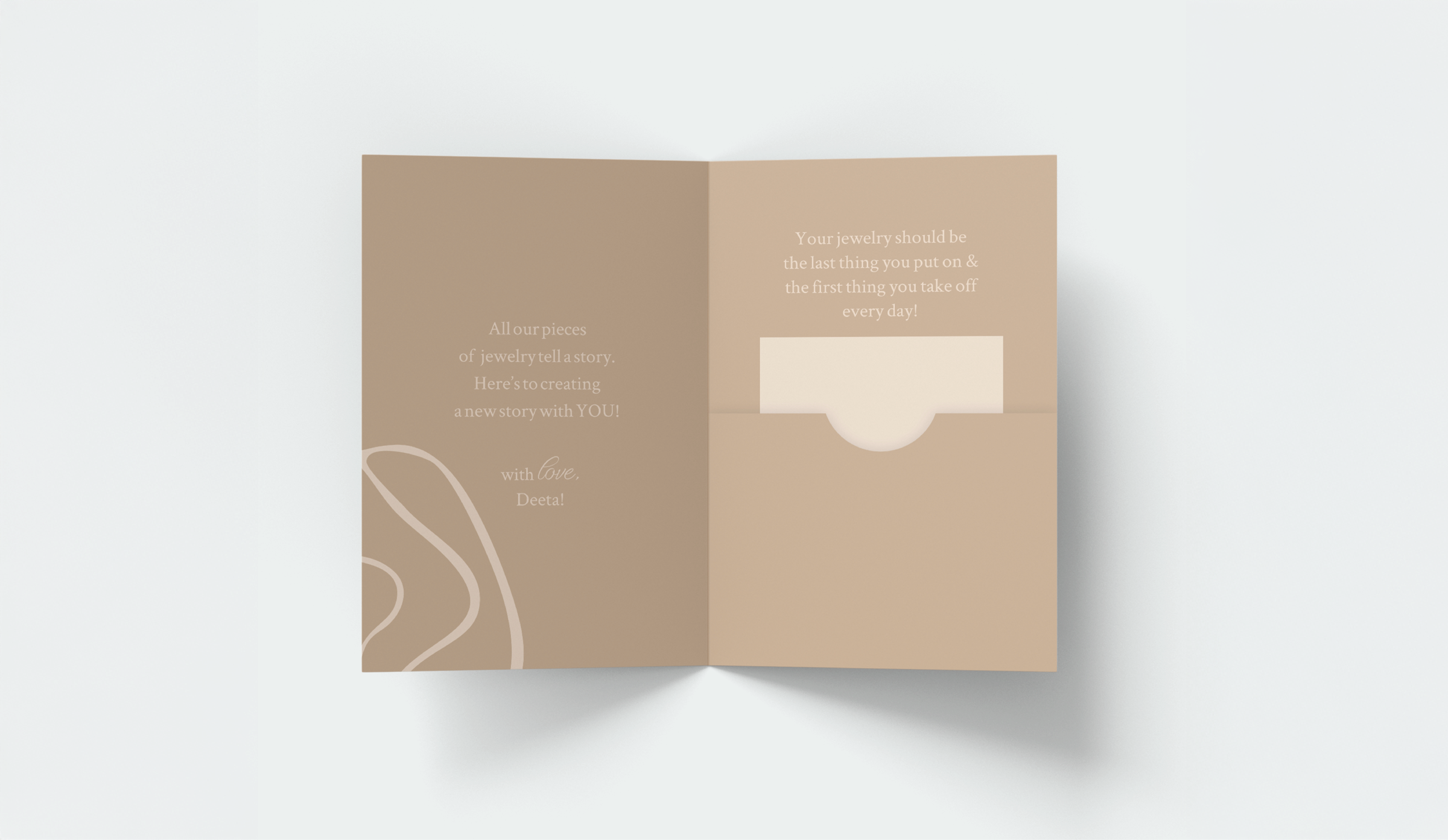
Stationery, jewellery cards, bags and packaging were designed as tactile extensions of the collection. Material choices and restrained finishes create a premium experience that feels intimate rather than ornamental.

07

Environmental Applications

Exhibition booths and display environments use the same palette, signature mark and editorial rhythm. The identity remains recognisable at distance while allowing the jewellery to command attention up close.

08

Foundational Brand System

The foundational system defines logo use, typography, colour, photography and packaging principles. It protects continuity across future collections while giving the brand enough flexibility to evolve with the designer.