COMPANY CASE STUDYJaipur, Rajasthan

Jaipur Printers

Redefining 75 Years of Legacy and Excellence with a Bold New Vision

350+Participants
400Artworks
15Days
ClientJaipur Printers
SectorManufacturing
ServicesFull-Funnel Marketing, Brand Activation, Growth Solutions
Sawai luxury real estate architecture in Jaipur
Jaipur Printers case study image 2

Redefining 75 Years of Legacy and Excellence with a Bold New Vision

The Mandate

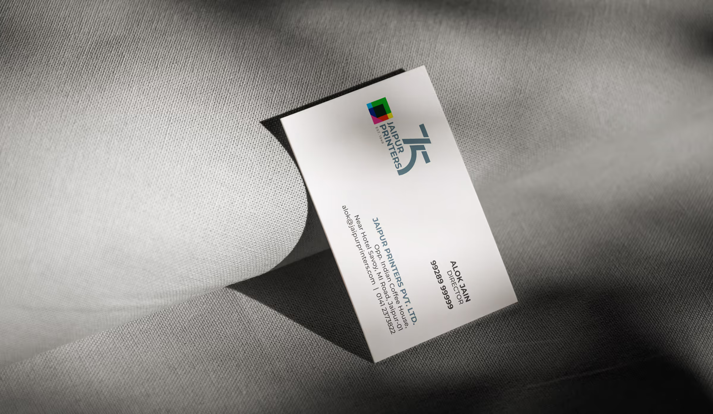
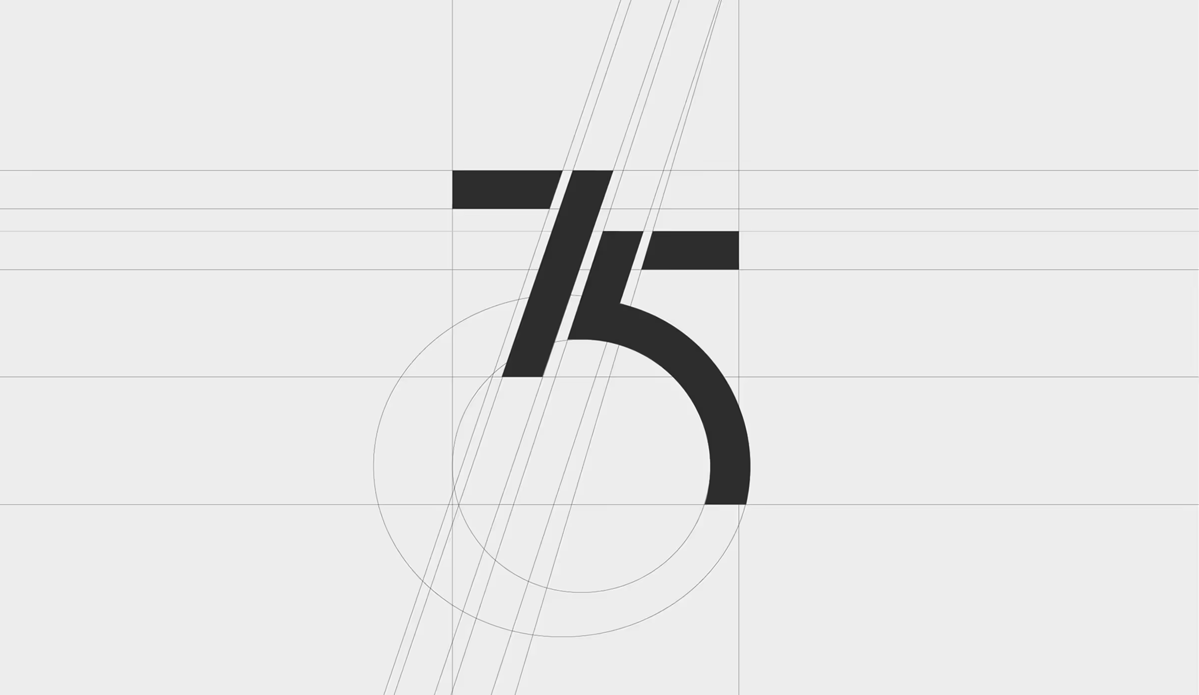
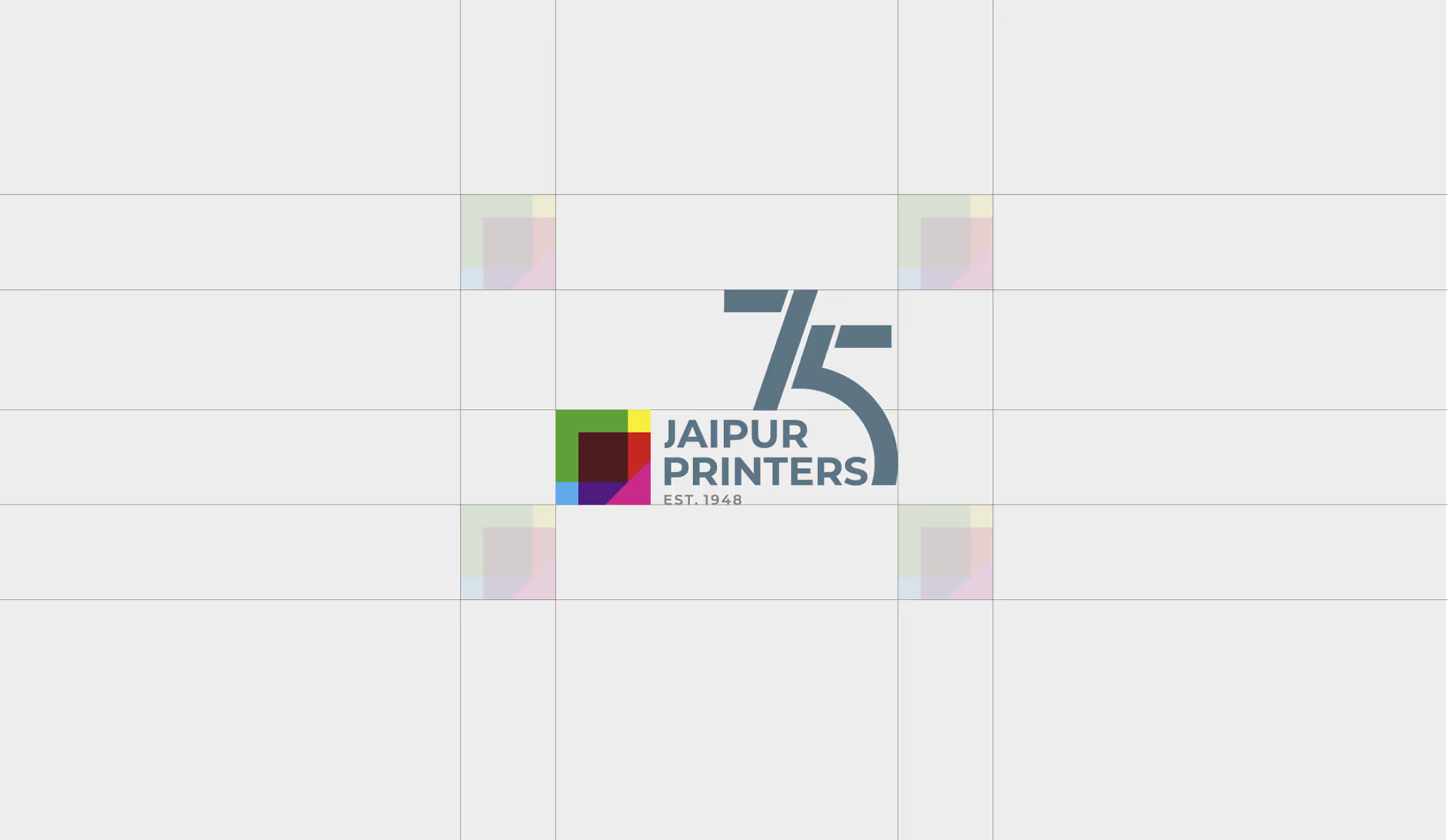
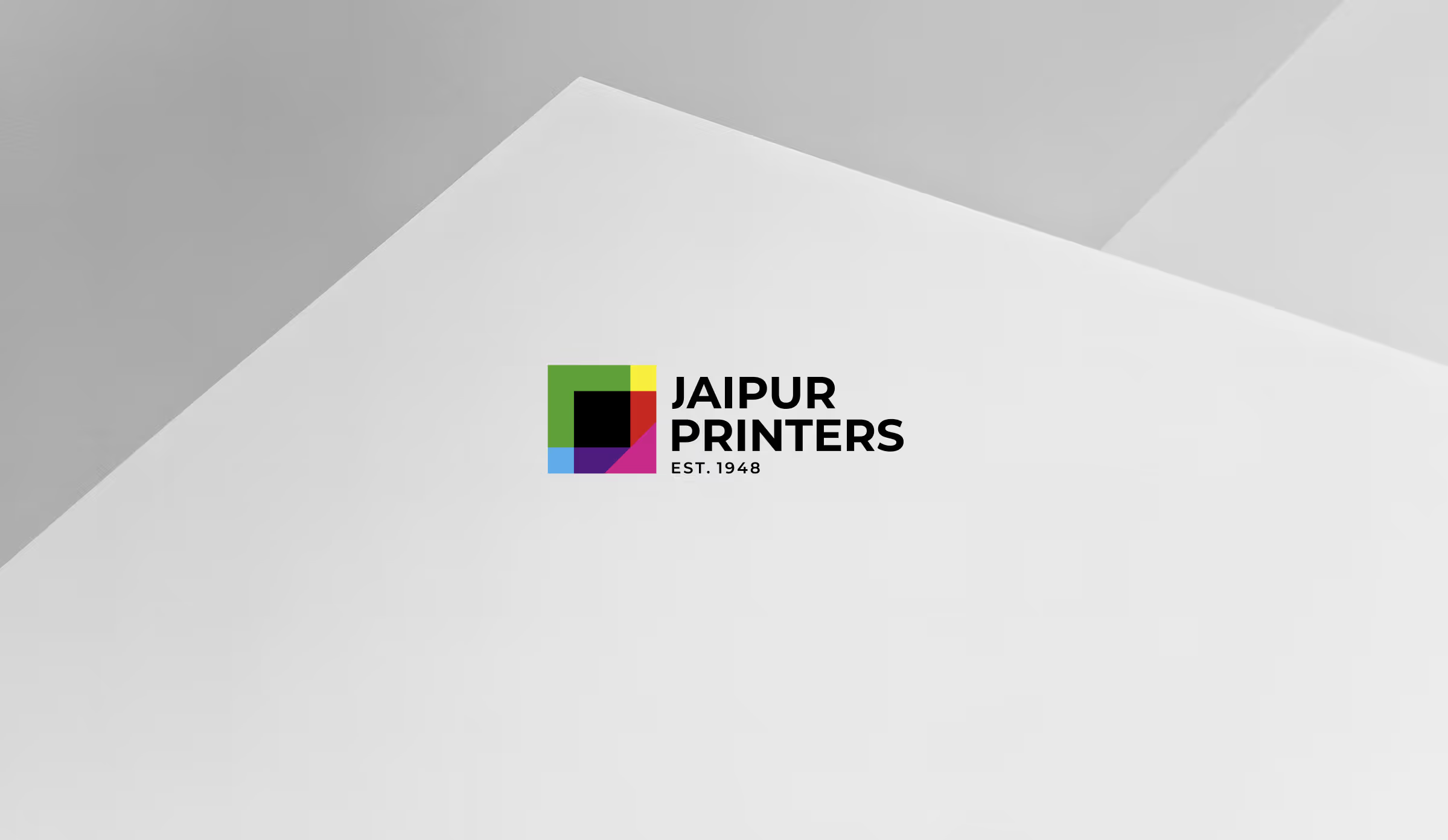
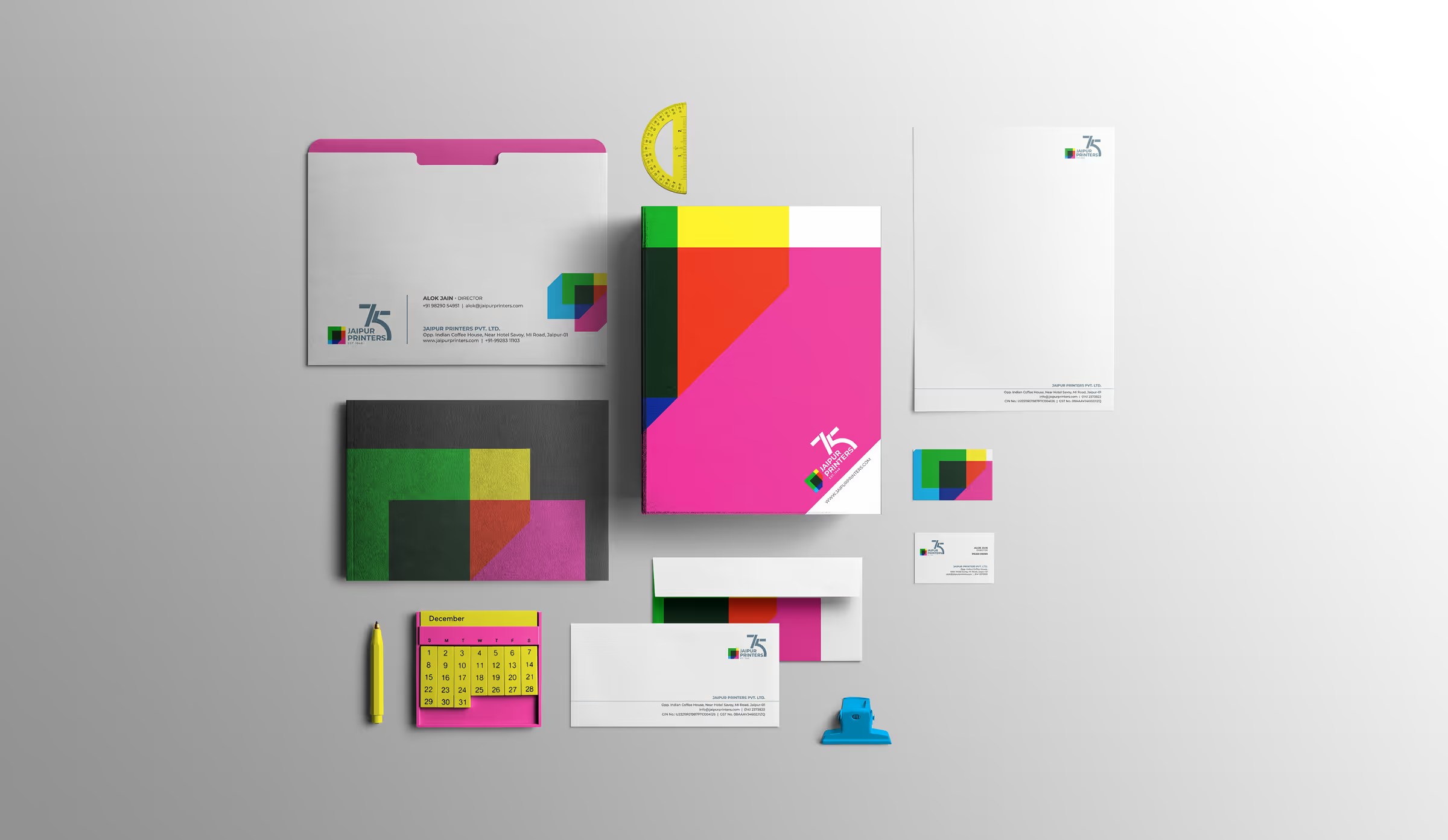
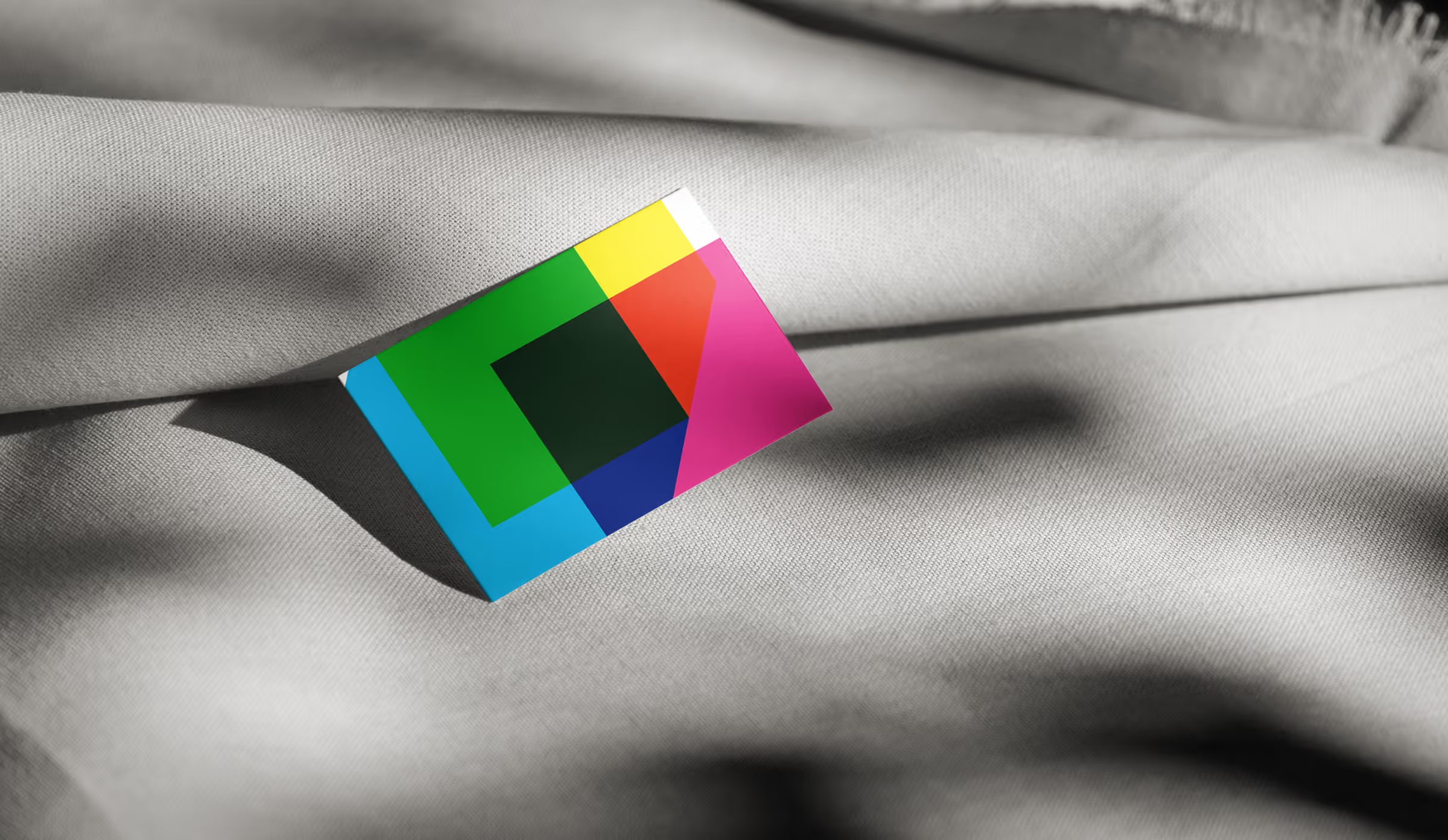
We approached Jaipur Printers’ rebranding as a bridge between legacy and innovation. The CMYK-inspired logo and "Infinite Print Possibilities" tagline honored their heritage while positioning them for the future. This bold identity shift helped them embrace modern branding without compromising their long-standing reputation for craftsmanship and print excellence.
What We Delivered

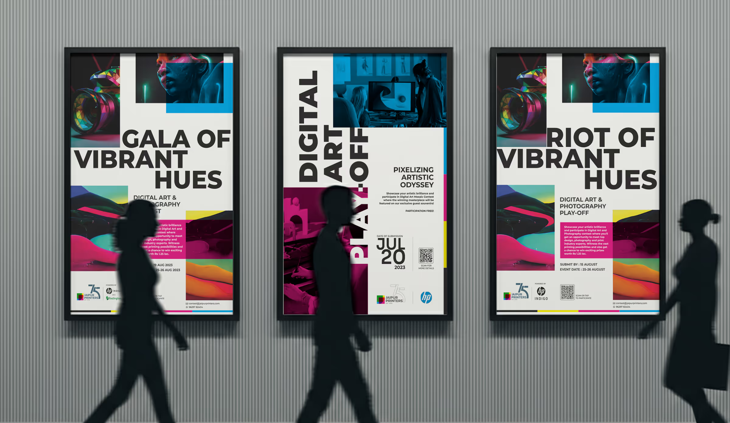
Our event strategy transformed a technical product launch into an immersive experience. The “Vibrant Hues” competition engaged designers and students, while the factory walkthrough showcased their legacy alongside new technology. This experiential approach built emotional connection, making the event memorable and positioning Jaipur Printers as a forward-thinking leader in the printing industry.

01

Brand Identity

Jaipur Printers’ seventy-five-year legacy needed an identity that respected its history while signalling new capability. We created a bold CMYK-inspired mark and a clearer visual system built around precision, colour and possibility.

02

Brand Experience

The story connects decades of craft with the arrival of the HP Indigo 20K. Messaging positions the company as an experienced printer that continues to invest in technology, experimentation and new forms of production.

03

Market Strategy

The launch was designed to attract clients, industry professionals and emerging creatives. A focused registration journey and the Vibrant Hues competition turned a technical equipment launch into an event with broader relevance.

Vimeo embed 1
Vimeo embed 2
Vimeo embed 3
04

Visual System

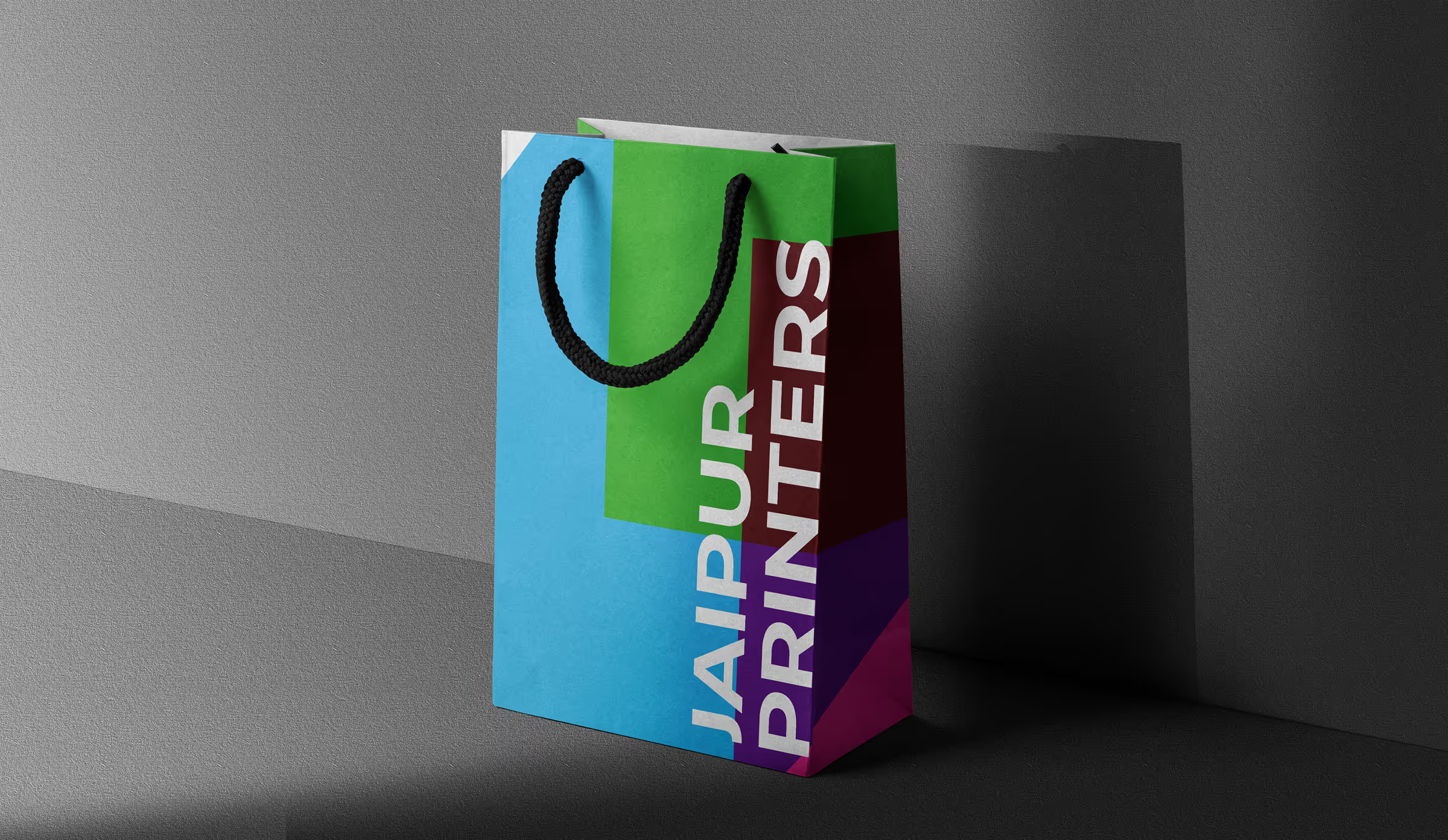
A vivid CMYK palette, strong black typography and modular layouts express the energy of print without becoming visually noisy. The system scales from small stationery to large event graphics.

05

Digital Presence

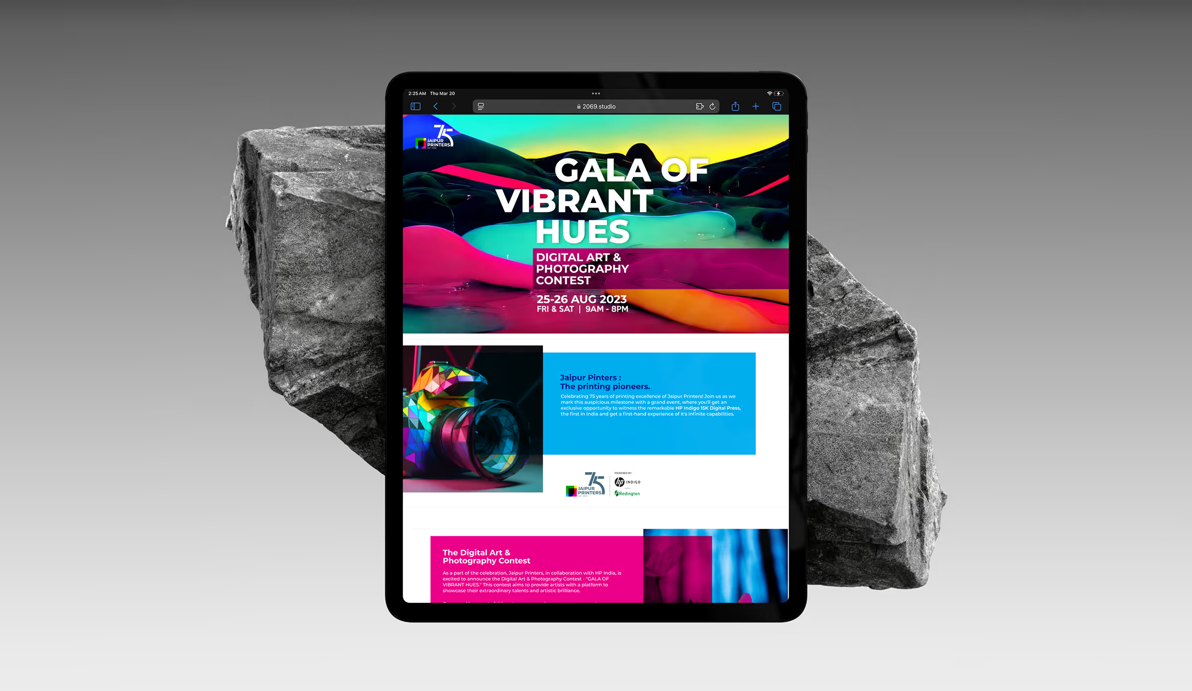
A dedicated landing experience handled registrations, competition entries and event information. It reduced friction for participants while giving the launch a clear digital home that could be shared across campaigns.

06

Campaign Collateral

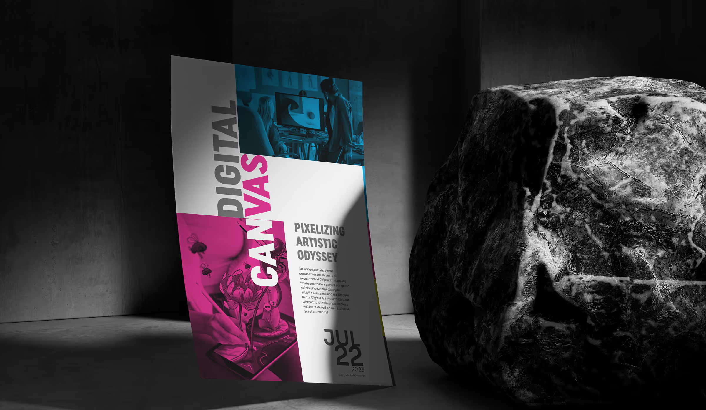
Invitations, competition material, certificates and event collateral demonstrated the quality of the new press through the work itself. Every printed piece became evidence of the expanded production capability.

07

Environmental Applications

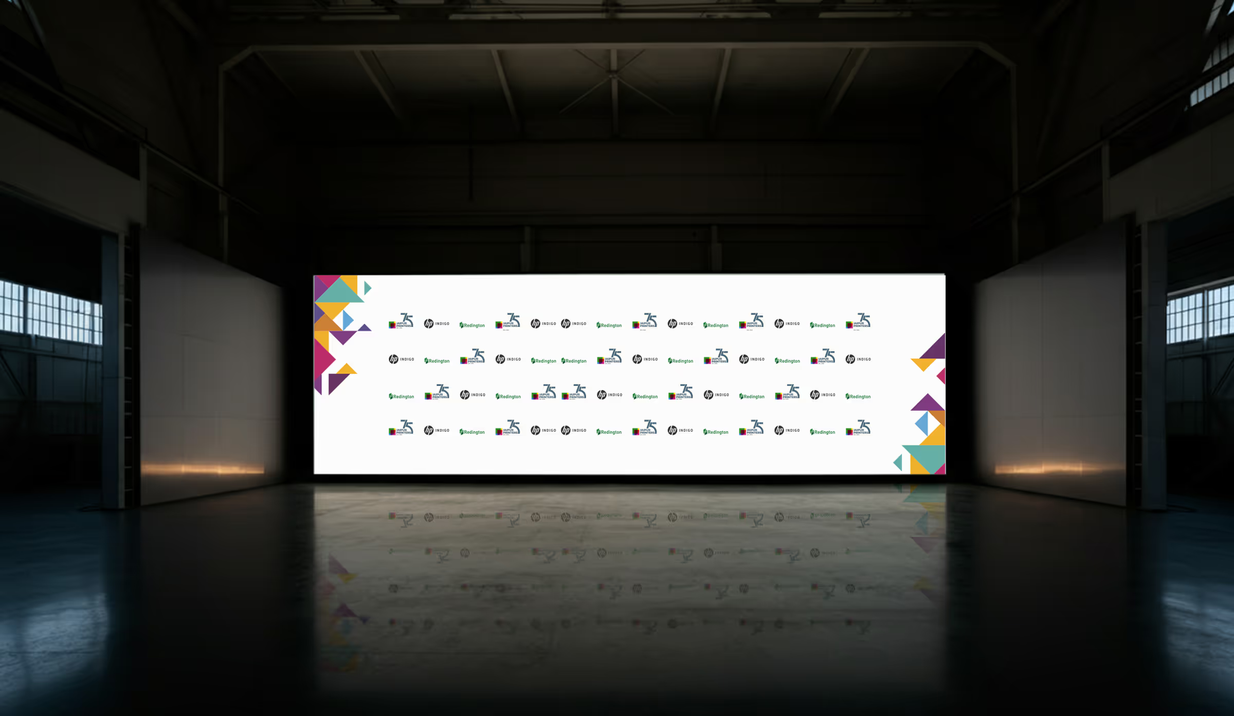
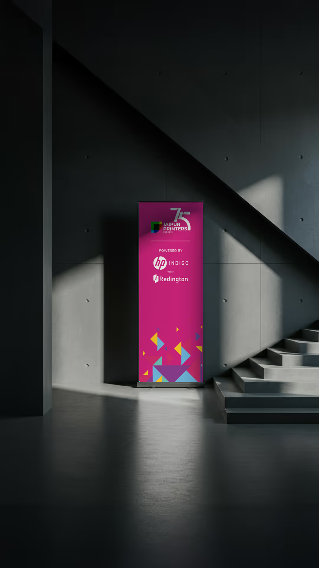
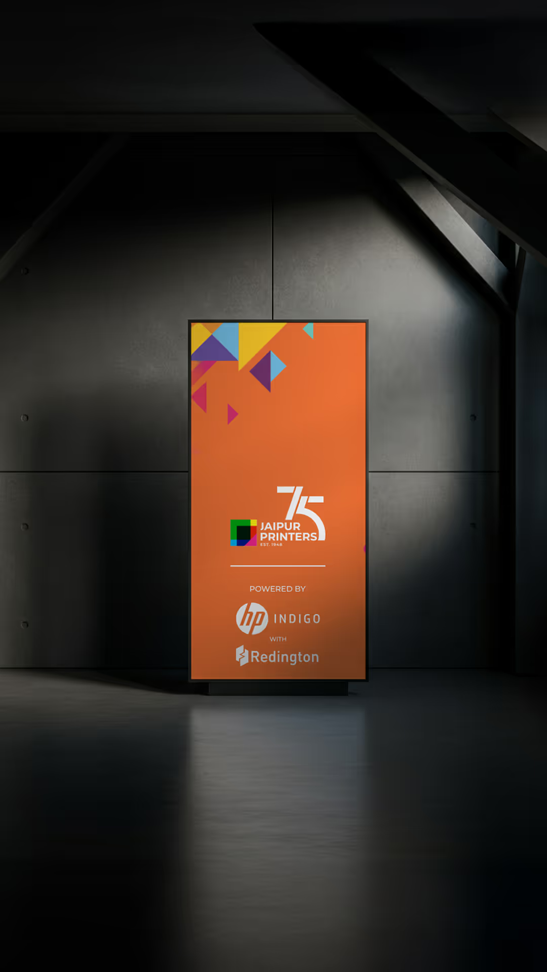
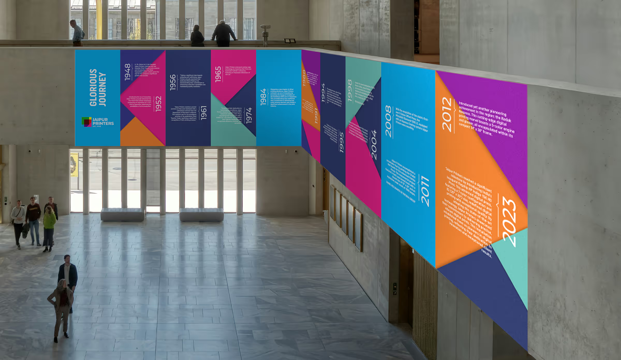
The factory was transformed into an immersive event environment using wayfinding, exhibition graphics and large-format brand applications. Visitors could move through the company’s history and see the new technology in operation.

08

Foundational Brand System

The final system brings logo, colour, typography, imagery and the Infinite Print Possibilities message into one usable framework. It supports everyday communication as well as future launches and milestone events.