Transforming liquor branding and packaging to elevate ABIL’s market position.
ABIL asked us to renew a regional liquor portfolio that had to compete on crowded shelves while remaining practical to manufacture. The project combined market research, brand positioning, packaging design and production planning.
Project details
Client
ABIL
Sector
F&B
Services
Design & Brand Identity
Services
Brand Activation
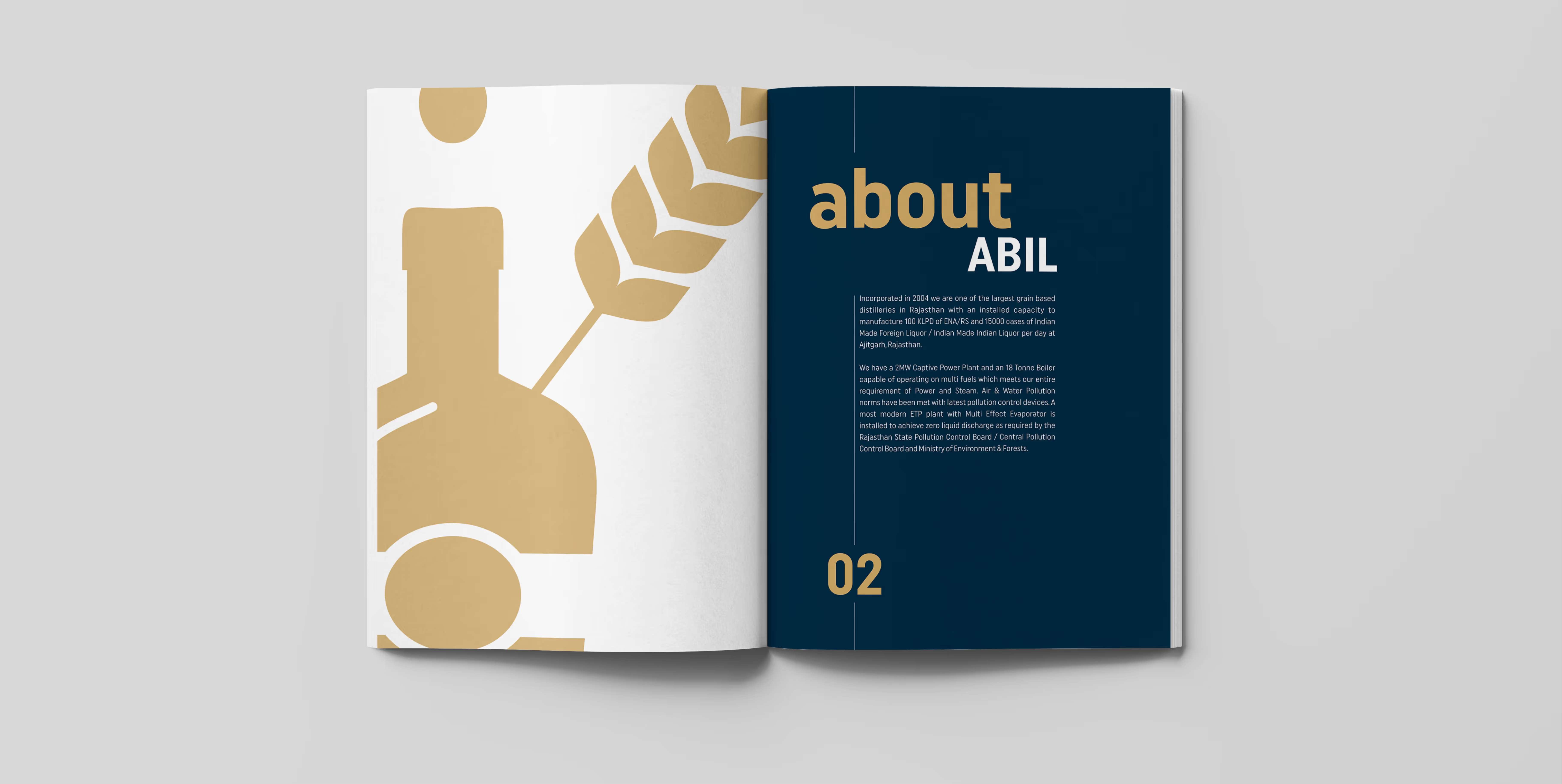
We created a clearer portfolio system that gives each product stronger recognition while connecting the range under one commercial logic. Design decisions were tested against retail behaviour, production constraints and the realities of manual bottling.
The core challenge
The portfolio needed to improve perception without losing accessibility.
• Stand out in a visually dense and price-sensitive category.
• Build distinction between products while retaining family recognition.
• Work within existing label materials and manual application processes.
• Prepare the range for launch despite internal operational delays.
Solutions
Store visits and competitor analysis informed a bolder hierarchy, clearer colour coding and simpler product communication. We developed new identities and labels around how buyers actually scan shelves, then worked with the production team to refine dimensions, glue zones and finishes.
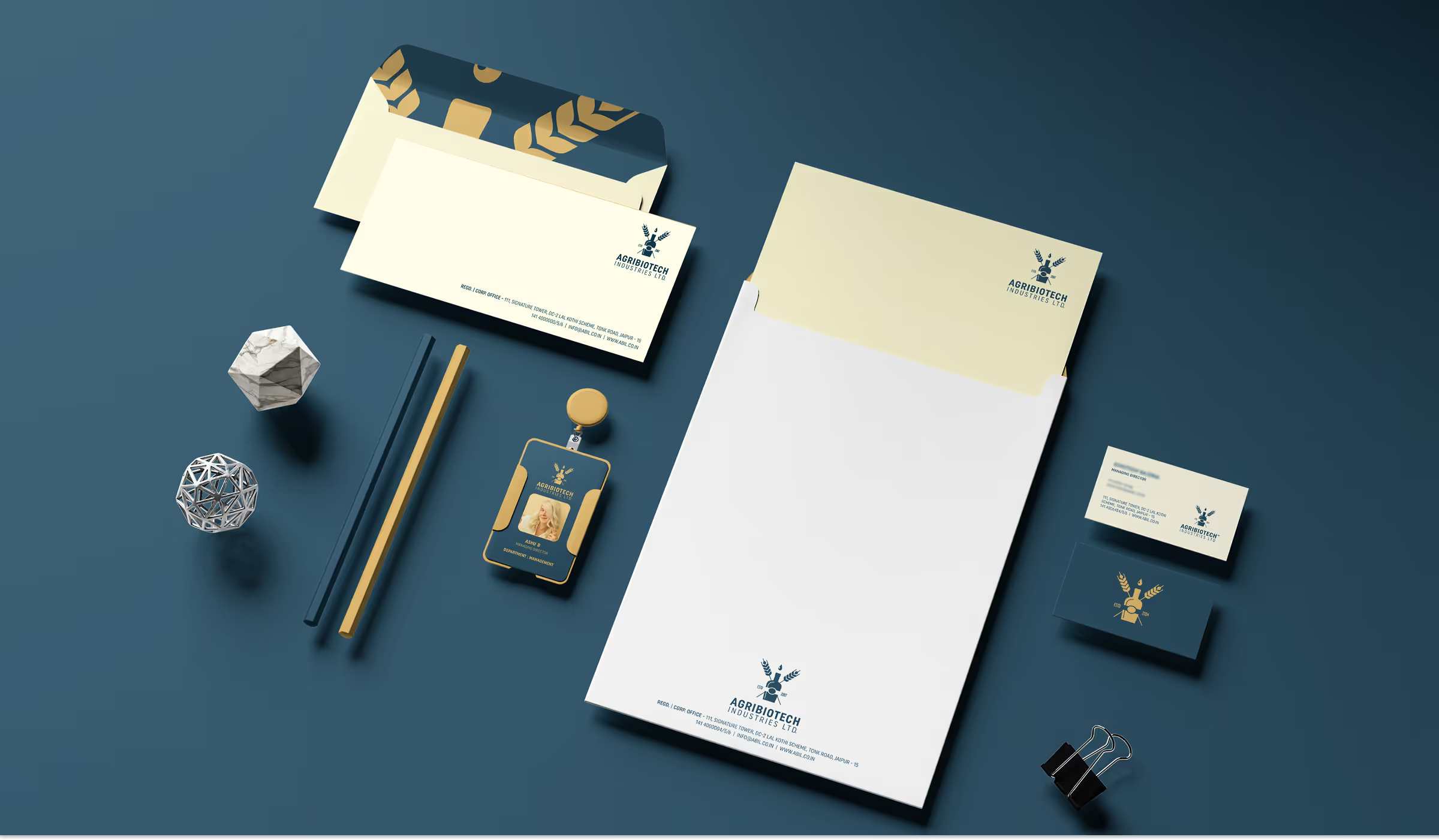
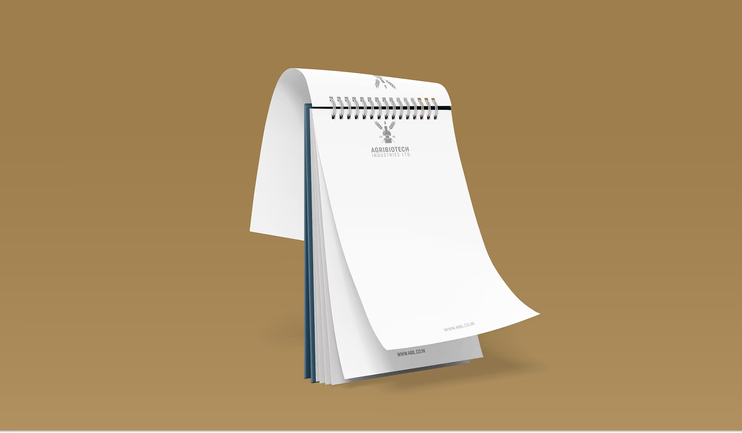
Supporting sales material and practical promotional ideas extended the system beyond the bottle, giving ABIL a more complete foundation for distributor and retail conversations.
The system behind the brand
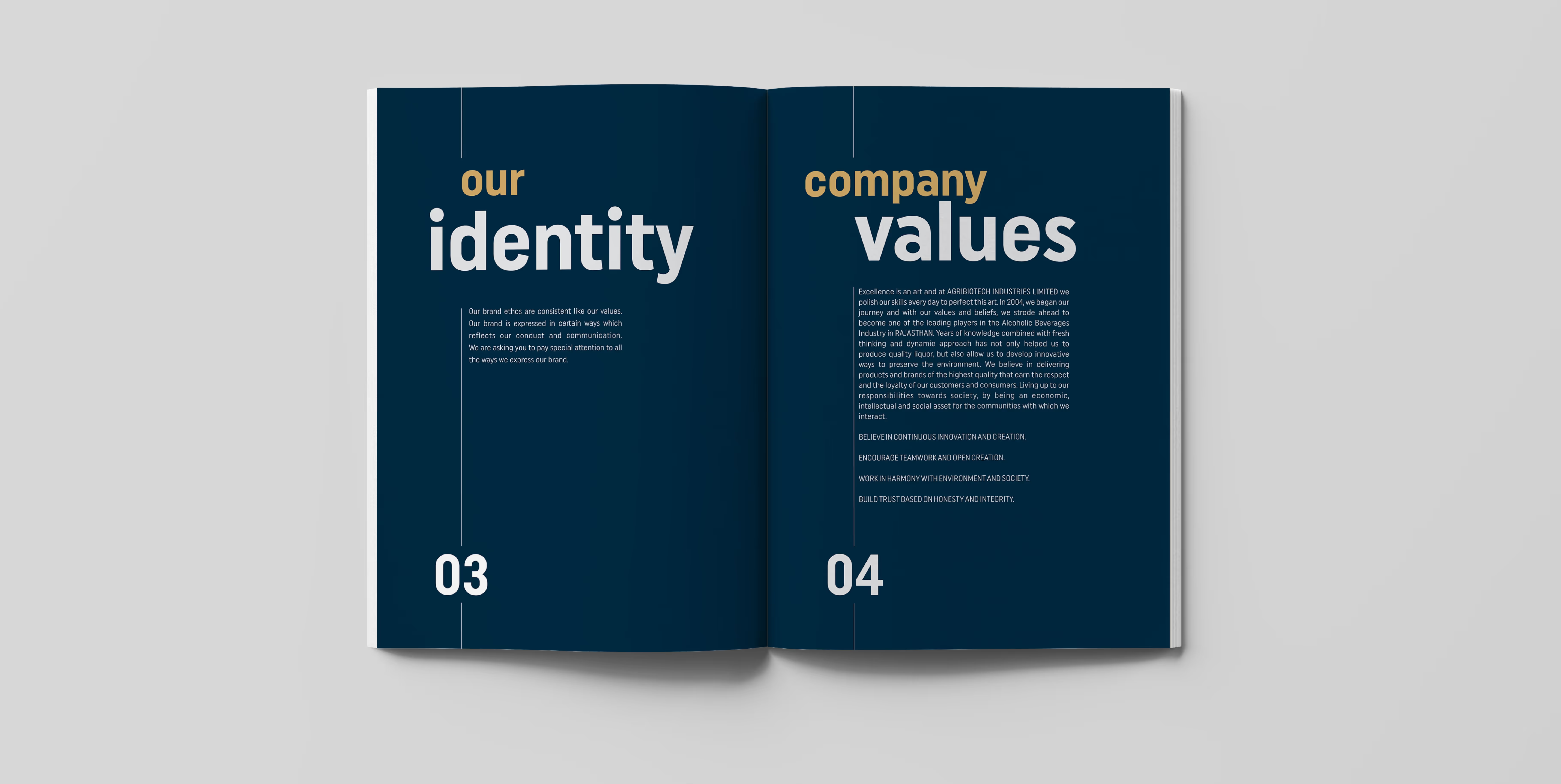
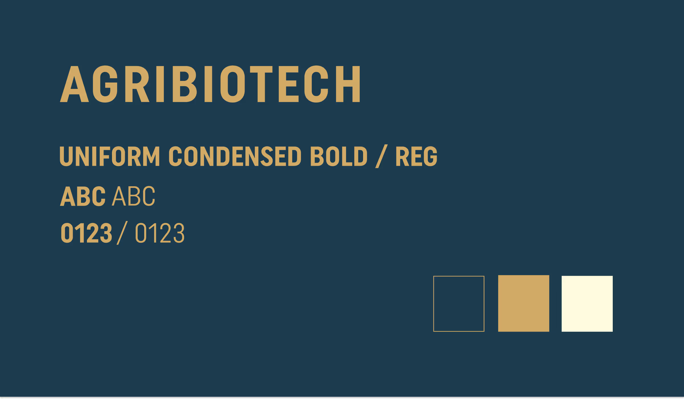
The portfolio system uses strong names, bold typography and controlled colour families to create immediate variant recognition. Shared layout rules connect the products, while distinctive palettes give each label its own shelf presence.
Production specifications ensure that the design can be reproduced consistently within cost and operational limits.
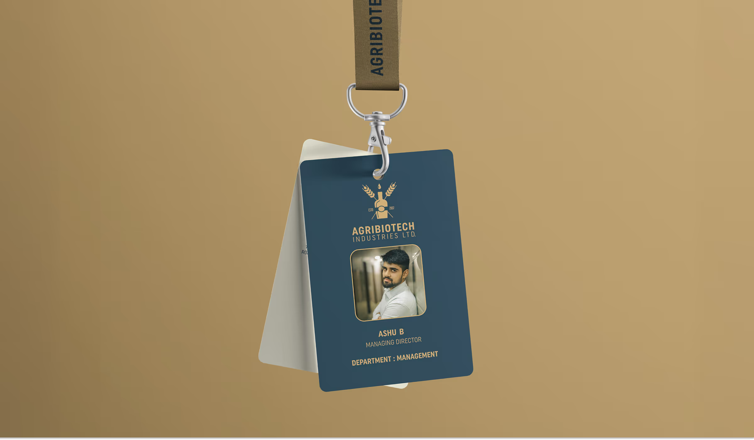
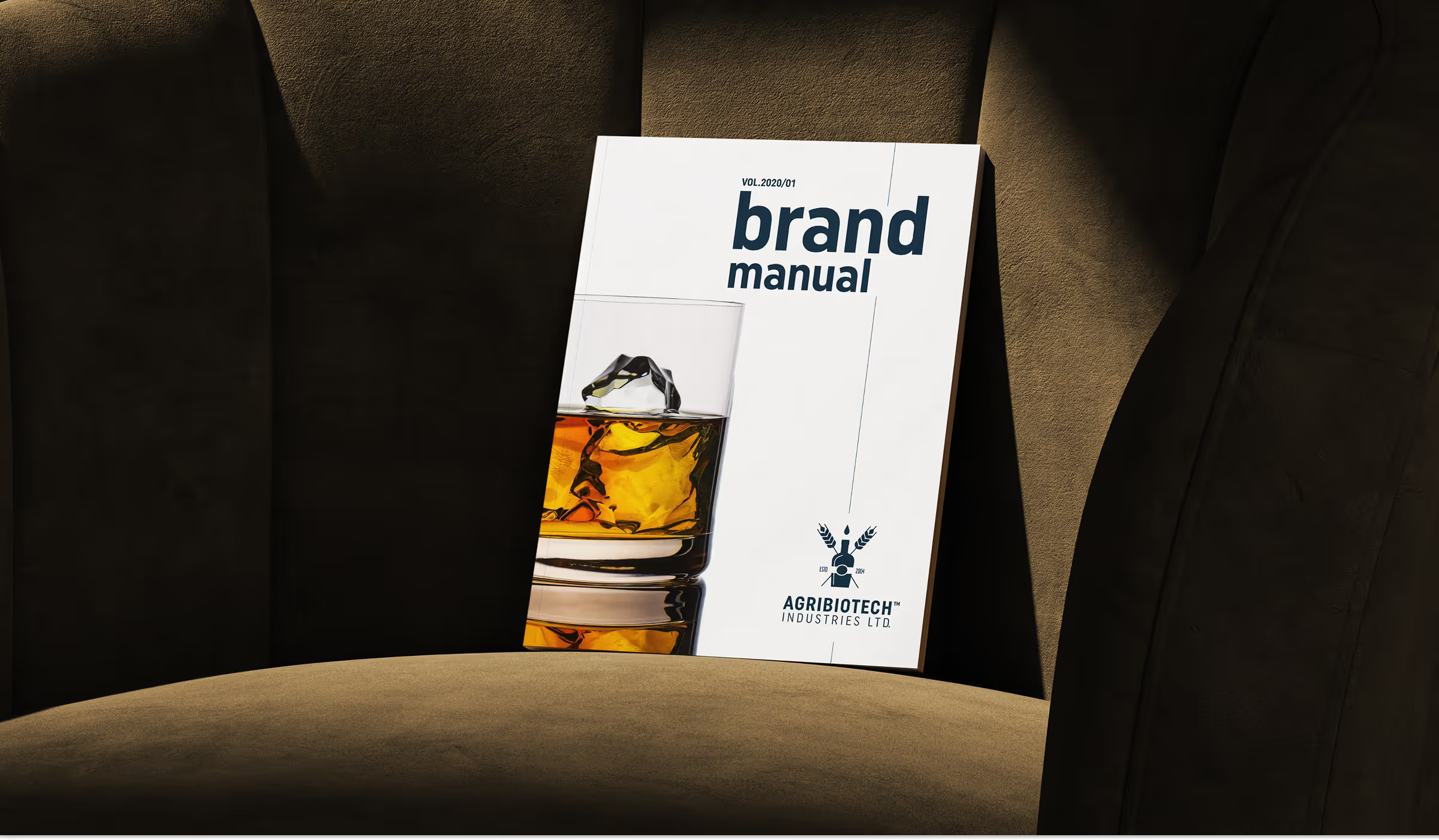
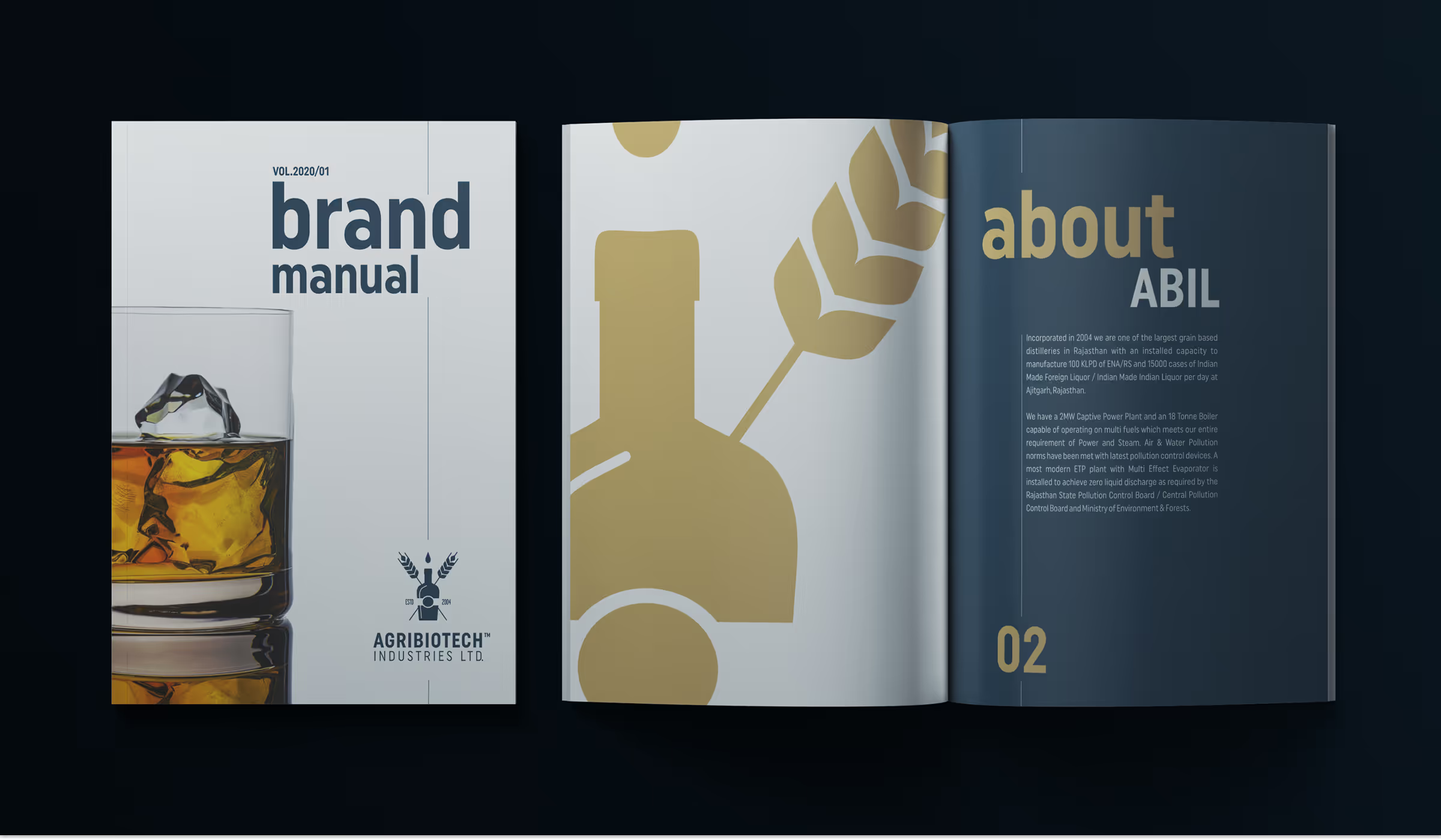
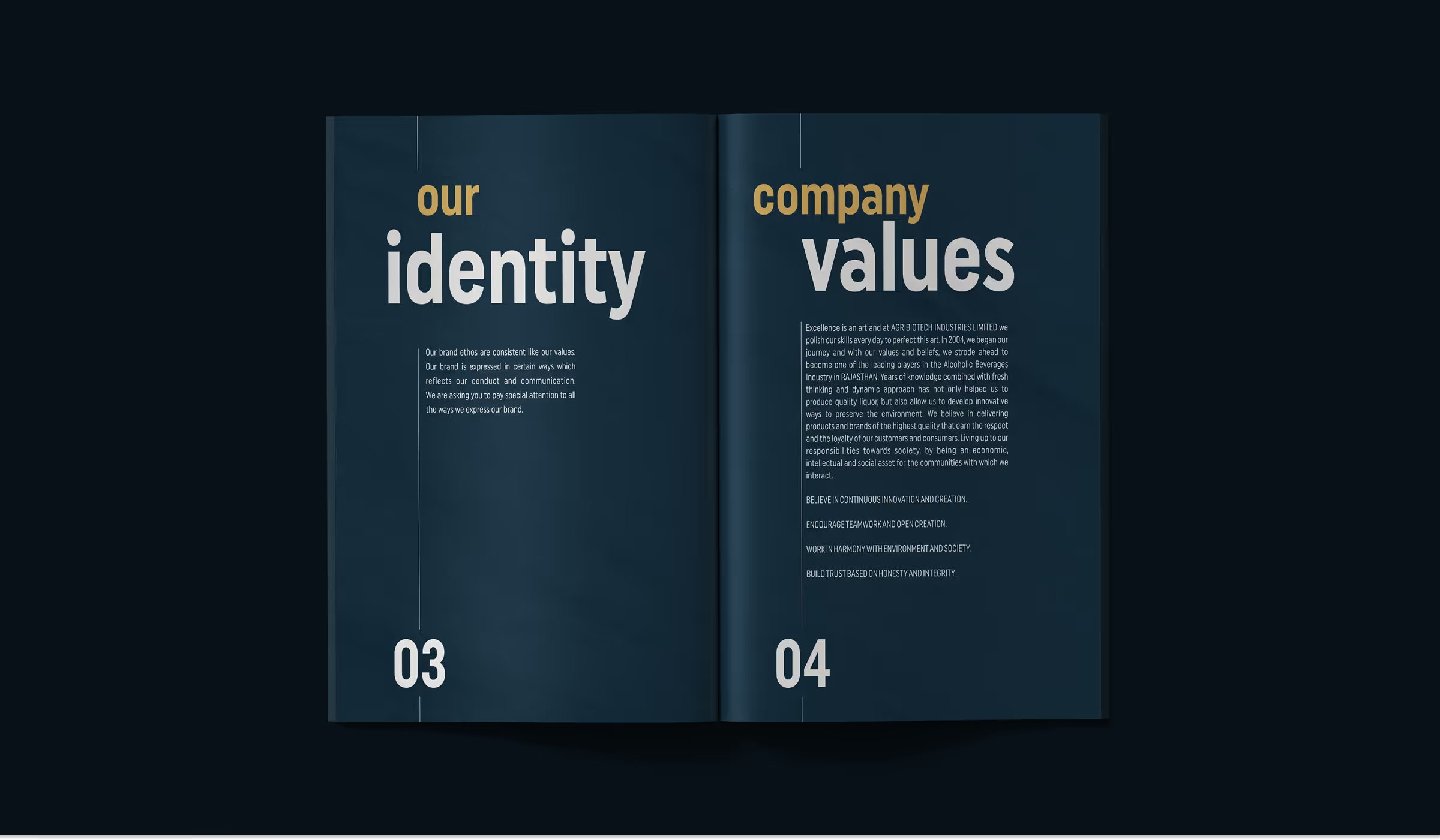
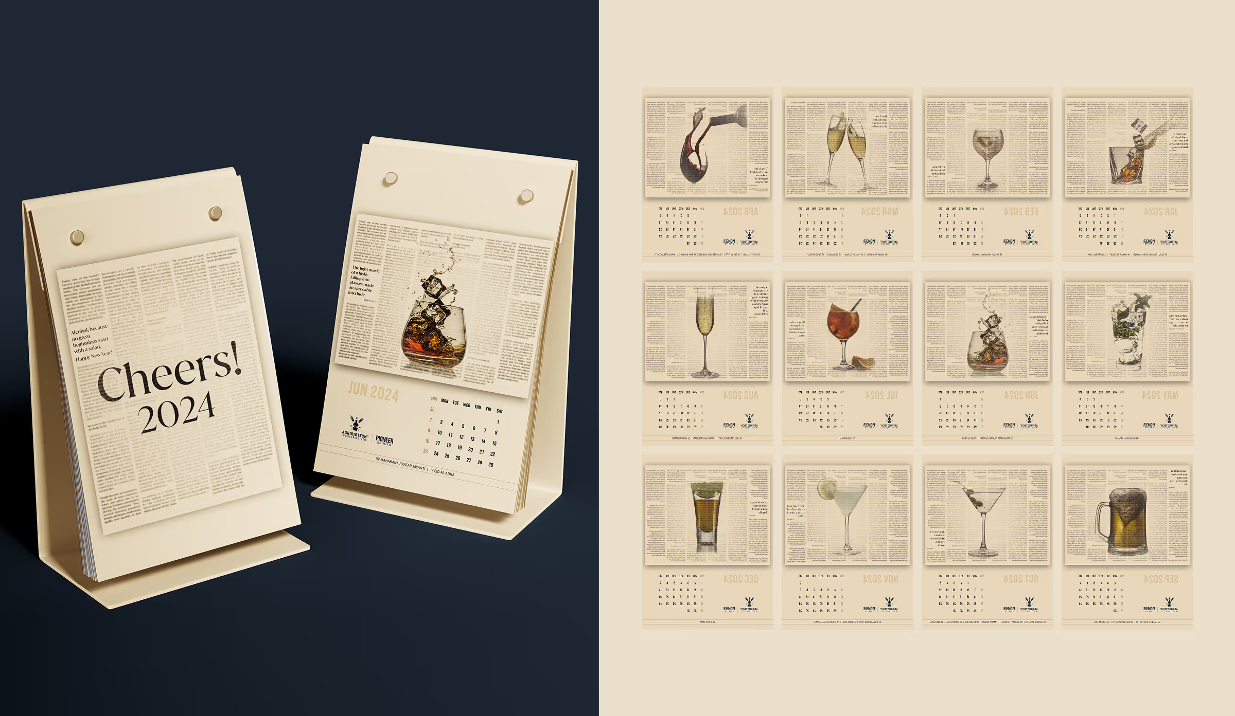
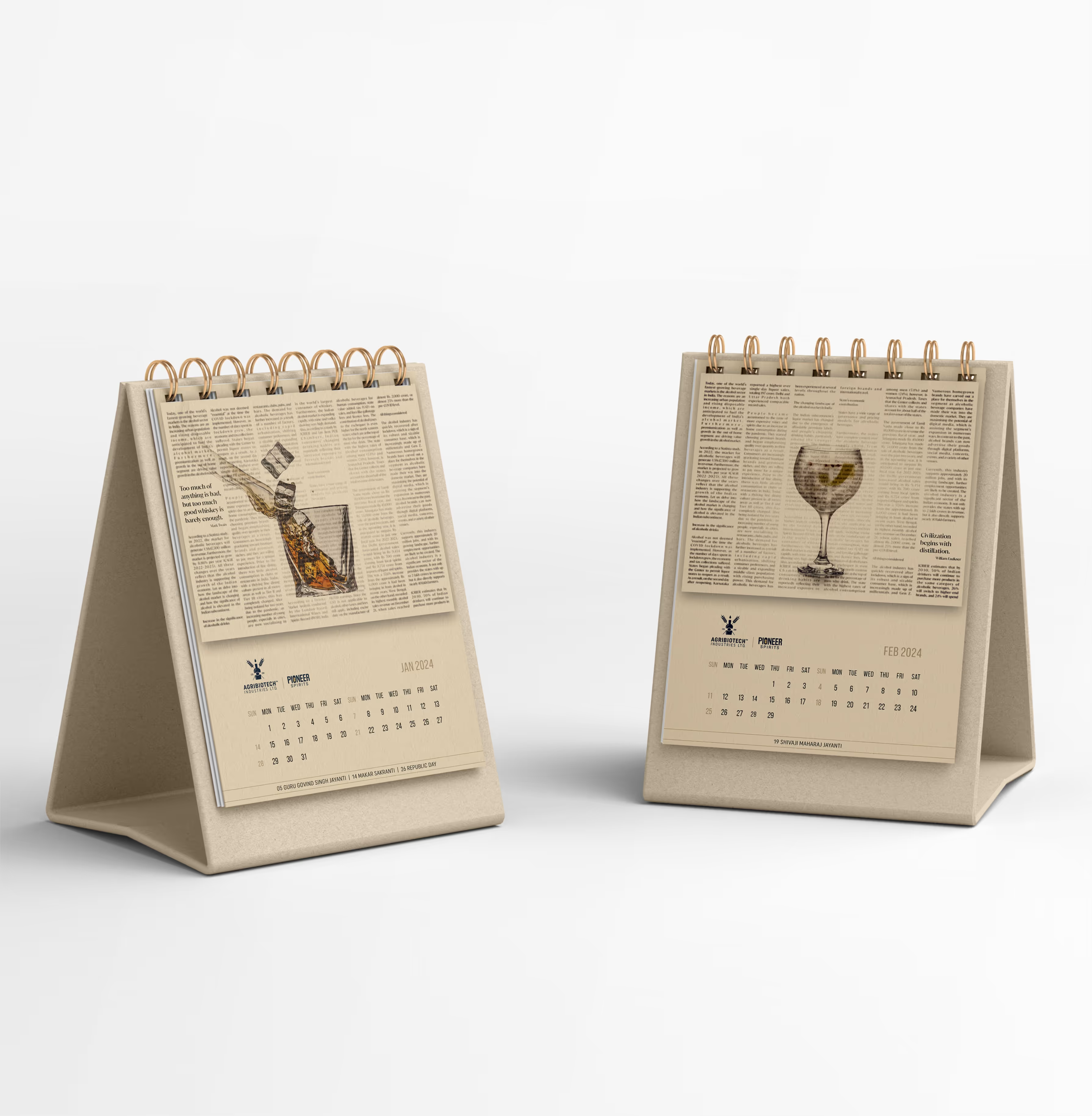
ABIL identity system
ABIL brand application
Visual Architecture
Front-facing information is deliberately simple: brand, product type and variant are understood in seconds. High-contrast colour blocks and restrained graphic details improve visibility from a distance and remain legible under typical retail lighting.
ABIL visual identity
ABIL brand collateral
ABIL campaign application
ABIL communication design
ABIL project media
ABIL project detail
ABIL Case Study gallery image 1
ABIL Case Study gallery image 2
ABIL Case Study gallery image 3
ABIL Case Study gallery image 4
ABIL Case Study gallery image 5
ABIL Case Study featured project media
Awards
The work gave ABIL a launch-ready identity and packaging system grounded in real retail conditions.
• Positive stakeholder response led to additional work across the portfolio.
• Labels were engineered for the existing manual bottling process.
• The renewed designs improved product distinction and shelf readiness.
• A repeatable system now supports future variants and launches.