BRAND IDENTITY & PACKAGING
Deeta Thakural Case Study
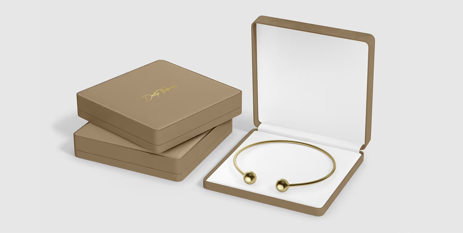
Bridging legacy and transformation through a signature-driven rebrand built for modern elegance.
Deeta’s name change risked separating an established jewellery practice from more than a decade of recognition. We created a signature-driven identity and communication system that preserves the designer’s legacy while introducing a more refined, contemporary brand.
Project details
Client
Deeta Thakural
Sector
Retail & Lifestyle
Services
Brand Identity, Packaging
Services
Brand Activation
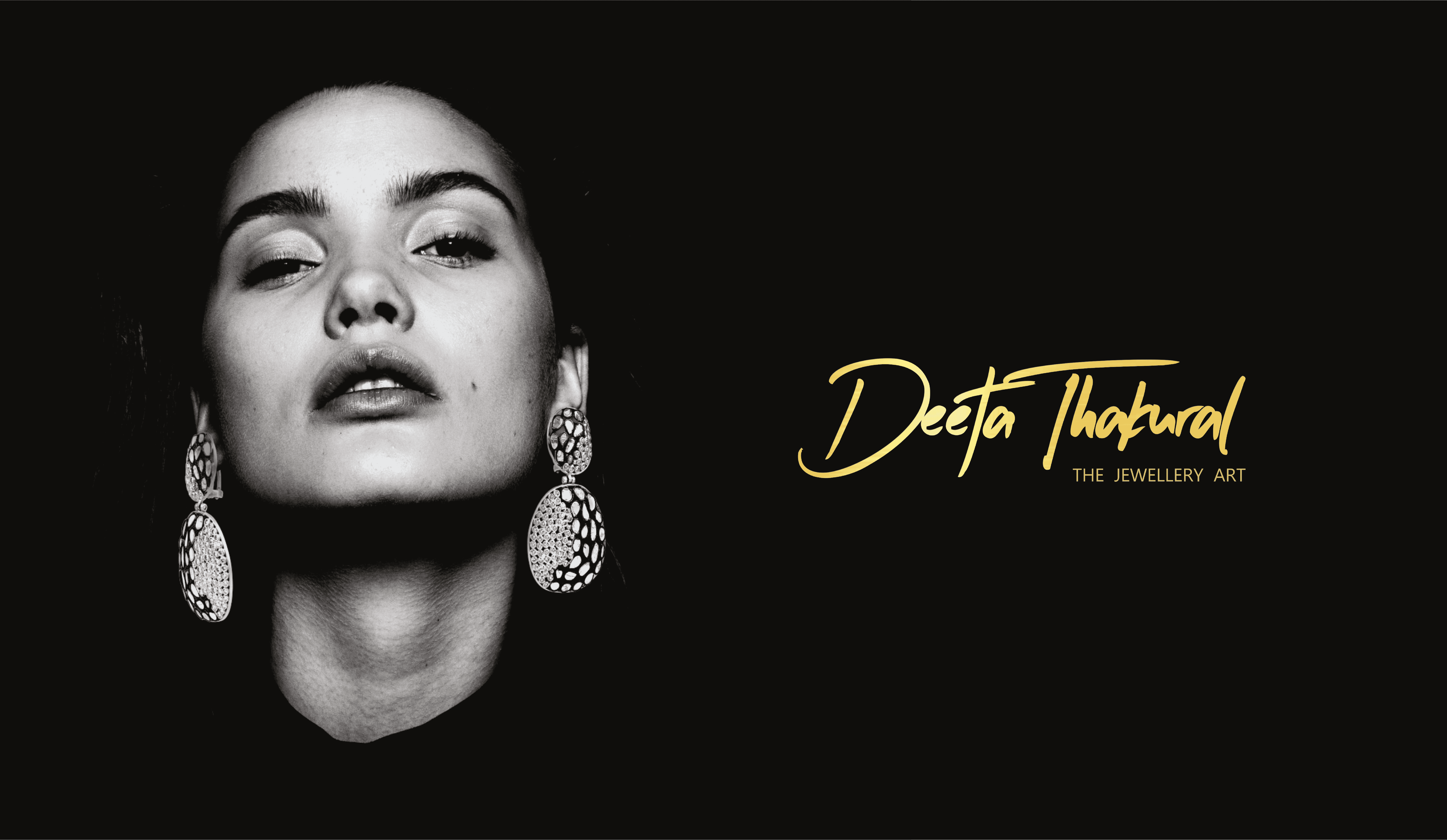
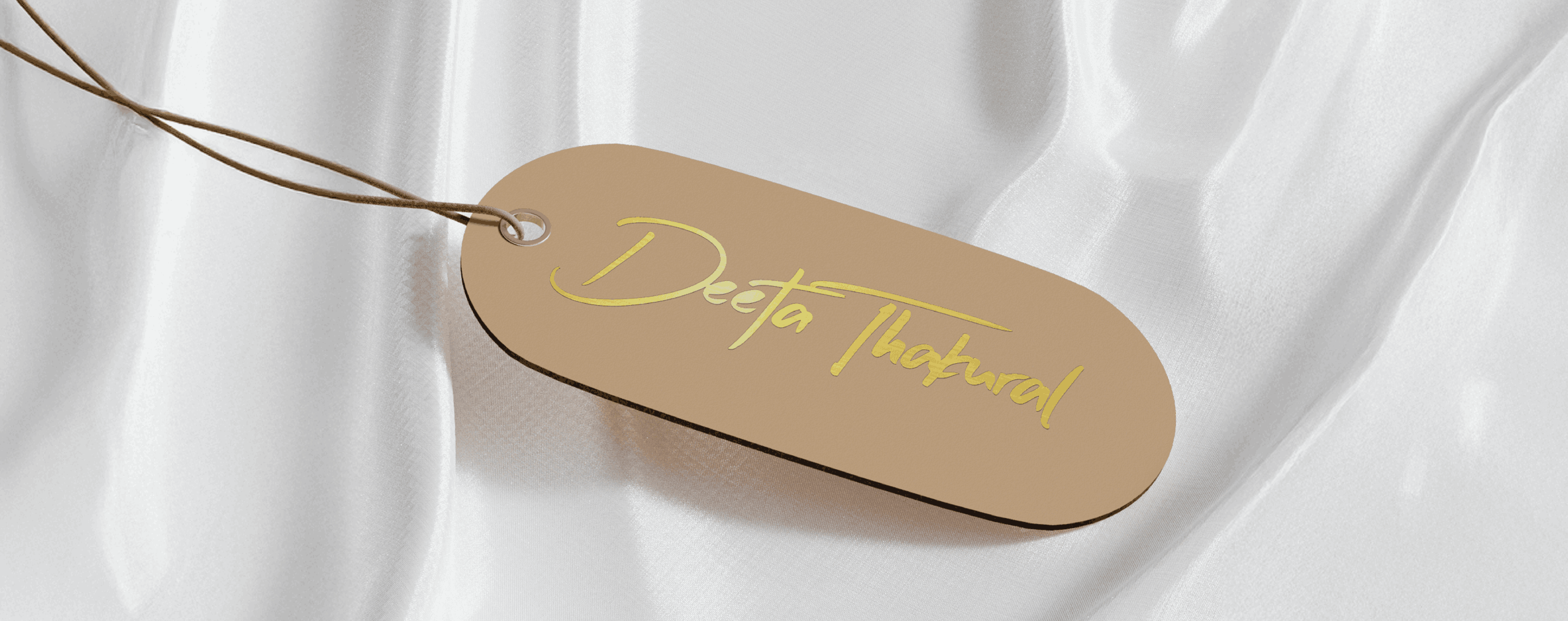
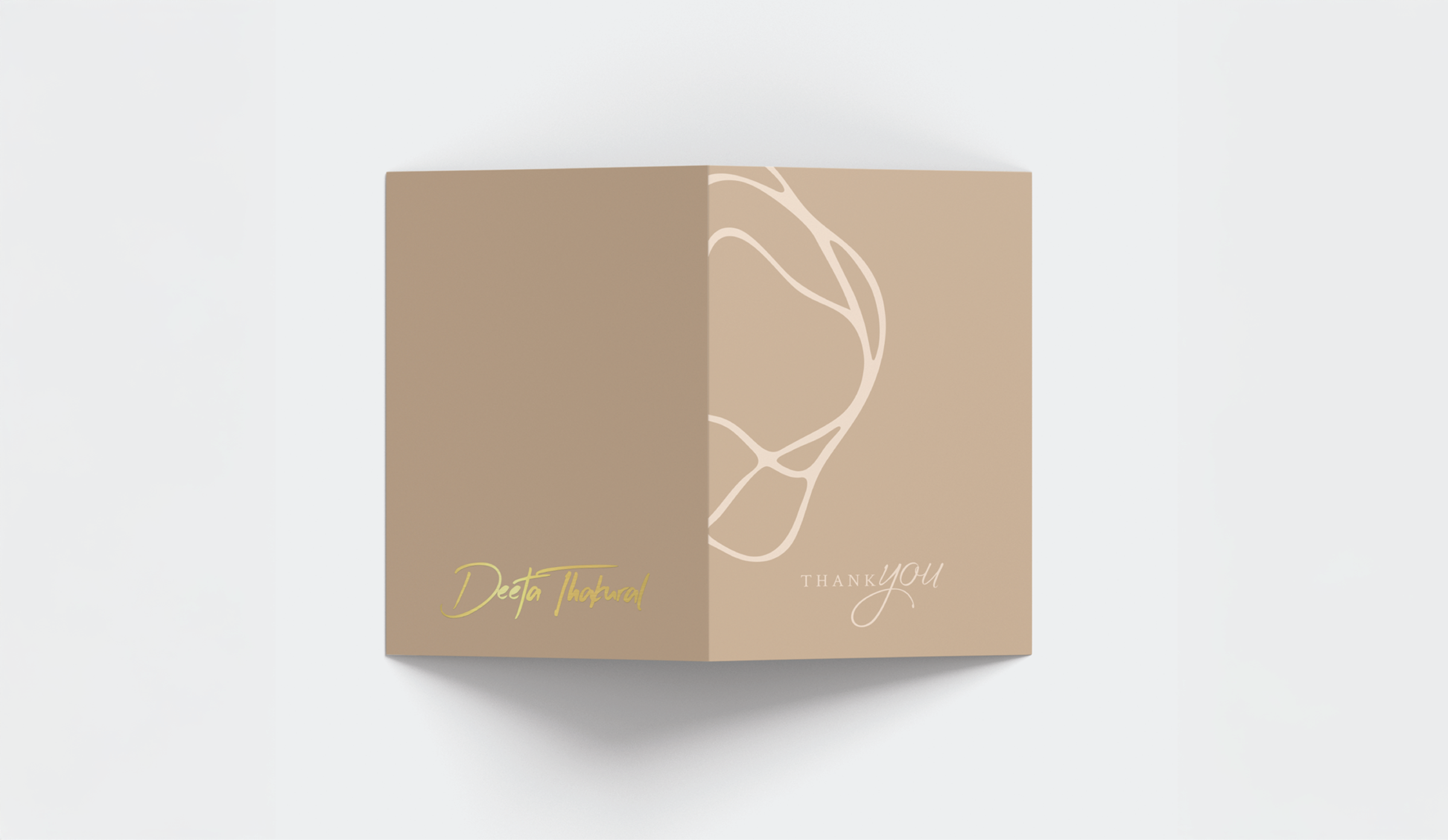
The rebrand was treated as a transition of authorship rather than a completely new beginning. A personal signature mark, quiet palette and carefully staged narrative helped existing clients recognise the designer immediately under the new name.
The core challenge
The new identity had to protect trust while making the change unmistakably clear. • Retain recognition built under the Khushboo Lakhi name. • Connect loyal clients to Deeta without creating confusion. • Express modern elegance without overpowering the jewellery. • Create one coherent system for packaging, exhibitions and digital communication.
Solutions
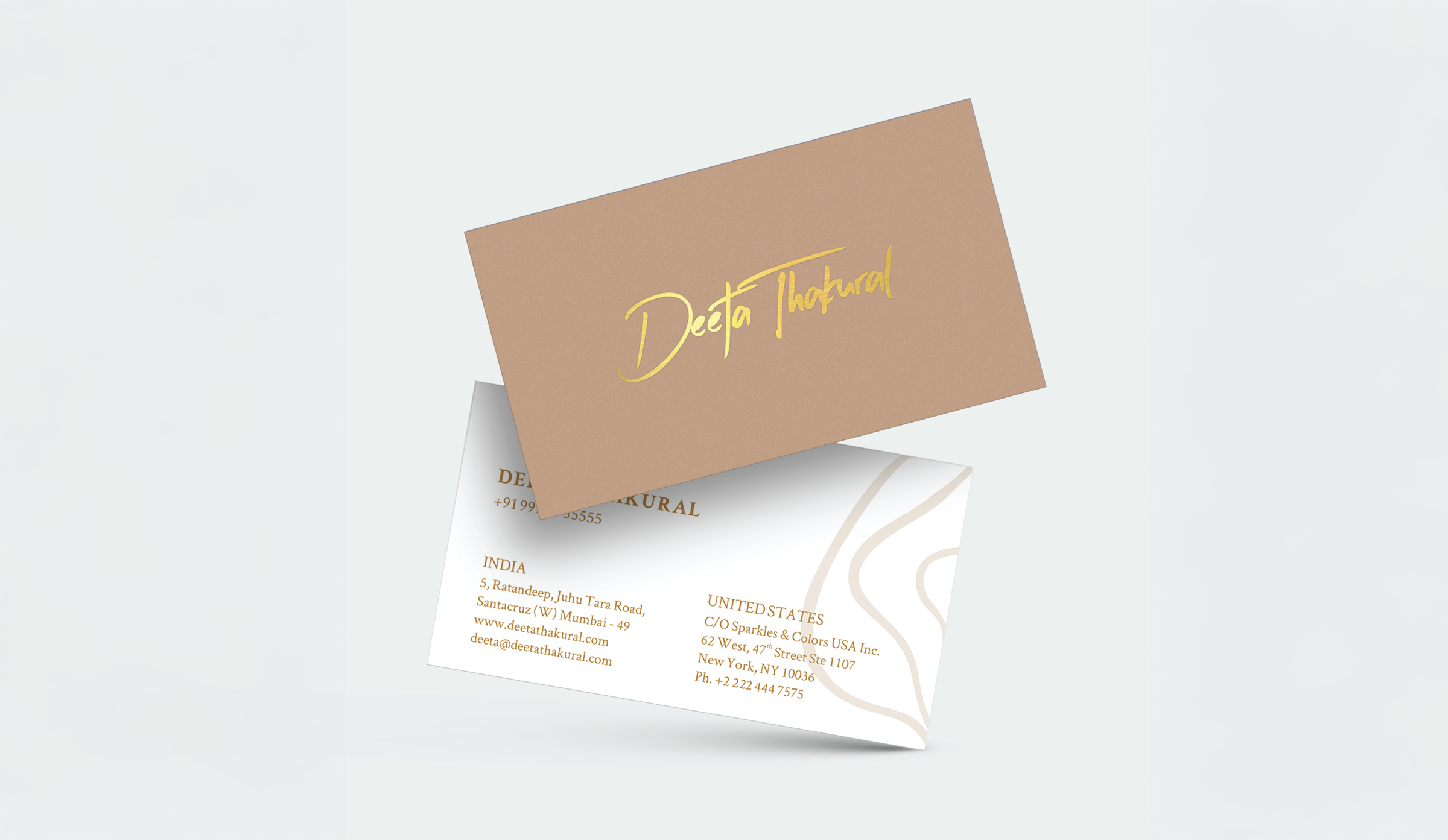
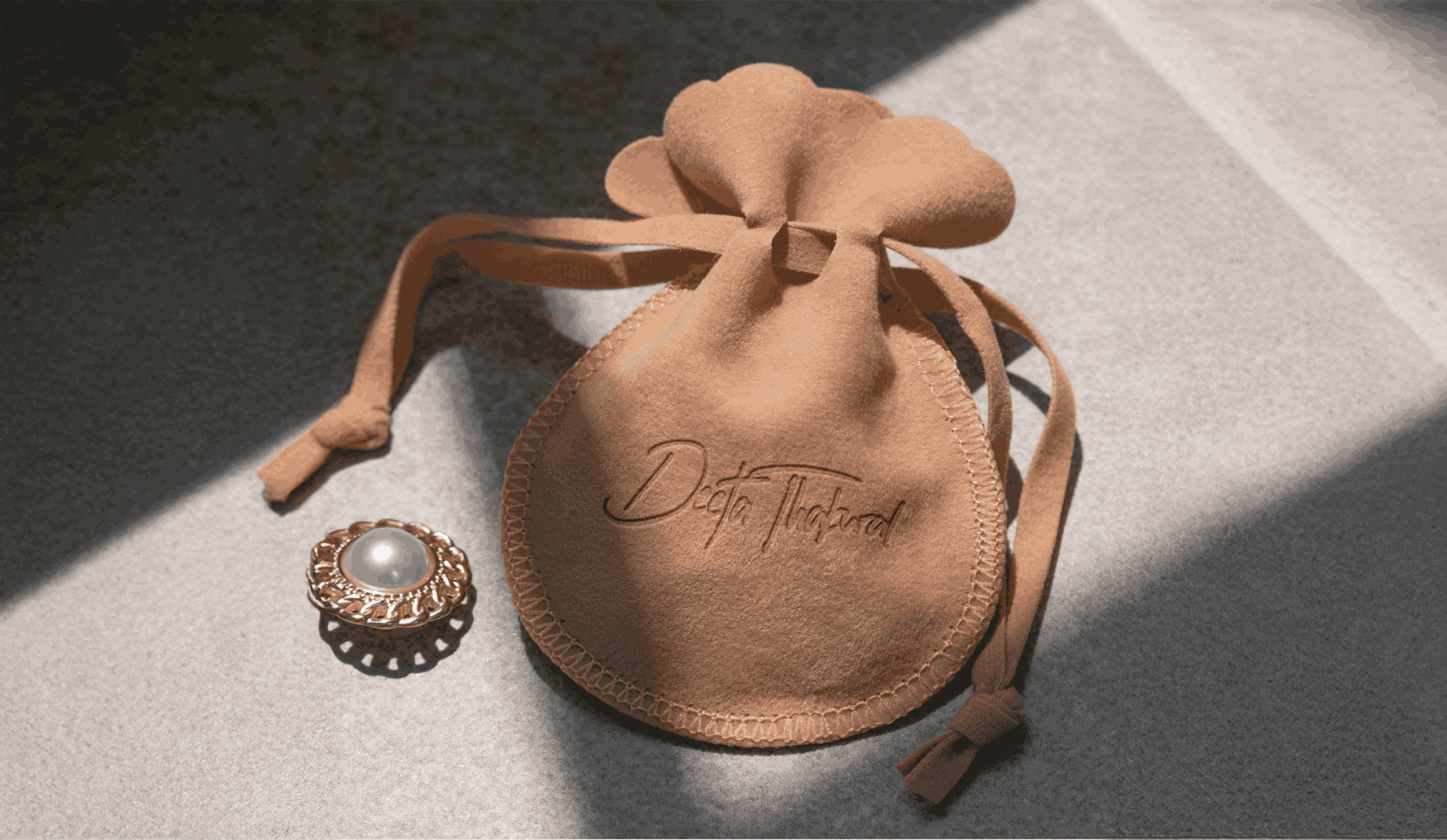
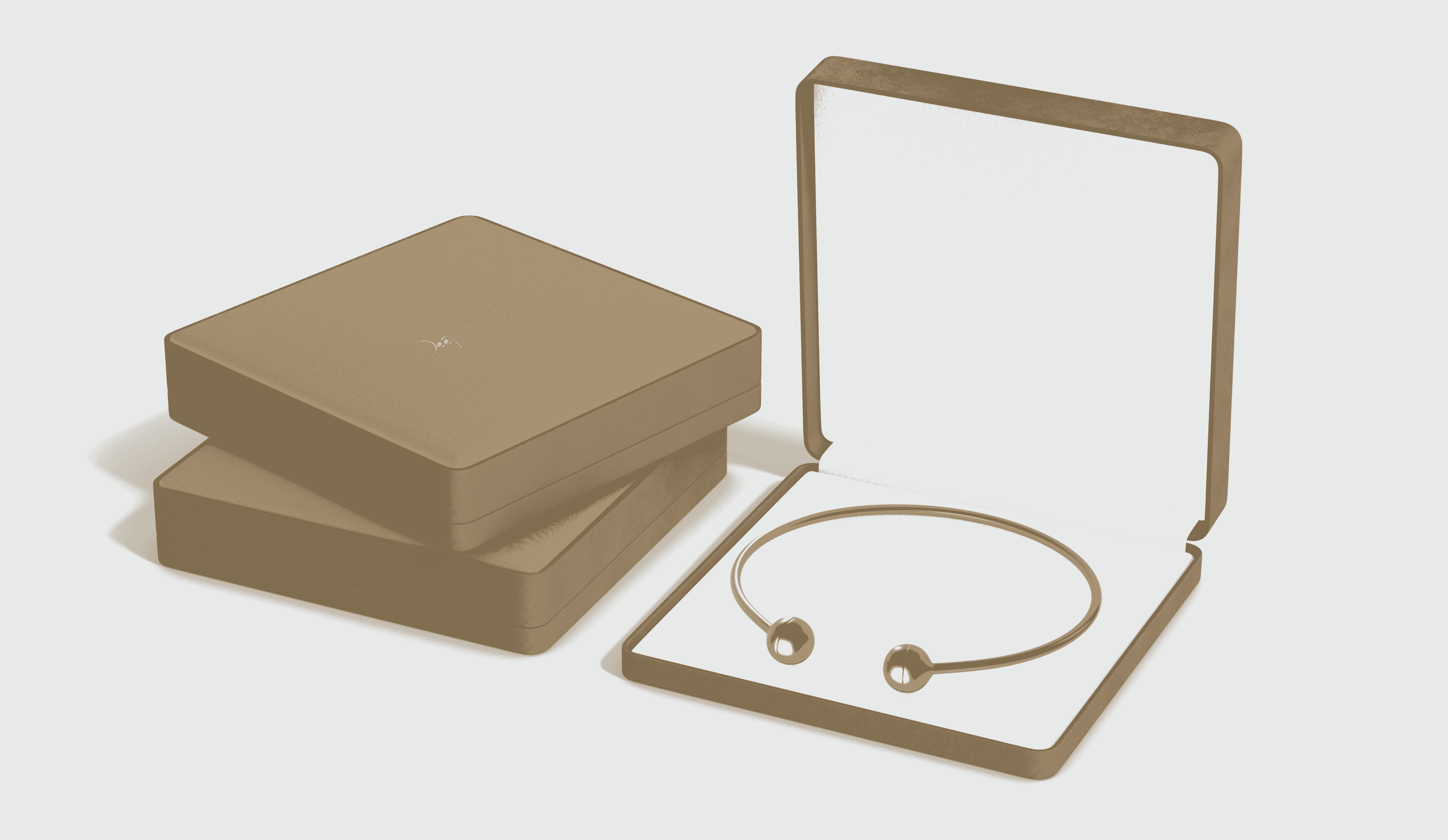
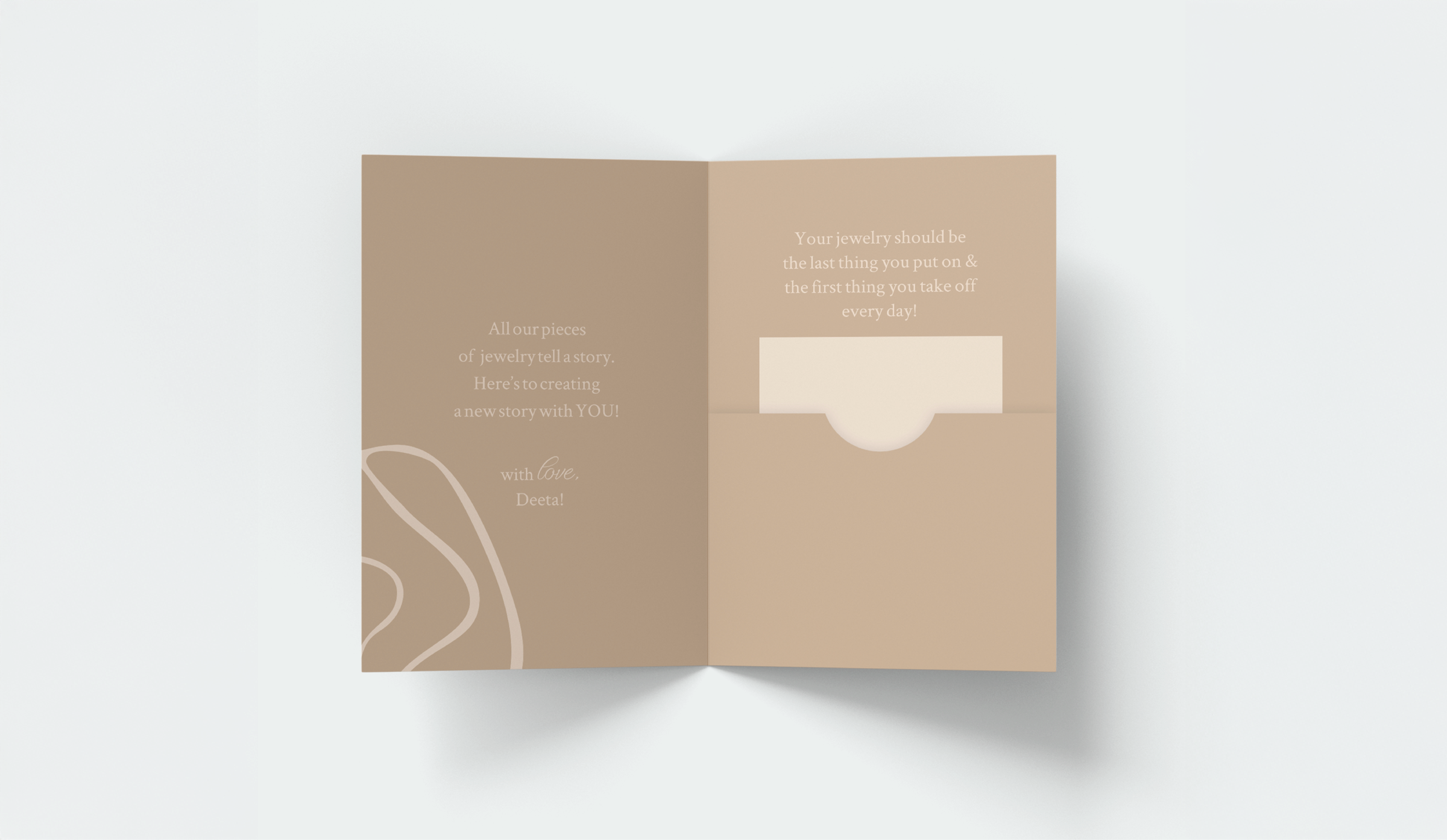
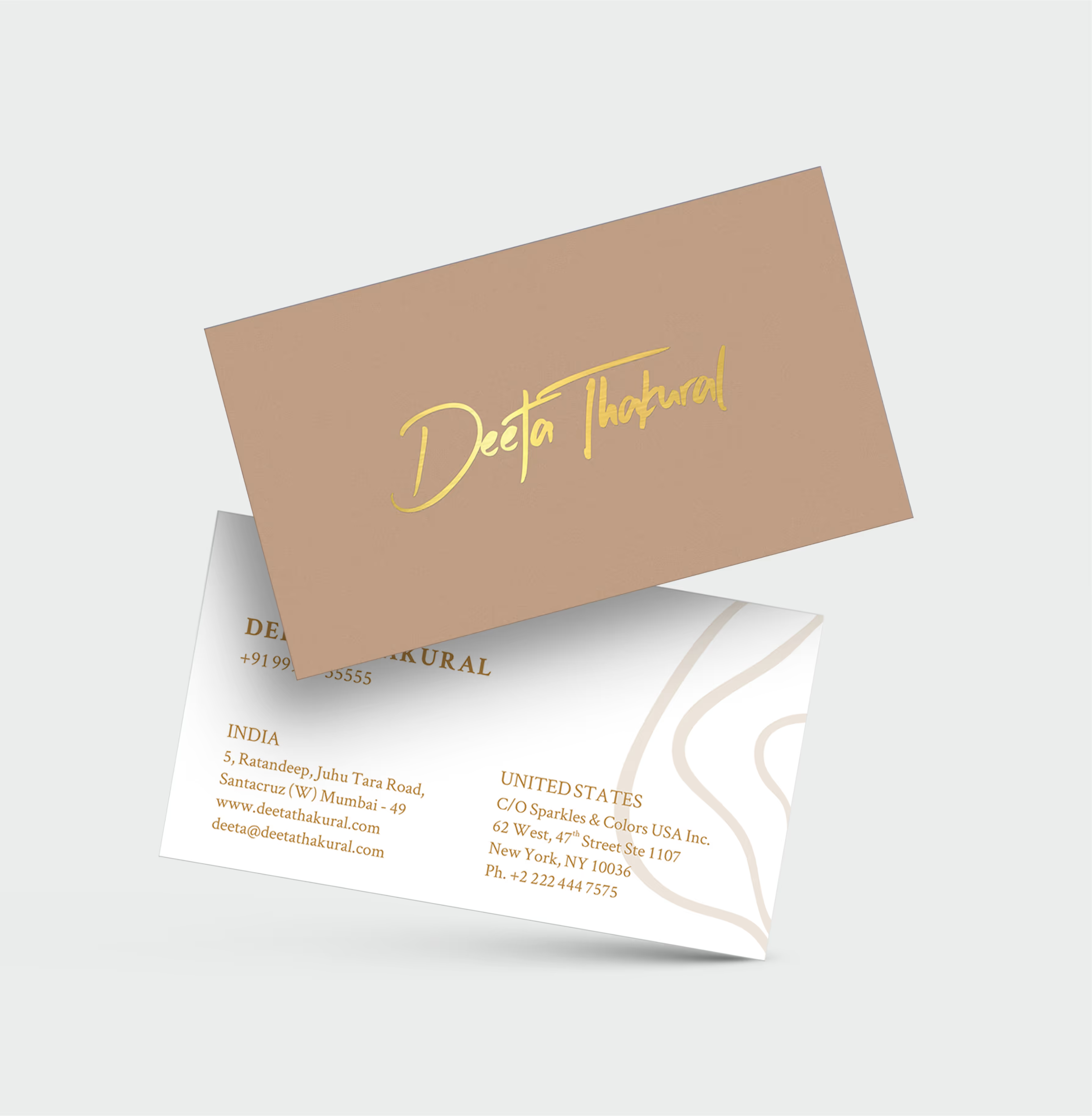
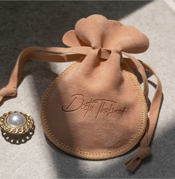
We evolved the existing personal cues into a minimalist signature identity that could carry both continuity and change. Launch messaging explicitly connected the former name with Deeta, while the visual system introduced a quieter and more confident expression. The identity was extended across stationery, jewellery cards, bags, boxes, digital touchpoints and exhibition environments so every encounter reinforced the same story.
The system behind the brand
The system is built around the signature mark, refined typography, muted blush tones and rose-gold detailing. Generous space and restrained materials keep attention on the craft while giving the brand a recognisable emotional tone. Clear rules for packaging, photography and layout allow future collections to feel distinct without losing continuity.
Deeta Thakural identity system
Deeta Thakural brand application
Visual Architecture
Editorial compositions, soft neutrals and precise metallic accents create a sense of quiet luxury. Product imagery remains central, while the signature and typography provide a consistent frame across print, digital and spatial applications.
Deeta Thakural visual identity
Deeta Thakural brand collateral
Deeta Thakural campaign application
Deeta Thakural communication design
Deeta Thakural project media
Deeta Thakural project detail
Deeta Thakural Case Study gallery image 1
Deeta Thakural Case Study gallery image 2
Deeta Thakural Case Study gallery image 3
Deeta Thakural Case Study gallery image 4
Deeta Thakural Case Study gallery image 5
Deeta Thakural Case Study featured project media
Awards
The transition established Deeta as a distinct name without abandoning the equity of the earlier identity. • Clients could connect the new name to the designer’s established practice. • The signature mark became a consistent identifier across packaging and exhibitions. • The refreshed system supported a more premium, internationally relevant presentation. • Future collections gained a flexible but recognisable brand foundation.
Deeta Thakural Case Study project outcome
See projects
View Project
View Project
View Project
View Project
View Project
View Project