Client overview
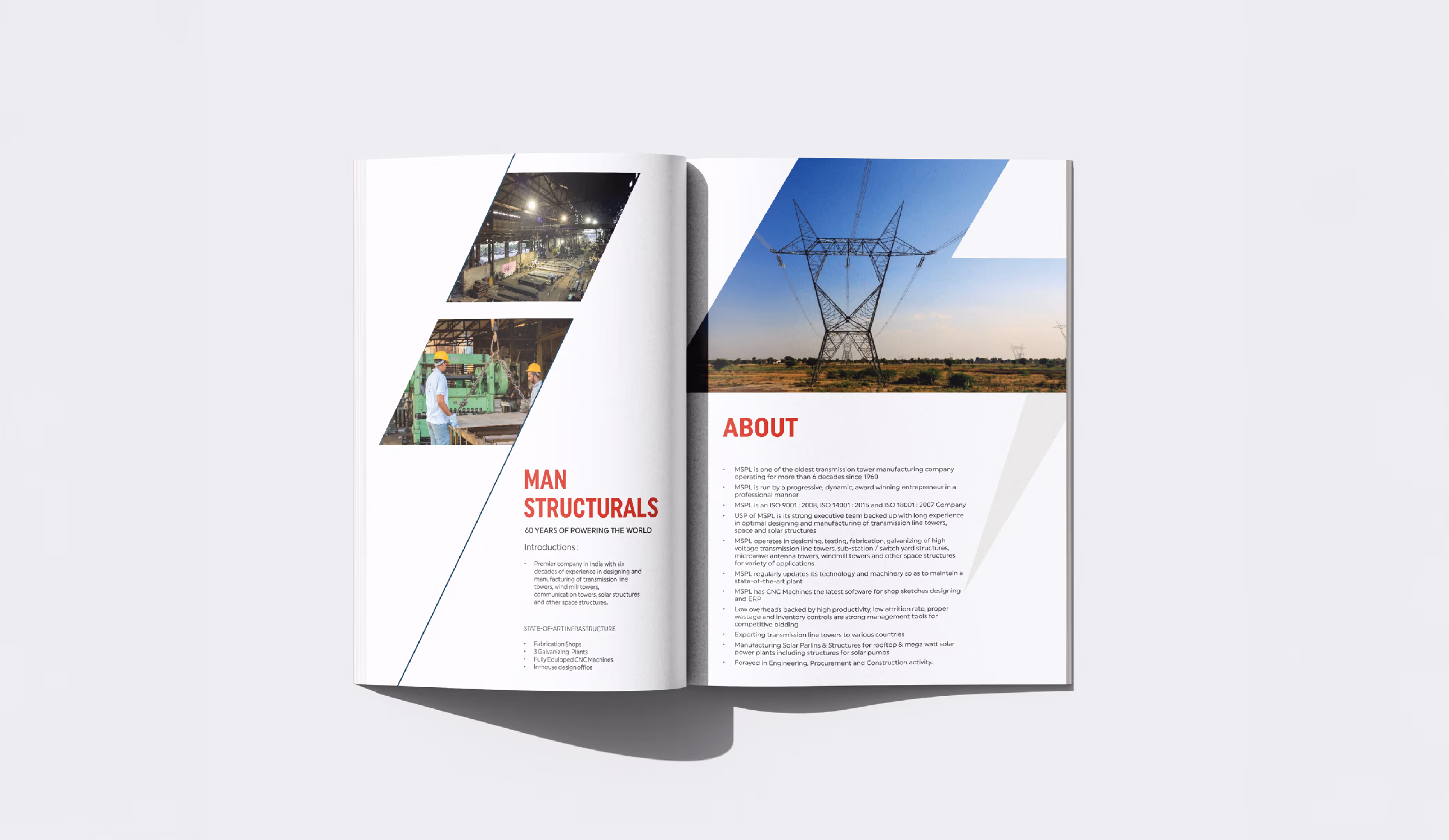
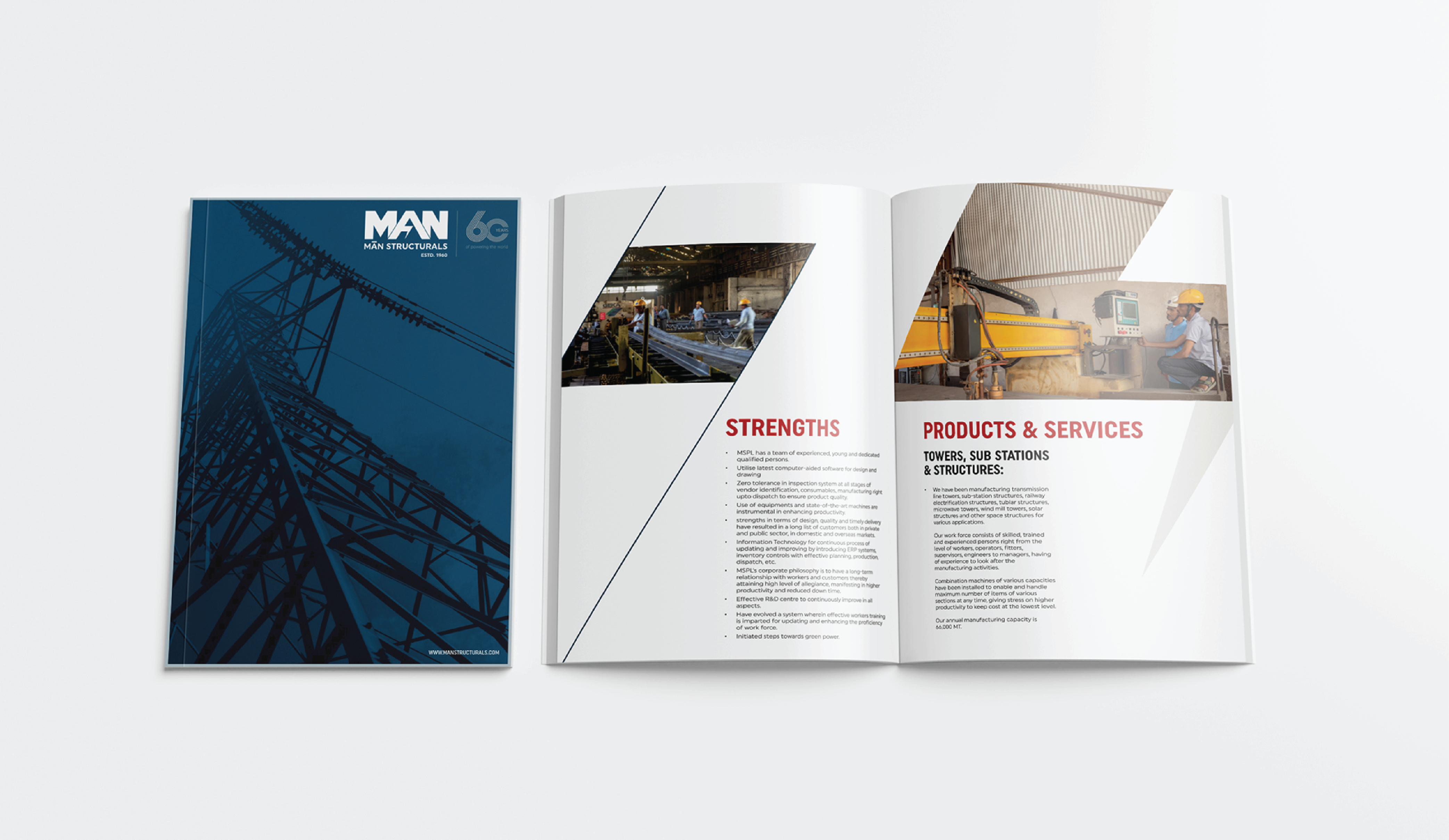
MAN Structurals Ltd. is one of Rajasthan’s oldest industrial houses, with a Pan-India footprint in manufacturing high-tension electrical structures, railway components, and large-scale iron fabrication. With a lineage tracing back to early industrialization in Jaipur, the company was part of a select group of families historically invited by the royal family and government to establish industrial ecosystems in the state. Now led by Managing Director Gaurav Rungta, MAN Structurals continues its legacy of precision engineering and national infrastructure contribution
When we first started working on the MAN Structurals project, our goal was crystal clear to craft a visual identity that reflected the sheer scale and industrial precision of the company’s work. MAN is one of those legacy brands that has done incredible work in the infrastructure space but had an identity that didn’t quite speak to its capabilities. They weren’t looking for something flashy; they wanted strength, clarity, and immediate recognition. That’s what drove our strategic and creative direction from the very beginning.
The bold typography was intentional. We chose an extra-bold typeface to mimic the weight and stability of the high-tension towers and iron structures they build. But we didn’t stop at form,we focused on meaning. We incorporated an electrical symbol into the letter ‘A’ in the logo, subtly communicating their core industry. This wasn’t just design for design’s sake. It was storytelling through visual cues. For a company that doesn’t invest heavily in advertising, the logo had to do the heavy lifting in telling people who they are and what they do.
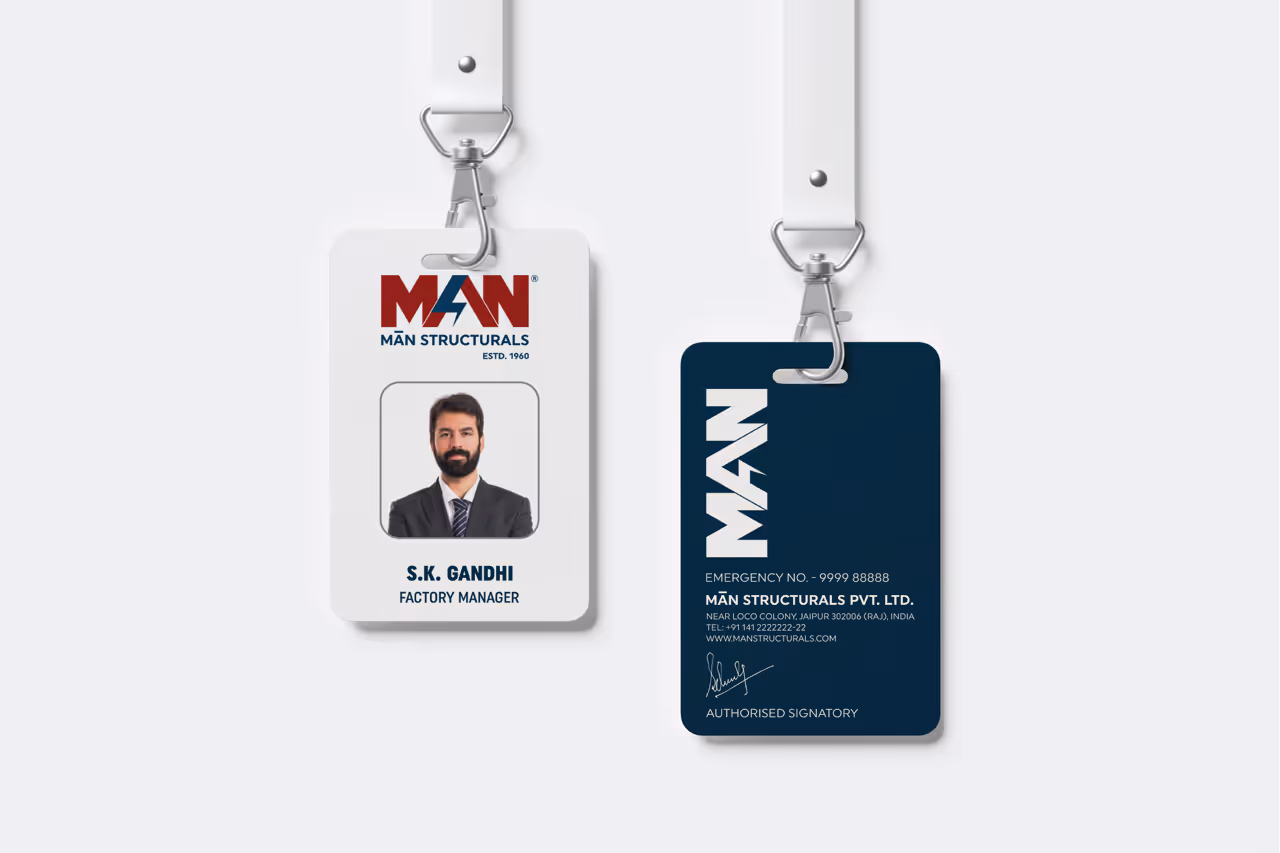
What made this solution particularly effective was how seamlessly it fit into every touchpoint from signage to stationery to corporate uniforms. It gave MAN Structurals a unified, unmistakable identity that was both modern and grounded in their industrial legacy. The new brand presence instantly felt more aligned with the authority and legacy they carry within their sector. And for the client, it was exactly what they were looking for, something that made them feel proud, seen, and well-represented
What stood out about this project was the simplicity with which it solved a complex identity gap. There was no over-designing or unnecessary noise, just a clean, powerful mark that said everything it needed to. The fact that the client loved it at first sight only validated the depth of thought behind it. We also had the chance to build a personal brand identity for their Managing Director, Gaurav Rungta, which added a human dimension to the engagement. Altogether, it was a great example of how thoughtful branding done right can quietly elevate a brand’s perception without needing to shout.