



Change the logo, the project name, and the colour palette, and half the property ads in a feed could belong to the same building. Tower, golden sky, happy family, rooftop pool. Buyers scroll past because nothing gives them a reason to stop.
The property is already attractive, so making it look attractive adds very little. The real job is finding the one thing worth noticing and giving it a form people remember. A 40-foot balcony can be the whole idea. A project with 41 residences can turn that count into a statement about exclusivity. When an ad takes something factual and makes it interesting, enquiries tend to get better too.
Twenty Ways Real Estate Ad Design Can Skip the Render
Start with the floor plan.
If the plan is genuinely better, enlarge it and let it carry the creative, because a plan offers evidence where "spacious" offers only a claim.
The same goes for numbers: a 40 ft balcony, 75% open space, or a 100 ft approach road can take over the whole canvas, since "expansive" is an opinion and "40 feet" is a measurement.
If the project overlooks a skyline, a fort, or a lake, show the view first and let the building turn up later.
Amenities work the same way when you stop listing them and start giving reasons. A private cricket net becomes: Your game doesn't need a booking, and a school inside the township becomes: The school run just got shorter.
Location can be the ad itself, with real minutes to the airport and the business district drawn on a map that proves the claim instead of sitting in the corner with a pin. Comparison works too, when it is honest: conventional planning against this project's planning, brochure area against usable area.
Some of the best selling points never photograph well, like privacy, light, storage, and the gap between buildings, so draw them. A shadow diagram can sell privacy better than any lifestyle shot, and a section drawing can show ceiling height. Take one detail seriously, a stone junction or a door, and say why it is there.
Then take almost everything else away, because one line, one logo, and a lot of empty space can read as confidence in a way a crowded collage never will (our piece on luxury apartment advertising ideas that attract high-net-worth buyers goes further on this). Plain facts can also become metaphors, such as a house drawn with the unnecessary walls crossed out for more usable space, provided the idea leads straight back to something the project can prove. "Limited inventory" has lost all meaning, so make the count tangible: 41 residences shown as 41 lit windows.
Crop the architecture differently, a corner of the façade or a balcony running out of frame, so the building looks new again. Replace the word luxury with evidence like natural stone, a private lift, or a four-side-open tower, and let the buyer supply the adjective.
Remember that the everyday can be the luxury too, whether that is a shorter school run, a utility room that actually fits a washing machine or a bedroom truly separate from the living area. If the project has a constraint, a single tower or a small residence count, ask whether the constraint is the campaign.
Use local identity sparingly, because a Jaipur project does not need a peacock and a jharokha on every post, and one well-handled reference does more. Make an ad that does not look like an ad: a hand-drawn plan, a technical sketch, a giant number.
Give the headline real work, since "Live the life you deserve" fits any building and therefore sells none. Build ads around questions only when the visual answers them, like: How much of your home do you actually use? And finally, do not make every ad sell the whole property. One creative builds curiosity, another proves the location, another explains the plan, another asks for the site visit. The campaign tells the full story, and no single post has to.
The Rules Behind the Best Real Estate Ads
Ideas matter less than the rules behind them. Start with the proposition, then pick the asset. Most teams receive a render and ask what copy to put on it, and that order produces interchangeable ads. This is also where 3D visualisation becomes more useful than a pretty picture, because camera angle, light and context can be directed around the idea. Nine Degree's 3D visualisation services work this way.
Give every ad one centre of gravity. If the headline fights the price, which fights six amenities and a large logo, the viewer has nowhere to begin. Specific beats impressive every time, so "7 minutes from the airport" outperforms "excellent connectivity". No typography or animation rescues a weak proposition, because design cannot stand in for positioning. And design for recognition as well as attention. An ad can be noticed and forgotten, so the best real estate ads repeat a device, a colour or a line of thinking until the creatives read as one project.
Real Estate Ads Images and Facebook Post Design
A campaign does not need twenty versions of one hero render. It needs a visual library where each image answers a different buyer question: architecture for first impressions, floor plans for proof, location graphics for convenience, detail shots for quality, delivered-project photographs for trust. Use photography when the spaces are real, diagrams when planning is the story, maps when location is the story and typography when a number is. The medium should follow the message.
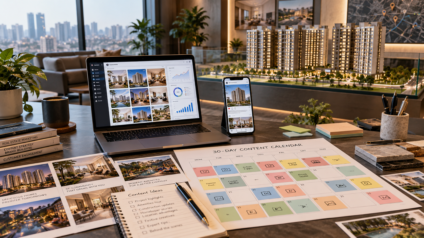
The same logic applies to real estate Facebook post design. A page of one render with different headlines is a template, not a campaign. Rotate proposition posts, plan posts, location creatives, detail crops, comparisons and social proof, and keep the identity constant while the idea changes. That also shows the team which propositions actually draw qualified interest.
Size for the placement, too. Meta Stories and Reels favour vertical 9:16 with key elements inside safe zones, while square and portrait suit the feed, and Google Ads commonly takes 1:1 and 1.91:1 assets. Specifications change, so check current requirements before export.
What Makes a Real Estate Ad Generate Enquiries?
No visual formula guarantees enquiries. Effective campaigns usually connect a relevant proposition, credible proof and an obvious next step, whether that is a site visit, a plan request or a call. Judge them on qualified leads, enquiry quality, site visits and cost per qualified lead. Likes and impressions say very little about a high-ticket purchase. Even award winning real estate ads rarely get there on rendering quality alone. The idea is usually clearer.
The Best Property Ad May Not Show the Property
Real estate is an unusually visual category, which is why showing more of the building is rarely the answer. A floor plan can be an ad. So can a number, a distance or a balcony. Good real estate ad design does not try to look better than the last campaign. It gives buyers a reason to remember this one.
A project has plenty to communicate. The harder decision is which single idea deserves to be remembered and how to prove it in a way a buyer can see.
That is the work Nine Degree does with developers, from positioning and creative to media and sales enablement. If a launch or a slow-moving inventory problem needs a sharper idea at its centre, let's discuss your project.
Frequently Asked Questions
What makes a real estate ad design effective?
An effective real estate ad design carries one clear idea, enough proof to make the claim believable, and a visible next step. It does not try to say everything about the project at once. It picks the one thing worth remembering and leaves the detail for the caption, landing page, or brochure.
Should a property ad lead with the render, a lifestyle image or the location?
Lead with the strongest selling point. A render suits a project whose architecture is the differentiator, lifestyle imagery suits an experience-led proposition, and location suits a project where proximity is the real reason to consider it. A campaign can use all three in different creatives, and none of them has to open with the building.
How much text should a real estate ad have?
Enough to land the idea without becoming a brochure. For most main creatives, one strong headline, one supporting fact, and a clear call to action are plenty. The rest can sit in the caption or on the landing page. Every extra line makes it harder for the viewer to know where to look first.
What sizes do real estate social ads need?
Prepare several formats instead of resizing one file. Common working ratios are 1:1 for square placements, 4:5 for portrait feed posts, 9:16 for Stories and Reels, and 1.91:1 for landscape. Platforms update specifications and safe zones from time to time, so confirm the current requirements before final artwork goes into production.
Share





.png)