Project overview
When we were approached to help Arun Pabuval shape a brand identity, it wasn’t just about designing a logo it was about protecting legacy. Here was a craftsman whose work spoke for itself across some of the finest hotel chains globally, yet his name had no formal presence. Over the years, others had started using variations of “Arun Jaipur” causing brand confusion in a very niche, reputation-driven industry. Our job was to help him reclaim that identity to build a brand rooted in authenticity, without disconnecting from the years of goodwill he’d already earned.

We made a deliberate decision to keep the name Arun Jaipur, adding India as a subtle but powerful differentiator. It was more than a suffix; it added scale, substance, and geographic pride. For someone exporting to global clients, Arun Jaipur India immediately felt more official, more enduring. Instead of reinventing, we clarified and that clarity became the core of our strategy. From there, we created a monogram using his initials, AP, and infused it with meaning: infinite possibilities. That became the design anchor - clean, classic, and personal.
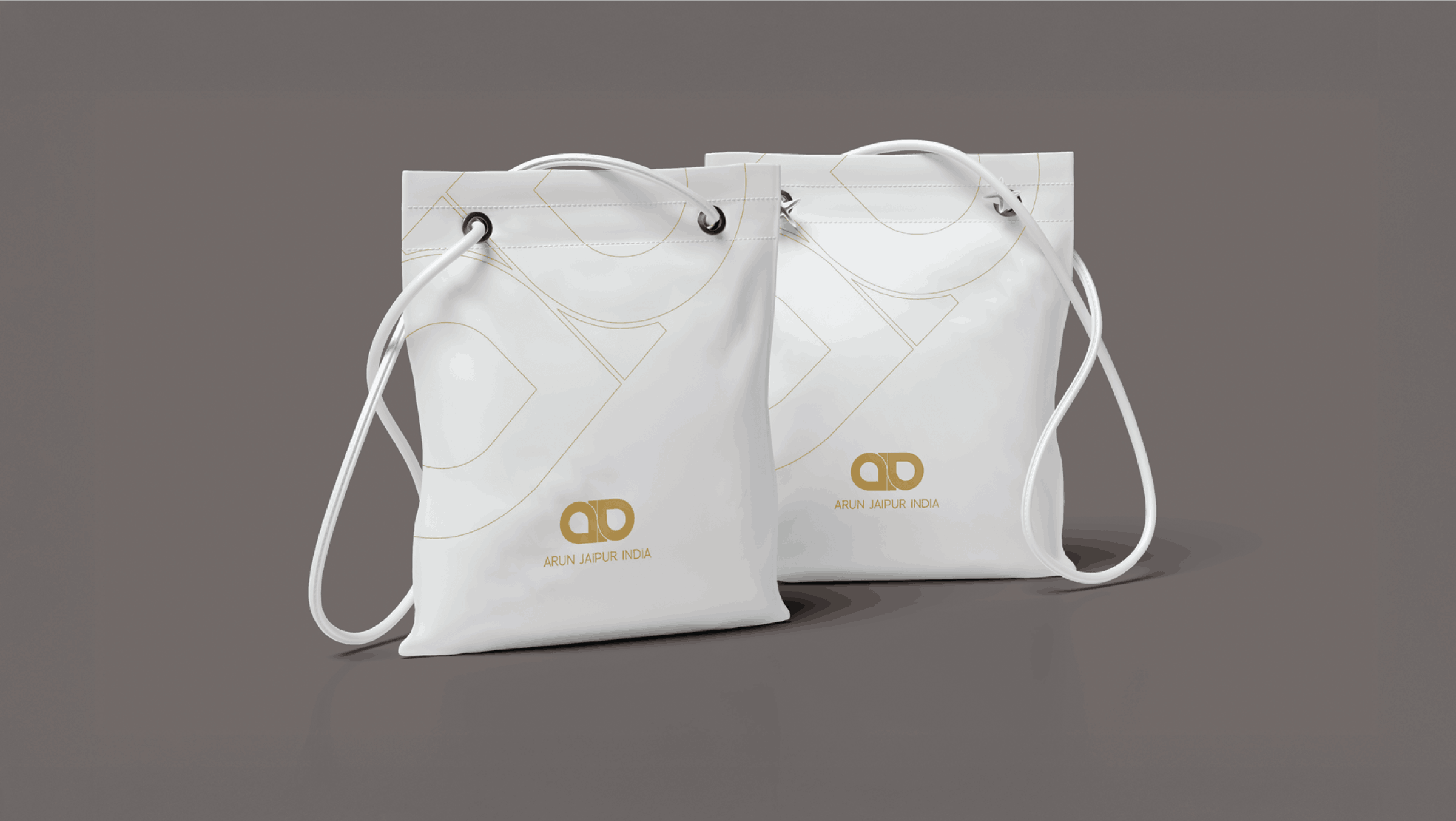
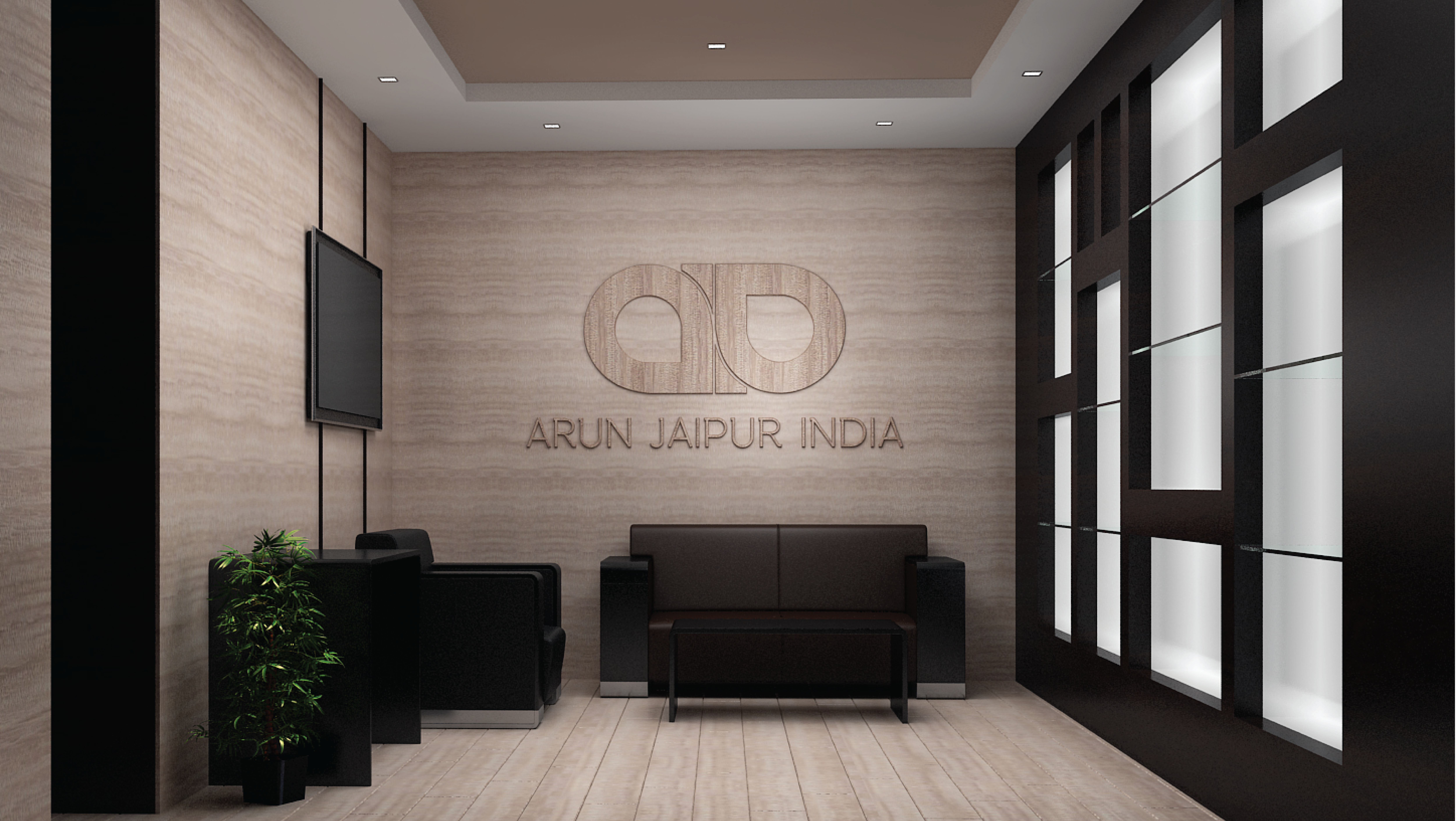
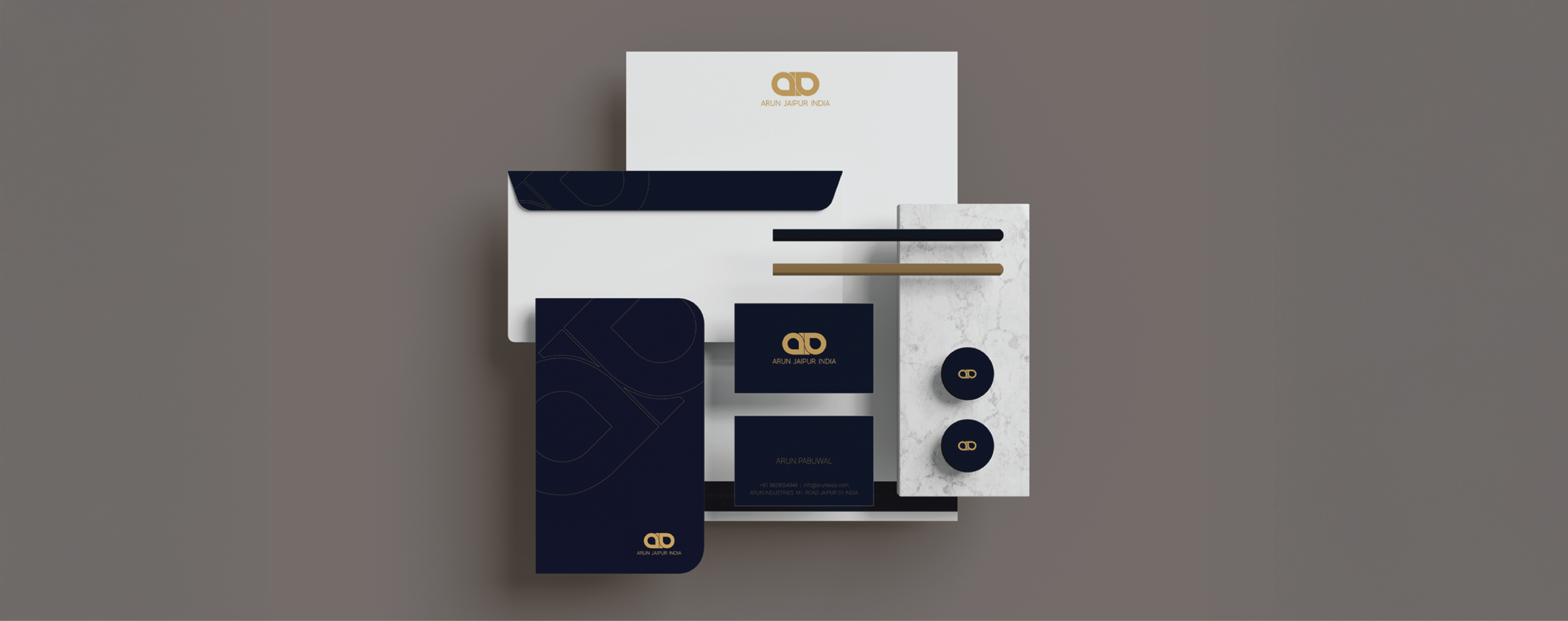
The visual identity had to live in a space where branding is often discreet: on metal, behind glass, sometimes only visible when flipped over. So the graphics had to be strong enough to register, but subtle enough to never distract from the product itself. We chose timeless typography and a monogram that would feel just as credible etched on a steel platter as it would on international shipping paperwork. That restraint both in color and form gave the identity its strength. And the best part? It felt like it had always belonged to him.
What made this project truly unique was how personal it was. We weren’t building a brand to shout in the market, we were building it to stand quietly and confidently in a world of noise. For a man who never wanted to market himself, the new identity gave him structure, ownership, and pride all without changing who he was. That’s the kind of work we love most: where strategy and sensitivity work hand-in-hand, and where a well-crafted logo becomes a symbol of legacy, not just design.


