Project overview
First Stone, known as FS, was conceived as more than just a real estate brand. Led by the vision of Charan Khangarot the company set out to reimagine the very landscape of real estate in Jaipur. Positioned as an umbrella brand with ambitious sub-entities (FS Realty, FS Foundation, Vaas, etc.), FS aimed to disrupt Jaipur’s traditional development practices through thoughtful, people-centric urban planning and investment-driven development strategies
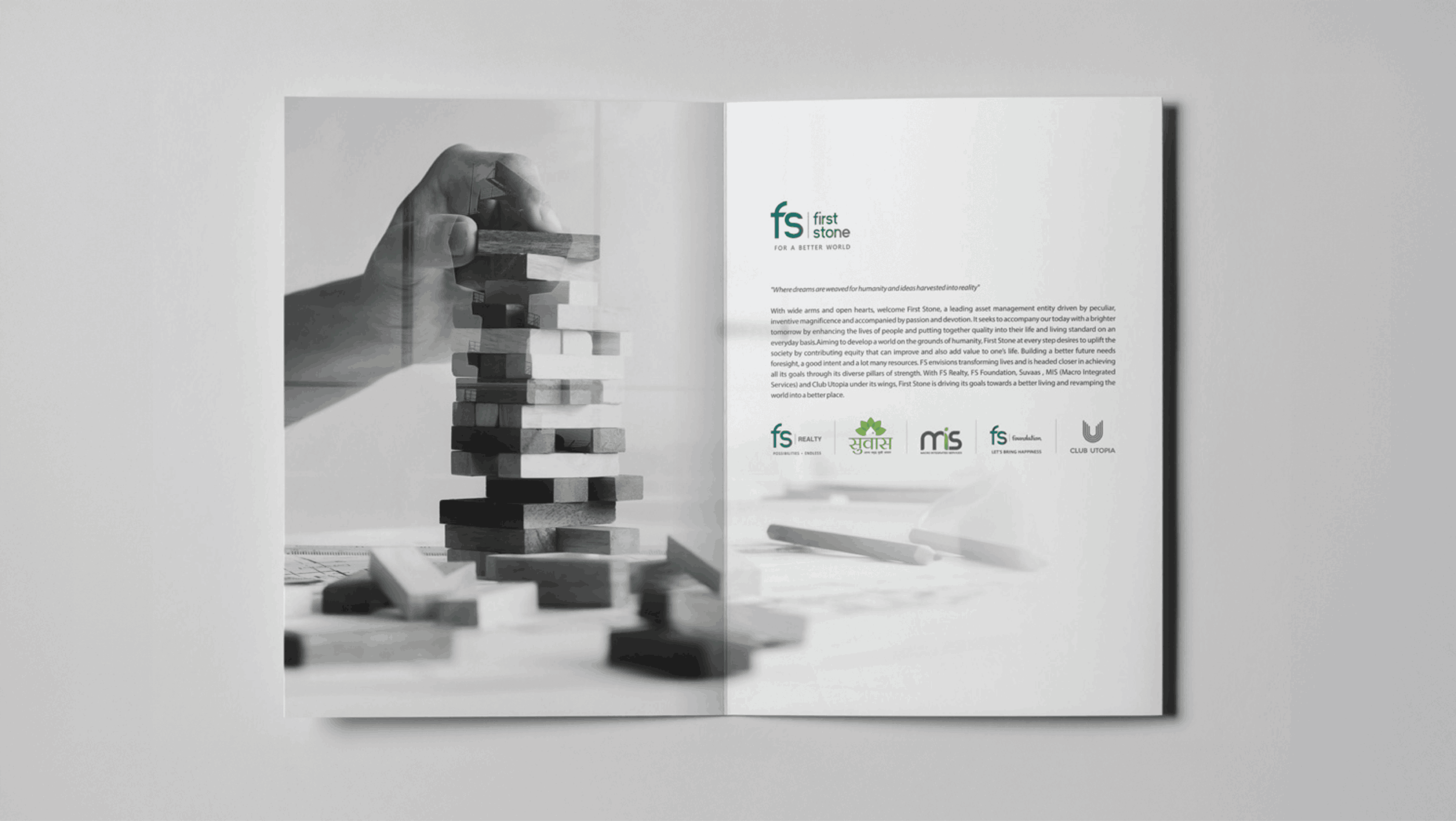
When we began working with FS (First Stone), we quickly realized that this wasn’t a typical real estate brand. The founder had a vision that was both poetic and uncompromising; he wasn't looking for a logo, he was building a legacy. That insight guided our entire branding approach. We moved away from overly literal representations like stone textures or flashy graphics and focused instead on building a brand system that felt foundational and future-facing. The turning point was simplifying the name into “FS” - a bold, clean monogram that could carry the weight of multiple sub-brands, while still preserving the symbolic meaning of being the 'first stone' in something greater.

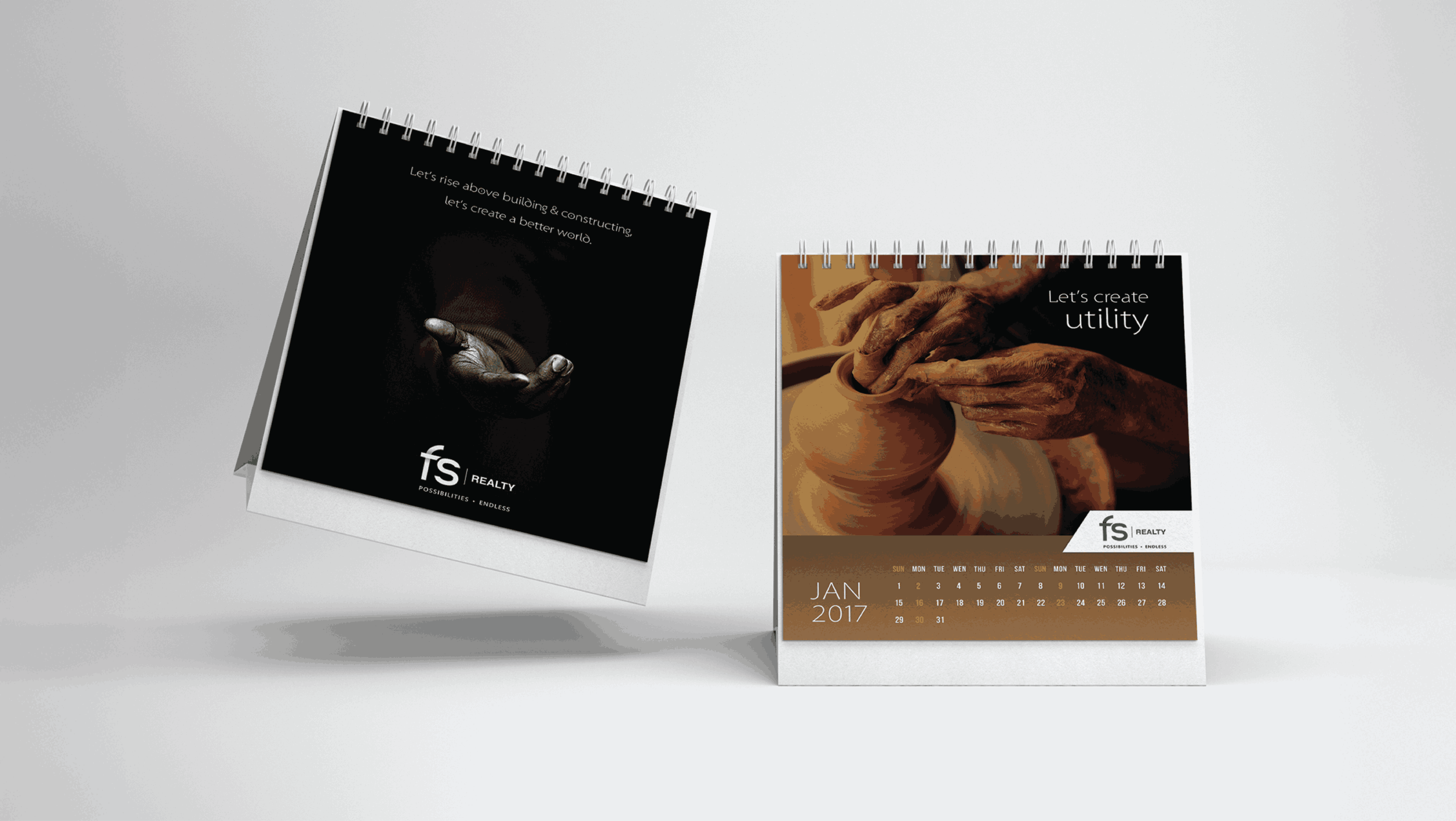
The visual identity leaned into fresh, elevated gradients, warm greens, deep blacks, subtle blues deliberately chosen to break away from the dusty, muted palettes often seen in real estate branding. It was important for us to reflect FS’s progressive mindset visually. We paired that with a tagline, “For a Better World,” which captured their socially conscious, community-driven approach to development.

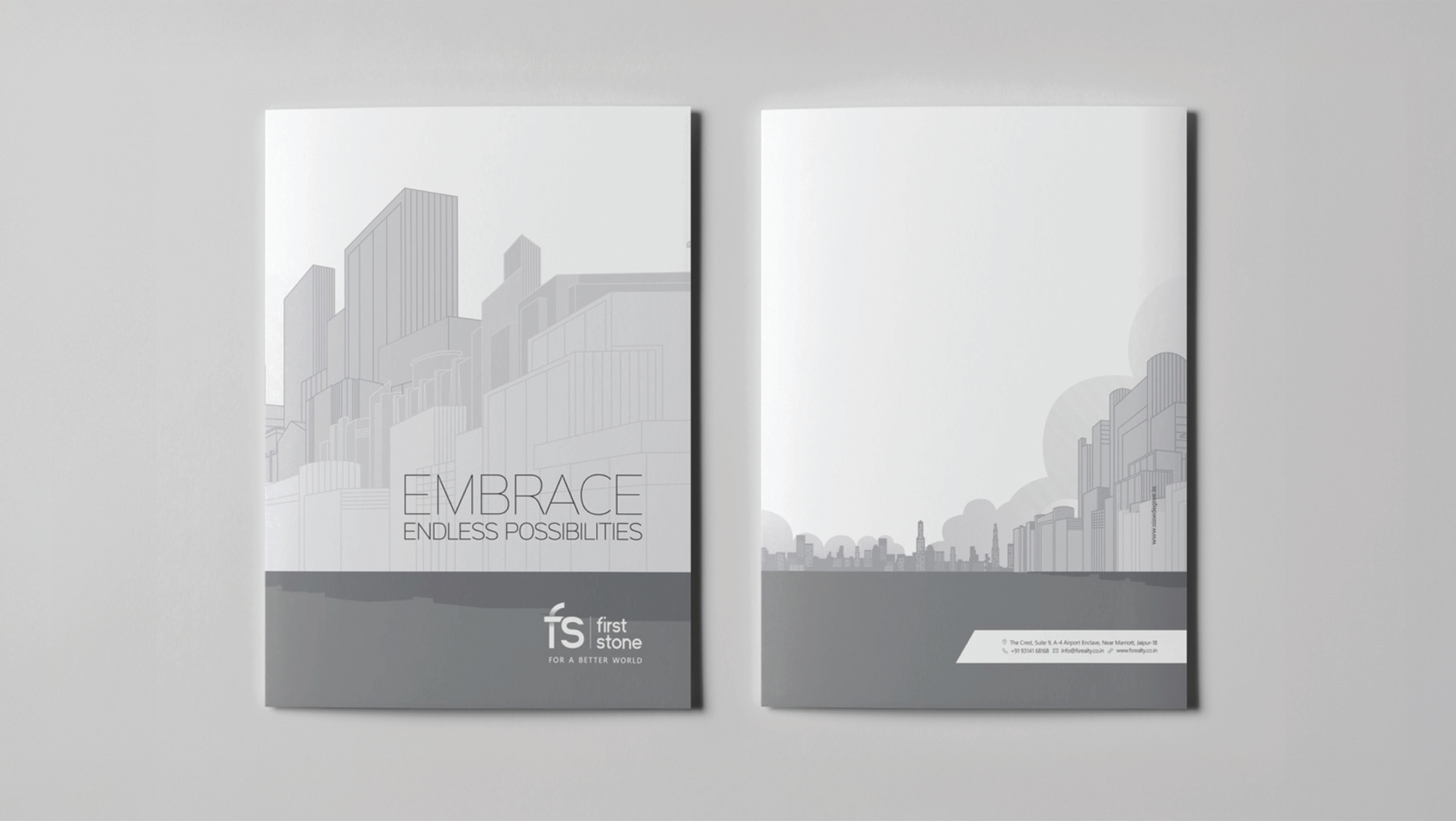
From naming projects like Arca (which symbolized multi-dimensional offerings) to designing visual storytelling that could live across billboards, office interiors, and editorial newsletters, every piece was crafted with intention. We weren’t just designing for aesthetics we were designing to communicate beliefs.

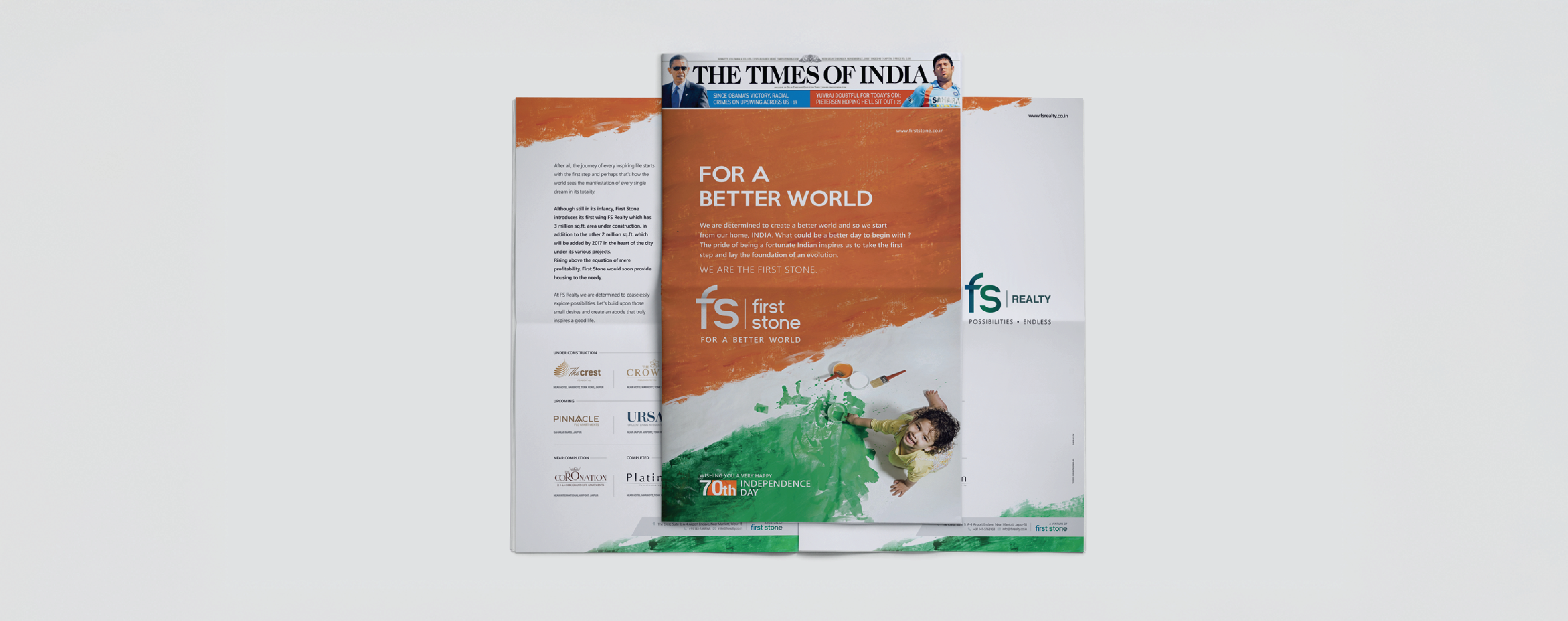
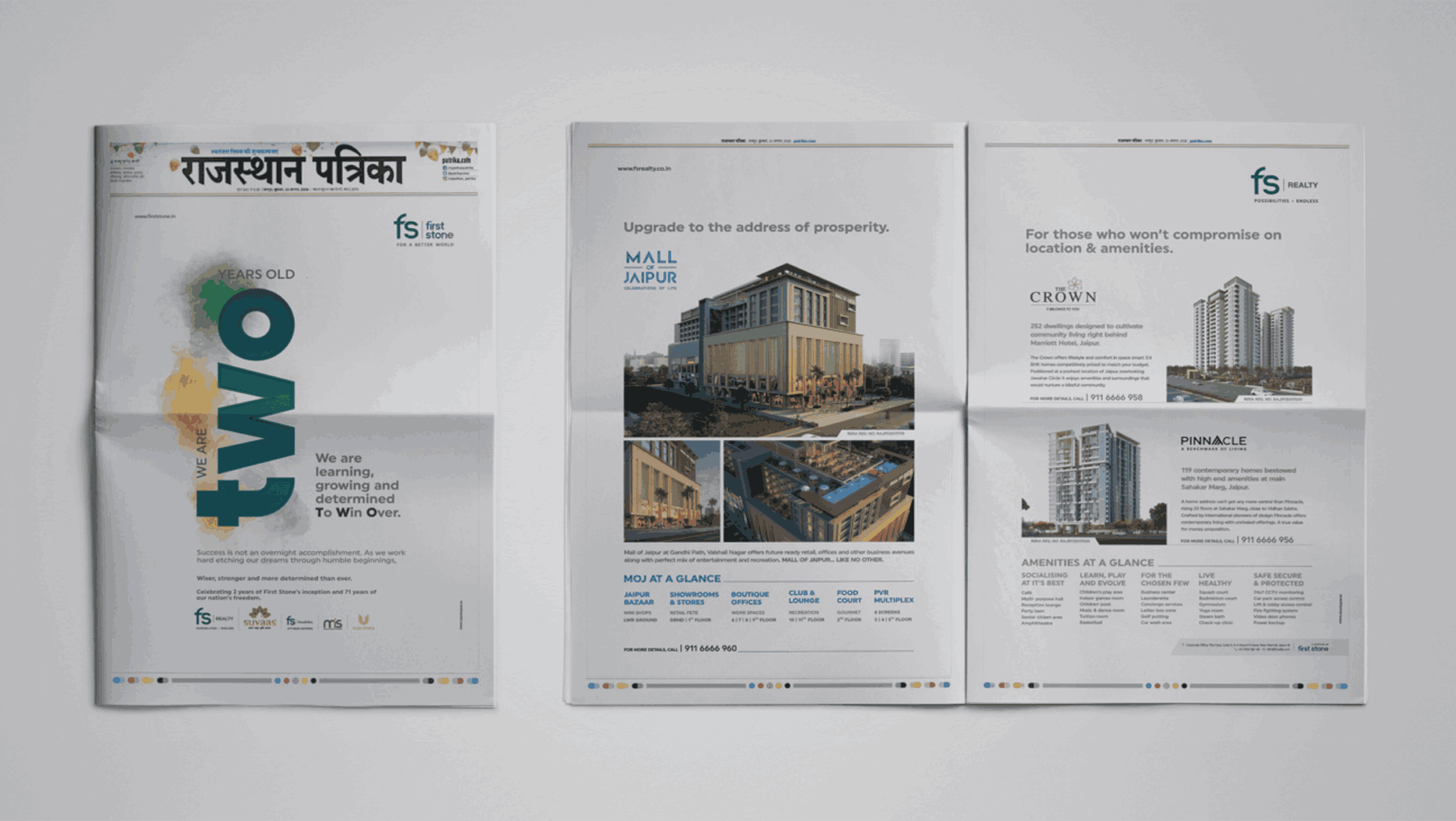
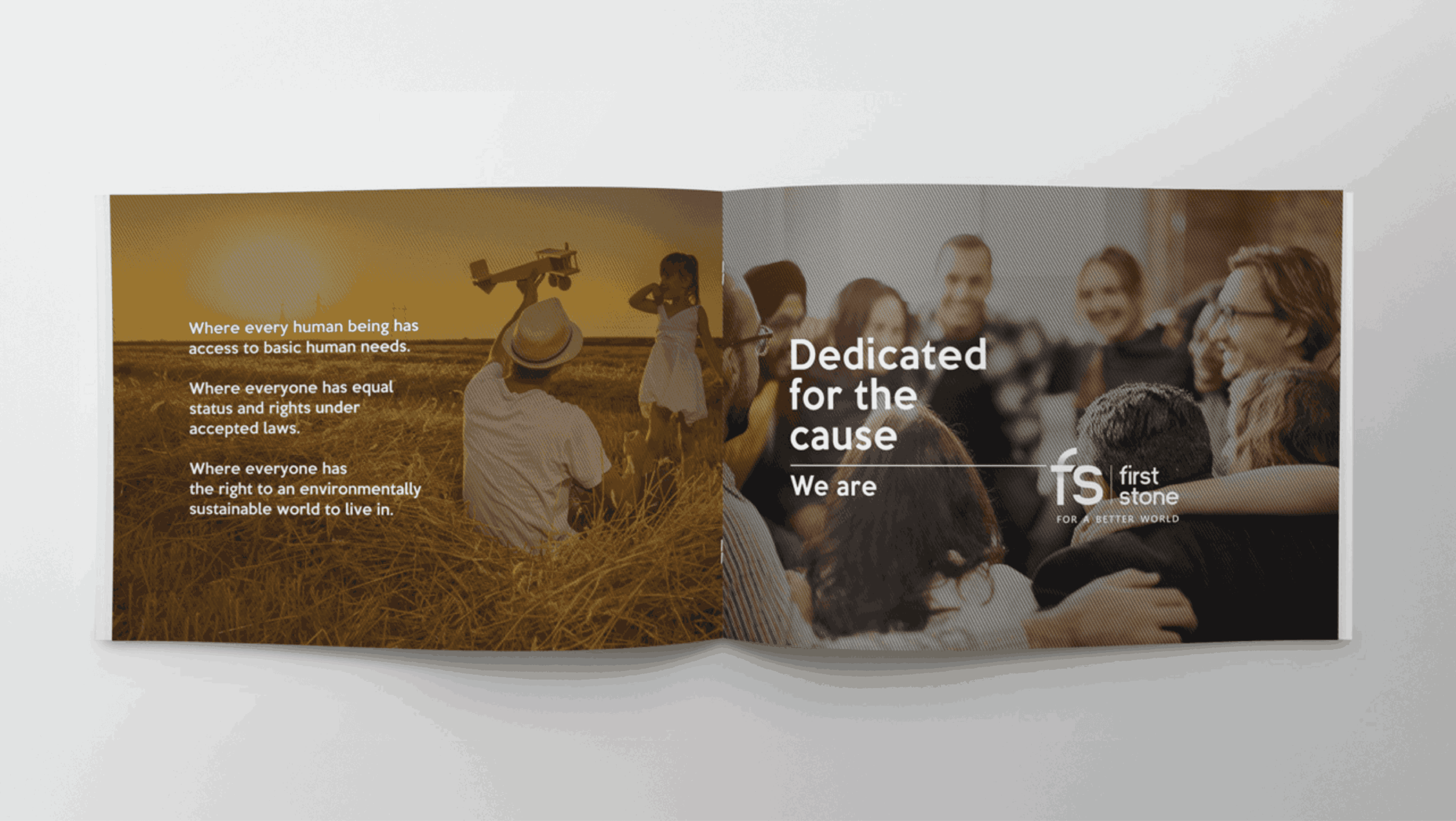
What made this project stand out was how immersive and layered it became. Most brands stop at the surface, but with FS, we helped build everything from the tone of voice and internal magazines to community-level messaging and CSR positioning. Launching in three leading newspapers, pairing it with evocative radio jingles, and creating a compelling visual narrative around a child looking toward a tricolour sky it all created an emotional and aspirational tone that was rare for Jaipur’s real estate market at the time. In the end, the strategy worked because it was deeply aligned with the client’s values and that authenticity gave the brand a unique edge that audiences could feel.


.png)
