Client overview
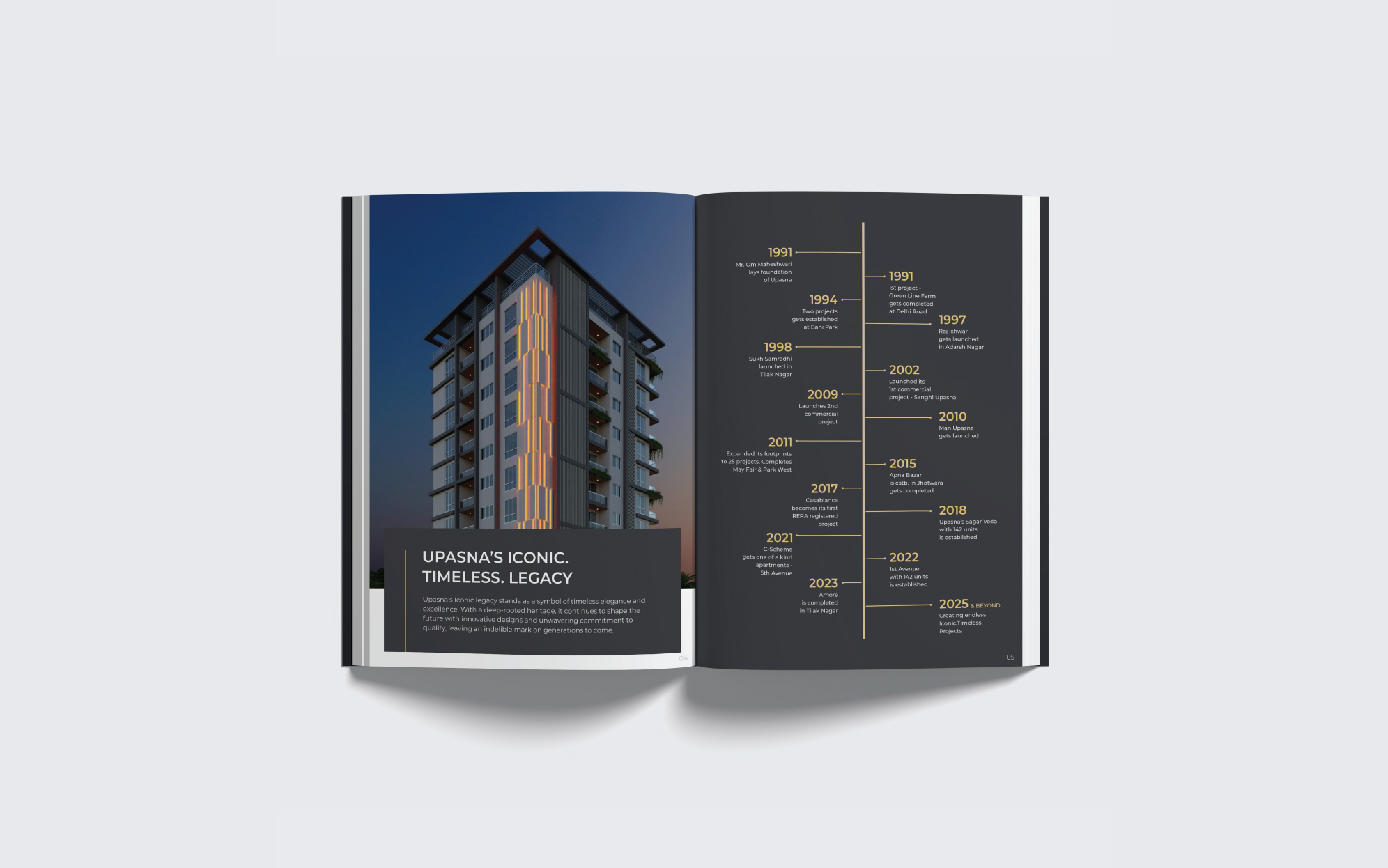
Upasna Group is one of Jaipur’s most established real estate developers, with a remarkable legacy spanning nearly four decades. Upasna was never the loudest name in the industry, but brick by brick, it became the name behind Jaipur’s most sought-after addresses. No shortcuts. No overnight success. Just relentless pursuit, bold vision, and an obsession with excellence. 70+ projects. 7 million+ sq. ft.
When we first started working with Upasna, we knew right away that a surface-level refresh wouldn’t do justice to a legacy brand that had been quietly shaping Jaipur’s skyline for nearly four decades. The real challenge was to help them claim the recognition they deserved and that meant digging deep into their fragmented identity.
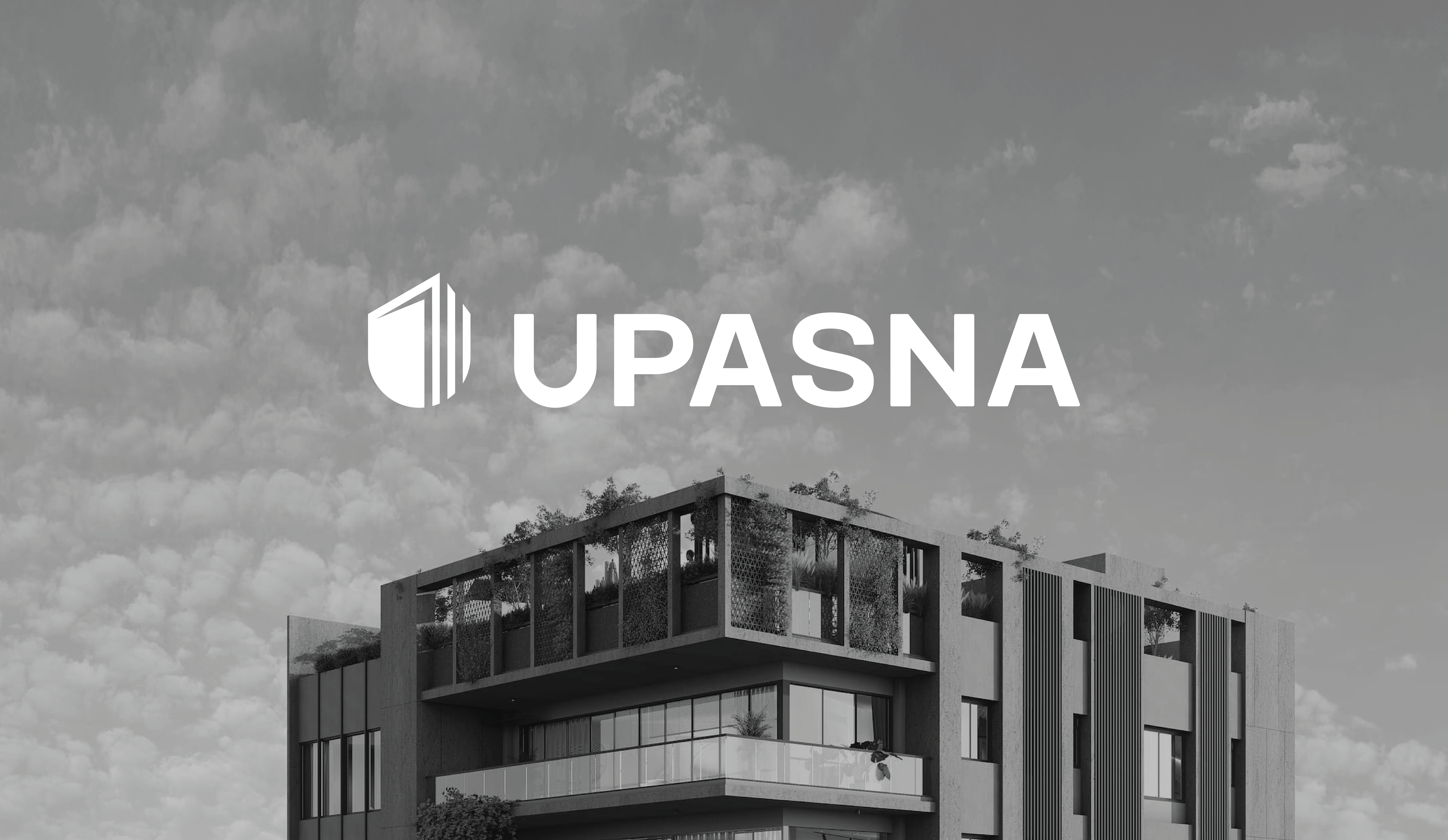
We deliberately chose a strategy that didn’t just create a good-looking logo but tackled the root of their recall problem: multiple spellings, scattered project-level branding, and an unclear corporate persona. By standardizing their name, unifying their presence, and setting a confident new tone, we laid a foundation that would outlast any single campaign.

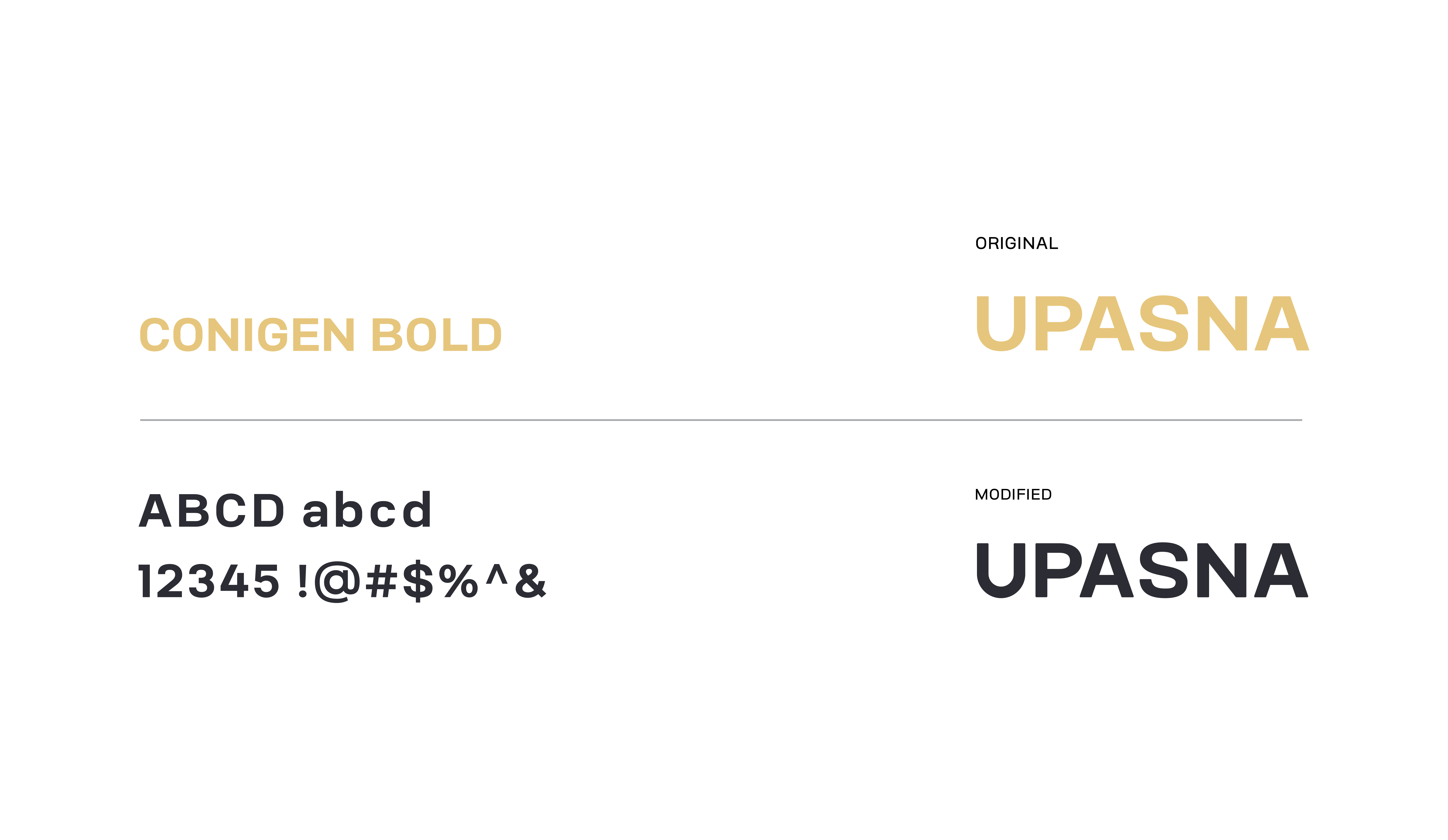
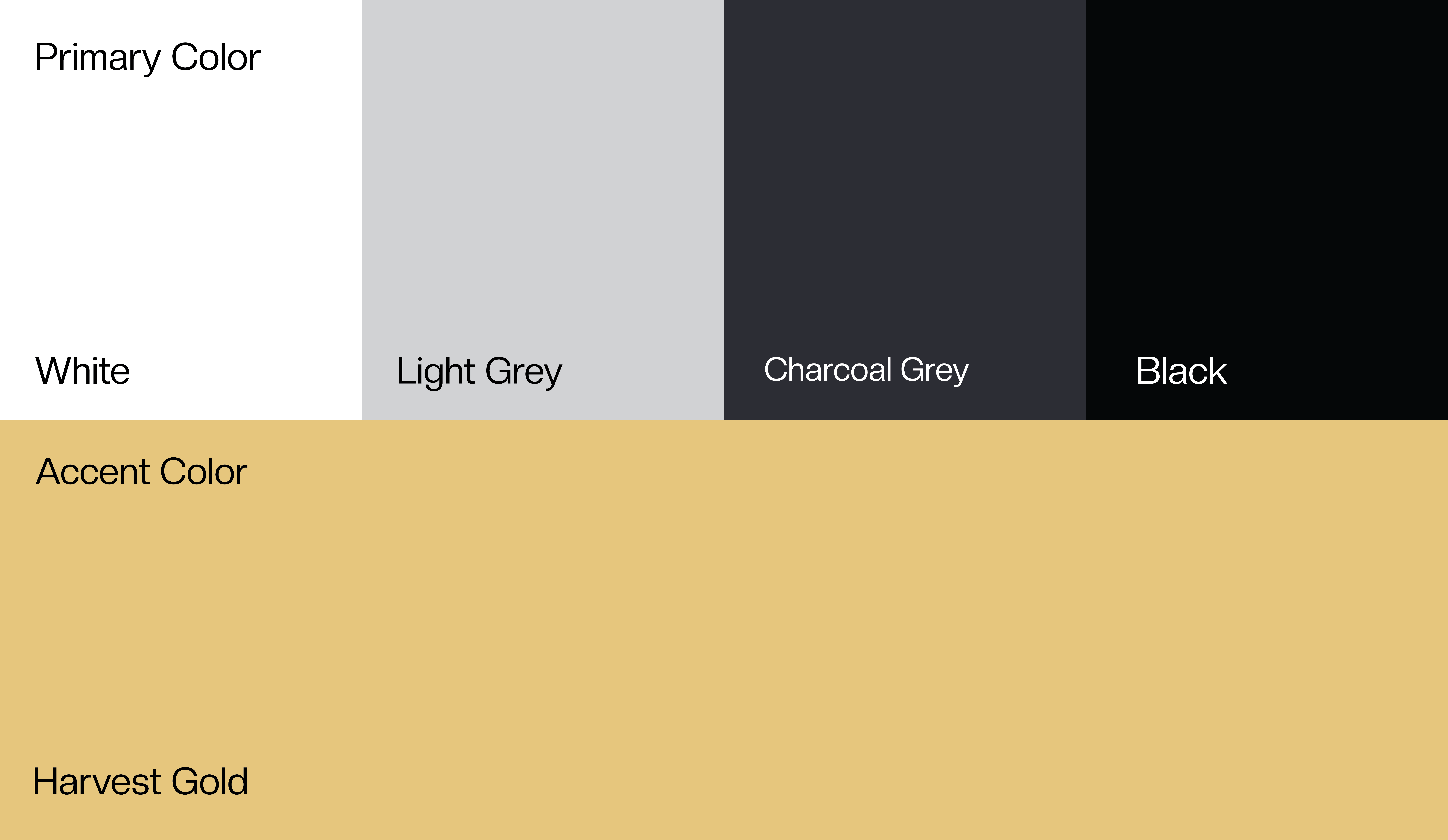
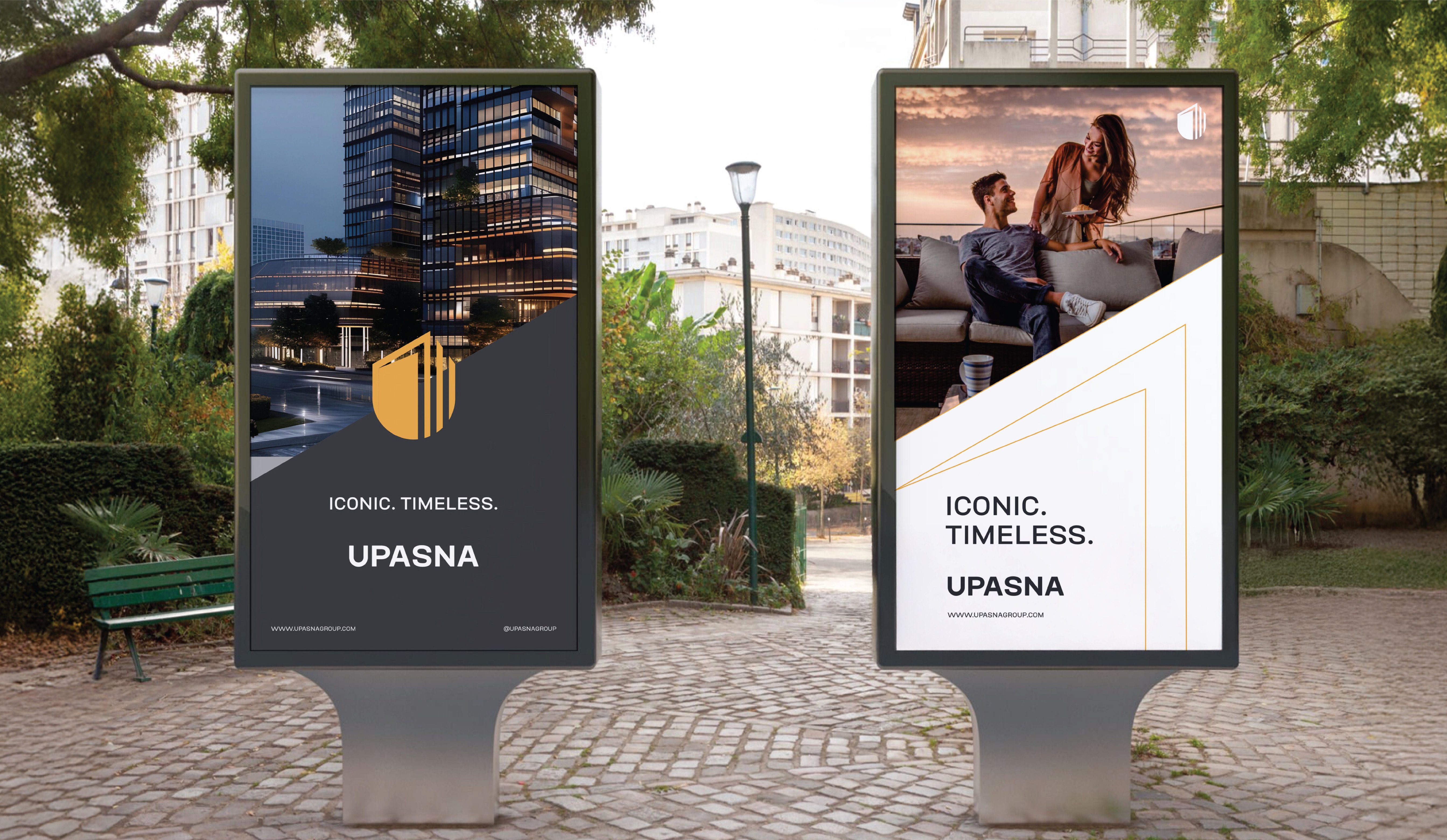
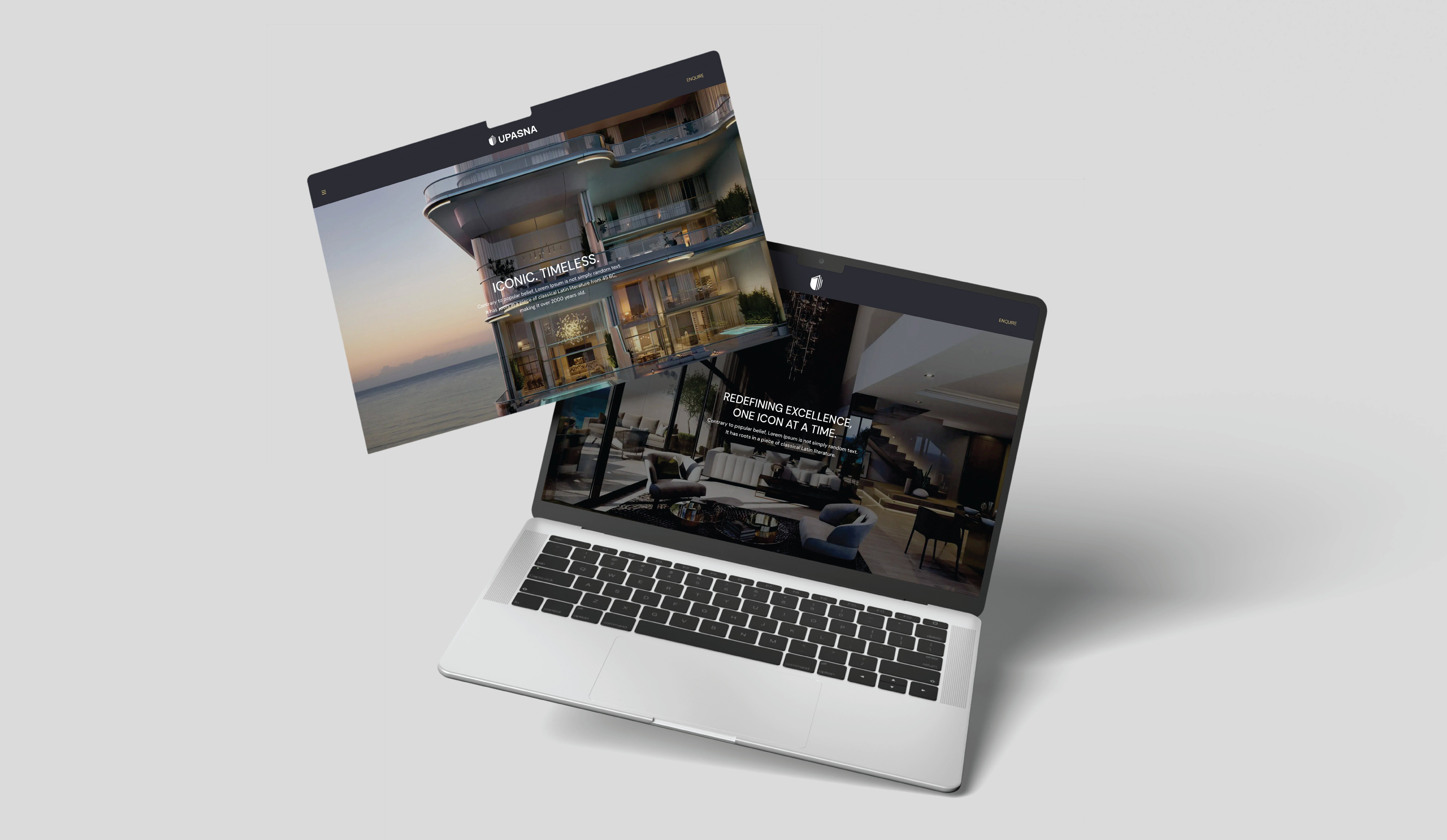
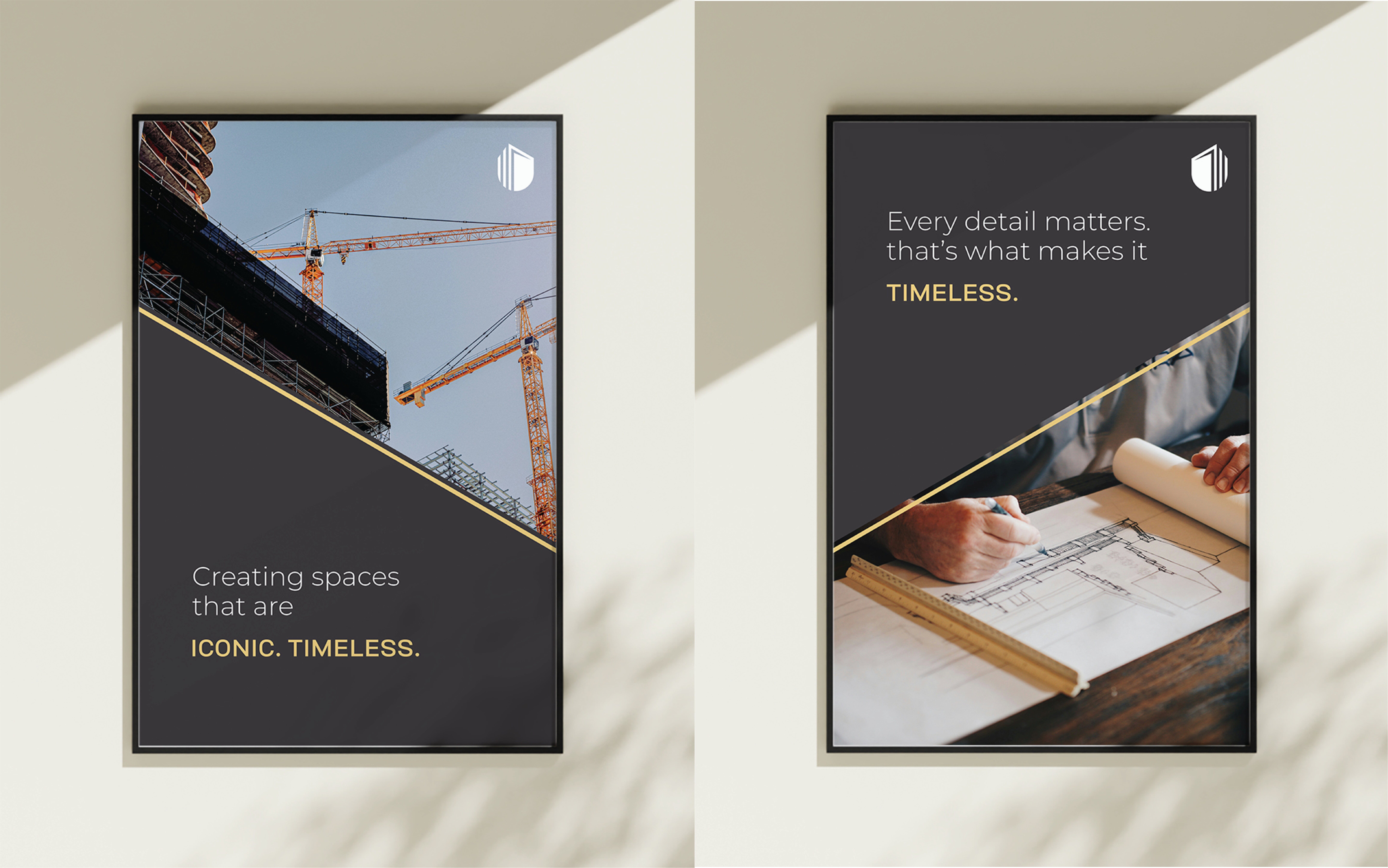
The graphics and design solutions we crafted for Upasna were driven by one core thought - they needed to be seen as a serious, credible developer, not just another project name on a building. That’s why we dropped the lightweight, decorative fonts and bright colors and replaced them with bold, timeless typography and a powerful monotone palette.
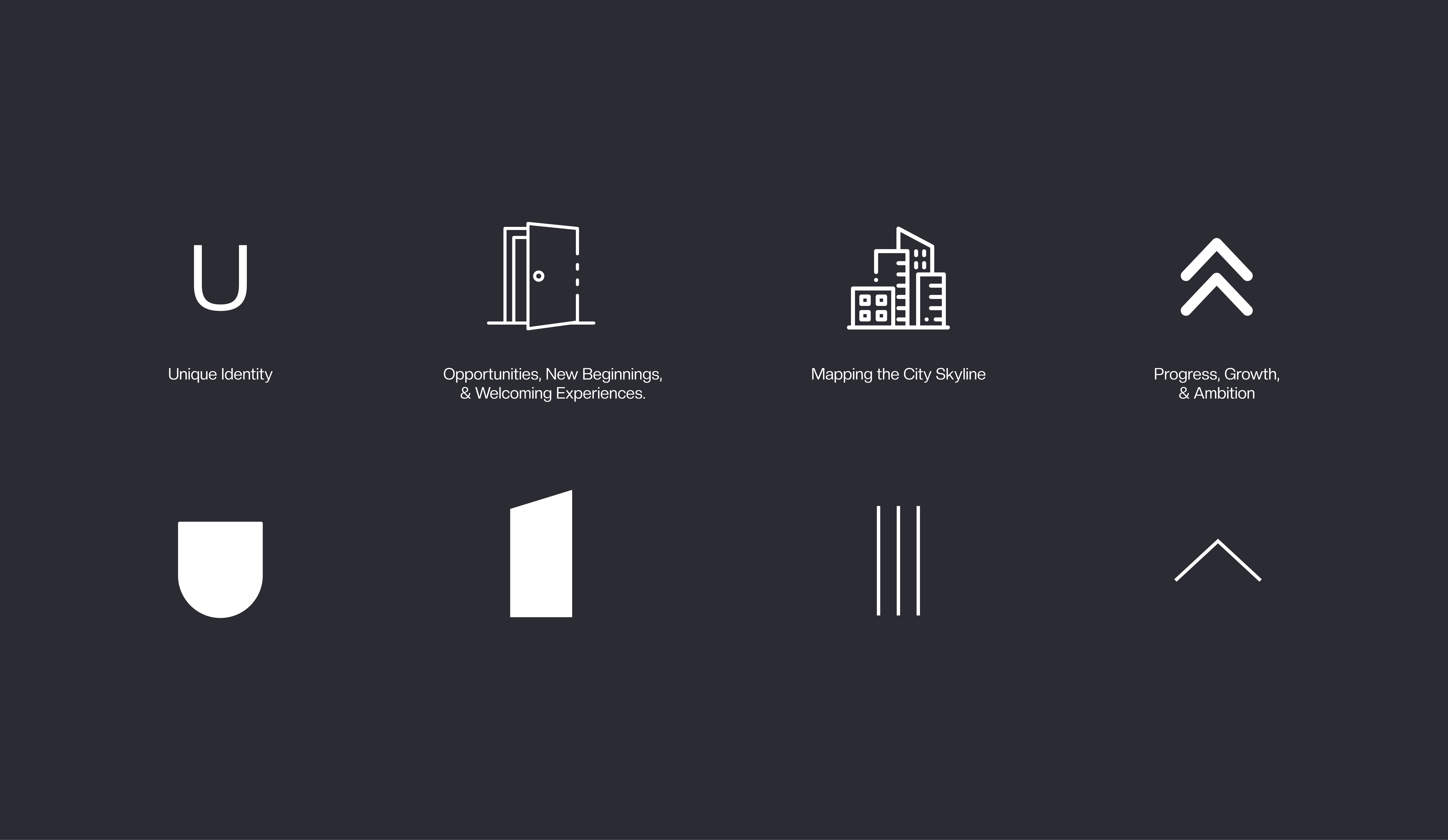
The custom ‘U’ motif was more than just an artistic element; it was our way of telling a visual story of open doors, new opportunities, and constant upward growth. This made the identity feel modern yet deeply connected to their legacy, setting them apart from other local developers who often rely on trend-based, project-specific logos.

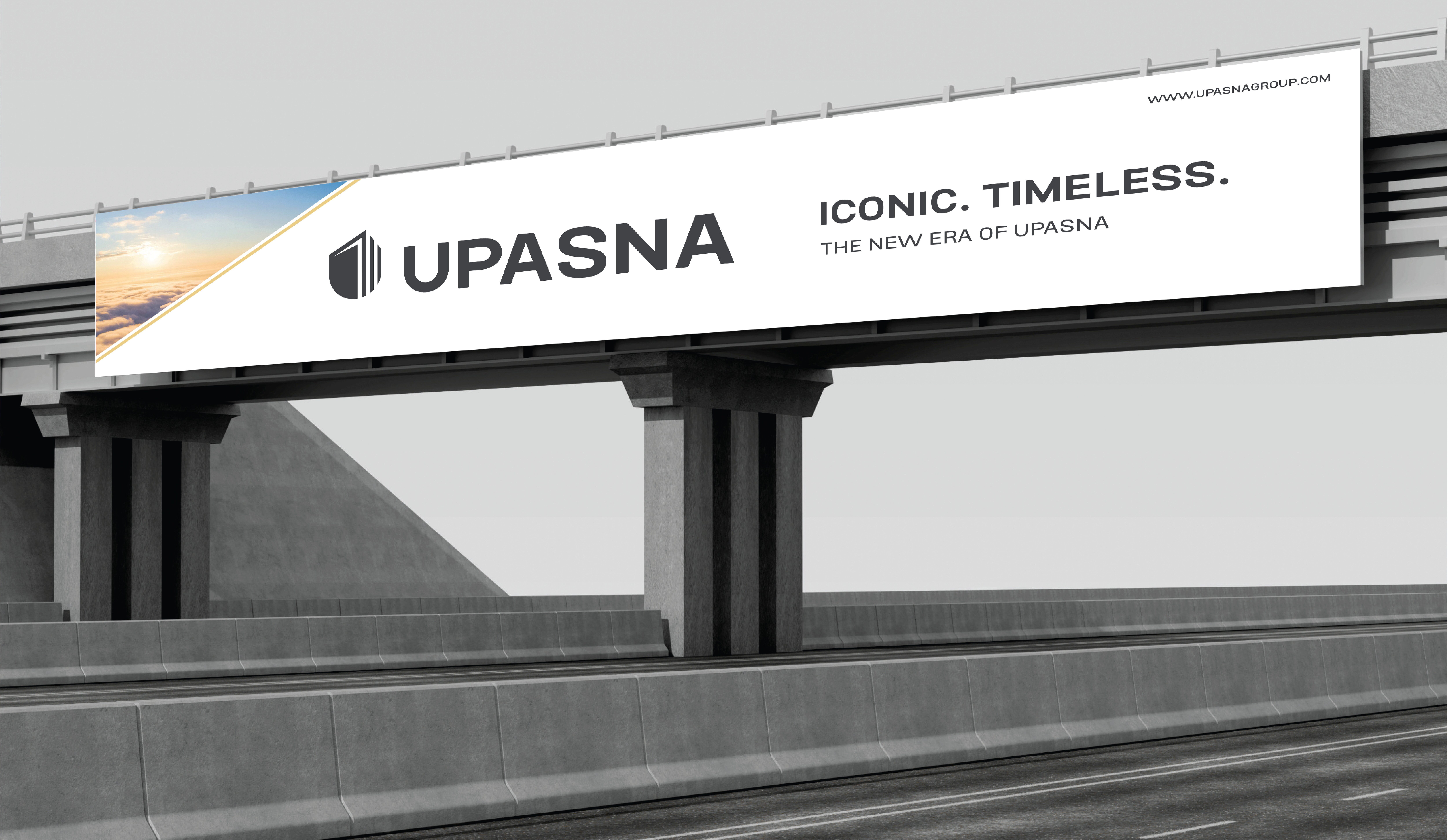
What really made this project stand out was our unconventional rollout strategy. Instead of investing heavily in new outdoor media, we turned Upasna’s own 70-plus completed projects into living, breathing brand billboards. This simple but powerful decision not only saved costs but also anchored the rebrand where it mattered most at the very sites that built Upasna’s reputation in the first place. Each site sign became a reminder to homeowners and passersby that this was not just a building, but part of a trusted developer’s story that continues to evolve.

Seeing Upasna embrace this bold, unified identity was one of the most rewarding parts of the journey. Their new logo and positioning didn’t just look good on paper, it gave them the confidence to launch premium projects like Aurallis at the level they deserved. And for us, it reinforced why a meaningful, strategic design backed by thoughtful rollouts can turn an ‘invisible’ legacy into an iconic, timeless brand that people finally recognize and remember.


