Most real estate logos are approved in a meeting room, on a large screen, with a mock-up of a tower behind them. That is the easiest place a logo will ever be seen.
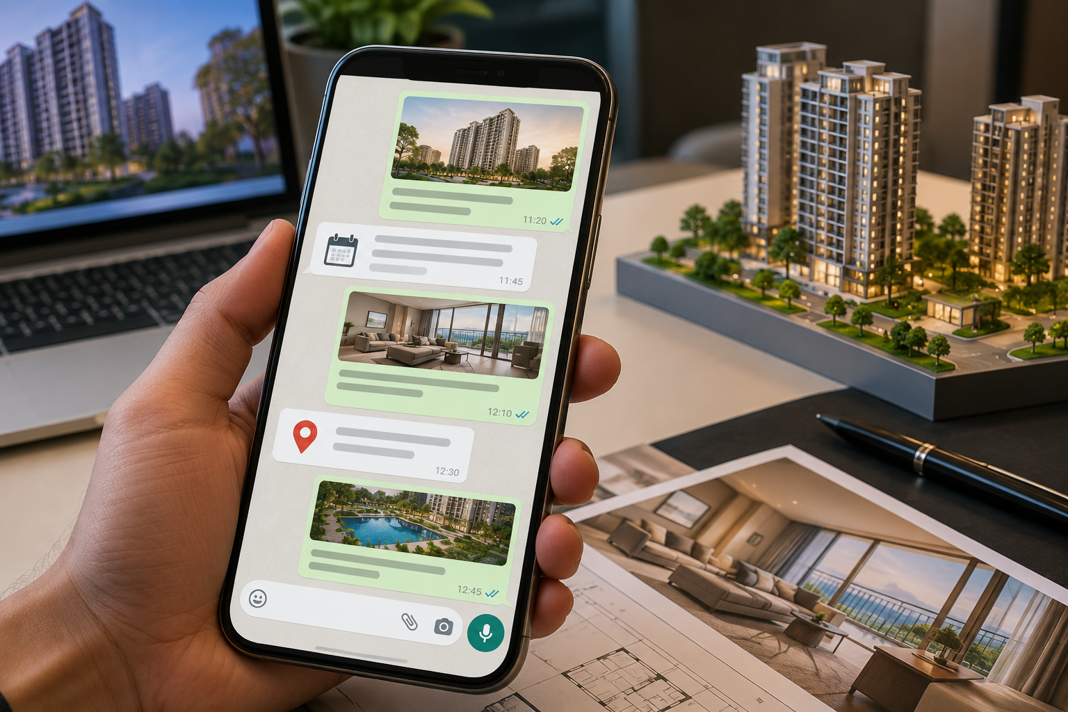
Then it goes to work. It sits at the top of a ₹2 crore project brochure. It shrinks to a circle on a broker's WhatsApp. It stretches across a 40-foot hoarding beside three competitors. It prints in black and white on a sale agreement. Many identities that looked confident in the meeting room start to fray at this point.
This is why a real estate business logo should never begin with a search for a roofline, a house icon, or a clever pair of initials. It should begin with a harder question: what does this brand need to be remembered for? As we have written in how strong branding helps real estate projects sell faster, identity is the part of a project buyers carry with them. The logo is its most compressed form.
What a Real Estate Company Logo Has to Survive
A real estate logo faces tests that most consumer brands never meet.
It has to work at 24 pixels and at 24 feet. It has to hold up in monochrome, because legal documents, newspaper notices and embossed brochure covers rarely allow colour. It has to sit beside a RERA registration number, a channel partner's logo and a bank's logo on the same page. And it has to stay credible through a sales cycle that can run for years.
There is a quieter test as well. A buyer comparing four projects over a month will see each logo dozens of times, on portals, in ads, on WhatsApp forwards and at the site. The distinctive one is the one they recall when the family sits down to discuss the shortlist.
A roof over a square tells people the company deals in property. It says nothing about what kind of property business it is, who it serves or why it deserves preference. The stronger approach is to identify the brand's territory first and then translate that territory into form.
30 Real Estate Logo Ideas for Developers, Brokers and Property Brands
Letters and names
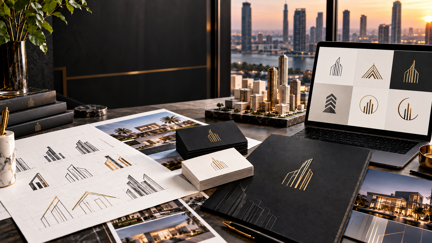
A monogram can outgrow a single project and become an asset that appears across every development, as it did in Nine Degree's work with MCC Realty, where an open door and a forward arrow formed the M and replaced generic construction imagery. An architectural monogram, built from the proportions of a façade, column or floor-plan grid, suits a luxury real estate logo because restraint says more than a literal building.
A wordmark with one customised character gives a plain name a signature, a fully geometric wordmark lets typography do the work of an icon, a project initial extended into its own mark separates the project from the developer, and a strong name set well can simply be the hero.
Form and architecture
Form and architecture offer more territory: negative space that implies a tower or doorway, a door abstracted into an aperture or threshold, a grid or floor-plan identity for precision-led developers, a sculptural form that sits closer to design than advertising, a horizon mark for townships and plotted developments, an abstract landscape for villas and farmhouses, and a single botanical contour for projects genuinely built around gardens. Done well, these become the most creative real estate logo options in a market full of rooftops.
Place and heritage
Place and heritage come next, with a landmark reduced to its characteristic line, a heritage motif such as a jaali or jharokha reinterpreted for the present, a modern crest edited down to one symbol, and a serif or sans-serif wordmark chosen to set the register, refined and editorial in one case, precise and contemporary in the other.
Positioning-led marks
Some marks are built to do commercial work: one drawn around the project's USP, whether deep balconies, connected towers or a waterfront, a symbol with a second reading, such as an initial that is also a doorway, a mark whose geometry becomes a pattern across brochures, hoardings and interiors, a monochrome mark that leaves weak design nowhere to hide, a category-breaking mark for markets where every real estate property logo looks alike, and a dignified mid-segment identity that signals trust and quality without a single discount cue.
Broker and agent identities
Brokers and advisors need a different toolkit, starting with a personal wordmark that carries the agent's name across WhatsApp, listings and business cards, an agent monogram that becomes the profile image and watermark, an advisory identity for firms serving HNIs and investors, and a compact, forgiving realty logo for brokerage networks whose associates will reproduce it on materials the firm never sees. A good real estate agent logo is built for small screens first.
Developer-scale identities
And for developers at scale, two directions stand out: a corporate identity built for brand architecture, with enough character to be recognised and enough restraint to let each project speak for itself, as in the Prithvy and Samsara work, and a family-led legacy identity, like Nine Degree's refresh for Akshat, that stays contemporary while keeping the reputation built over a long presence in Jaipur.
Developer Logo vs Project Logo
The two are routinely confused. A developer's identity builds recognition across years, projects, and market cycles. A project identity, or real estate property logo, has a narrower task: establish a position for one development and stay recognisable through its sales cycle.
Consider a developer launching a high-rise in the central business district, a family township on the city's edge and a villa project. Giving all three an identical identity strengthens corporate recall and weakens each project. Giving them three unrelated identities creates attention and throws away the developer's accumulated trust.
The answer is a clear parent brand paired with project identities that have room to speak for themselves. That decision belongs in brand architecture, and it should be made before any logo is drawn.
Which Colours Work for a Real Estate Logo
There is no best colour. Blue is associated with trust and stability. Black signals authority and a more premium register. Green connects to the landscape. Warm neutrals suggest materiality and understated luxury.
But colour should follow positioning, not category habit. If every developer in a micro-market uses navy and gold, using the same pair does not communicate trust. It communicates that the brand is one more developer.
For a luxury identity, fewer colours usually work harder: one dominant colour, one supporting neutral and one considered accent. The palette also has to work with architecture, photography and campaign design, so it should never be judged on a logo slide alone.
What Makes a Luxury Real Estate Logo Look Premium
Luxury is often mistaken for decoration. Gold gradients, ornamental frames, and thin script typefaces are used as shorthand, and sometimes they work. More often they signal that the designer wanted the logo to look expensive.
A premium feel usually comes from four things: proportion, restraint, typography and relevance. There is enough clear space around the mark. The type feels chosen. The palette is controlled. And the idea belongs to the project's real positioning.
That last point matters most. A luxury real estate logo should look like it belongs to the world the brand is trying to create. The Sawai identity did this by tying the mark to Jaipur's architecture instead of borrowing generic luxury cues.
Seven Mistakes to Avoid
Starting with the symbol: If the first question is which icon to use, the strategy is already too narrow. Start with positioning, audience, and differentiation.
Using the same house icon as everyone else: A roof, chimney, and window are the quickest ways to say "property" and the quickest ways to be forgotten.
Designing around the competitor: A rival's logo is useful as a market reference and useless as a brief. If five developers in a city look alike, copying them reinforces the similarity.
Over-ornamenting a luxury logo: In premium markets, confidence often comes from knowing what to leave out.
Ignoring scale: If the logo only works large, it was not designed for real marketing.
Expecting the logo to supply a positioning: If the project has no distinctive proposition, a new logo will not create one.
Forgetting the site: The identity ends up on the gate, the hoarding, the sales gallery, the wayfinding, and the sample flat. If the physical brand and the digital brand feel like different projects, the buyer notices the gap at exactly the point where confidence matters.
How to Choose a Direction
Before you shortlist any of these real estate logo ideas, answer five questions.
Who is the buyer? A first-time homebuyer, an HNI investor, an upgrading family, and a commercial investor read different cues. An NRI buying from abroad often relies on the logo and website alone for a first impression.
What should the brand be known for? Location, architecture, legacy, value, privacy, design, investment, or something narrower.
What does the category already look like? Know which visual territory is crowded before deciding where to stand.
Is this a corporate or a project identity? The answer decides how much freedom the logo has and how long it must stay relevant.
Where will it appear? Portals, WhatsApp, hoardings, brochures, sales decks, signage, and newspaper ads each impose their own limits.
Once these are answered, logo design becomes productive. Our brand identity work begins at exactly this stage.
Conclusion
Take the logo out of the design presentation. Put it on a hoarding beside three competitors. Reduce it to a profile picture. Print it in black and white. Place it at the top of a brochure and on a site gate.
Then ask whether it still feels like the same brand.
That is the real test of a real estate company logo. It is passed by the logos built on a clear decision about what the company or project wants to own in the buyer's mind, and failed by the ones that began with a symbol.
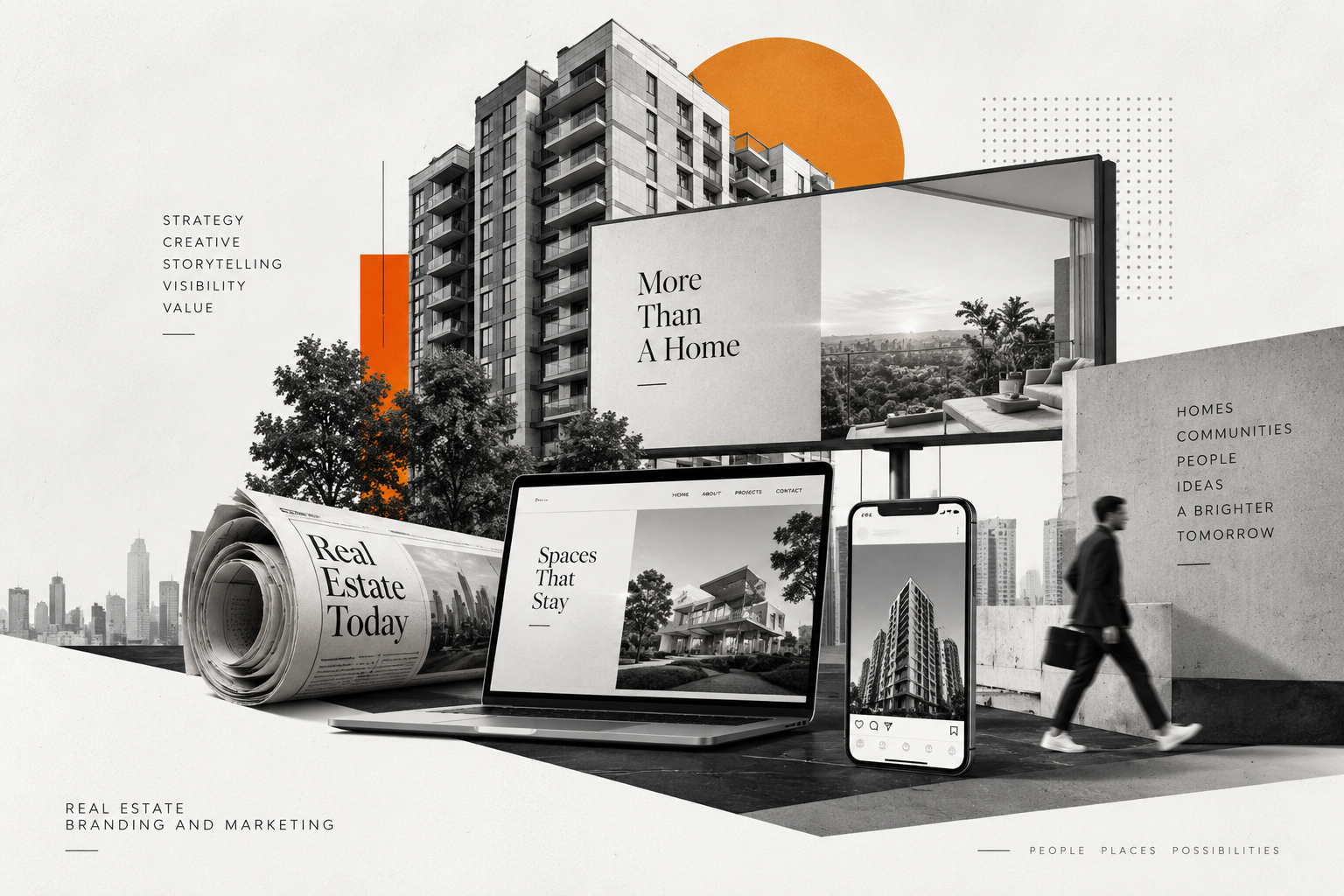
At Nine Degree, we do not treat logo design as an isolated graphic exercise. We begin with the business, the buyer, the market, and the position a brand has earned or wants to earn, and then translate that into an identity built to live across the full real estate marketing system. If you are weighing a new identity or a relaunch, we would be glad to talk through what your brand should be remembered for.
Frequently Asked Questions
What should a real estate company logo include?
A real estate company logo should include a distinctive wordmark, a symbol or monogram where it adds value, and a visual system that holds up across digital, print and physical environments. That means a compact version for small spaces, a monochrome version for legal and print use, and clear rules on colour, clear space, and minimum size. The exact mix depends on positioning and brand architecture.
Which colours work best for a real estate logo?
No single colour works for every real estate brand. Blue suggests stability, black reads as more premium, green connects with landscape, and warm neutrals suit understated brands. The better question is what the competing logos in the micro-market already look like. A colour that separates the brand from that field, while fitting its positioning, will outperform a conventional choice.
How is a project logo different from the developer's company logo?
A developer logo represents the parent company and builds recognition across projects and years. A project logo represents one development and is shaped around its specific audience, price point, and proposition. When the two are planned together through brand architecture, the project gets room to differentiate, and the developer keeps the trust built across earlier launches.
What makes a luxury real estate logo look premium?
A luxury real estate logo looks premium when every element looks decided. That means controlled proportions, considered typography, a restrained palette, generous clear space, and a visual idea rooted in the project's real positioning. Ornament rarely adds value. A mark that looks like it belongs to the project's location, architecture and buyer will almost always feel more expensive than one that merely decorates.
Share